Tuesday 30 March 2010

River Kennet at Avebury - Watercolour


Avebury is a village in Wiltshire (England) where you can see stone circles. The difference with Stonehenge is that the stones are in the village itself. This watercolour represents the river Kennet at Avebury. There is a nice walk that takes you on the hills surrounding Avebury and starts just after you have crossed the river, which is not very wide there.


River Kennet at Avebury – Watercolour (40 cm x 33 cm) by Benoit Philippe

Saturday 27 March 2010

Invest in the process, not in the outcome


A set-back on the journey

I have been working for many months on a series of works on California for my exhibition “Californian Dream”. After months of going back and forth and a couple of set-backs, Mr. Darren Edwards, the House Manager of the Swindon Art Centre, had sent me the confirmation for an exhibition in June (date: Friday 4th June between 9am - 5pm - Take down: Saturday 3rd July between 10am - 1pm).

This was my main exhibition for 2010.


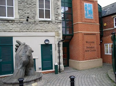
The entrance of the Swindon Art Centre


Everything was coming together. I had ordered most of the frames needed and I was designing the invitation and about to send an announcement to various websites when I received an email from Mr. Darren Edwards on Friday telling that my exhibition is cancelled:

“Unfortunately I am now unable to honour the planned exhibition scheduled to take place in June / July at the Arts Centre.

We are about to go through a re-development of the ground floor which includes the gallery spaces. The work has been moved forward now that plans have been completed and unfortunately will mean those areas are closed to the public whilst work is carried out.”

This could have just been another delay, but the end of the email is more worrying, as Mr. Edwards added:

“We are currently not sure if we will still have hanging space for exhibitions after the renovation but I will be in touch with you if / when we start taking bookings again.”

This is bad news not only for me but for all artists in Swindon because the Art Centre is currently the only public space available in town for local artists.


The answer is: Invest in the process, not in the outcome

A few days ago, I watched a TED video of a talk by Srikumar Rao titled “The riddle of hard wired happiness”. You can watch it on the TED conference website.

What he explains is really interesting and true. In a nutshell, the “If... then” model is flawed (“If I had a studio, I could paint more”; “If I had more money, I would be happier”... Sounds familiar?)

While outcomes are outside of our control, actions are within our control. So, instead of investing – emotionally - in the outcome, we have to invest in the process. In other words, do the best you are capable of, choose and enjoy the journey.

I enjoyed the journey of creating a series of works for my “Californian Dream” exhibition and I intend to continue until I complete the series.

I now need to take action to find another venue to host my exhibition. At the same time, I am going to take actions and do my best to have the exhibition space maintained at the Swindon Art Centre. I already sent some questions to Helen Miah, the Head of Culture for Swindon, and will then bring this to the attention of the media if necessary.

Both of these journeys are worthwhile.


Add to Technorati Favorites

Thursday 25 March 2010

Unifying colours in your paintings


This article was first published in "Frequency Magazine" – March 2010


In this article, I will discuss several strategies to unify the colours of a painting in order to avoid an impression of a patchwork of unrelated colours. These techniques help to build a more cohesive painting.


Mid-Day San Francisco - Pastel (37 cm X 30 cm) by Benoit Philippe


One way to achieve unity is to use a tinted background that shows through. Coloured backgrounds are common for pastel and you can buy pastel cards and papers in many different shades. In oil, I like to work on tinted background and let it show between touches of colour. For watercolour, some artists start their work with a light wash over the initial drawing to get rid of the whiteness of the paper and provide some unity to the subsequent washes.


For oil, you could start with a monochromatic layer. The classic school of painting taught that the first stage of an oil painting should be a grisaille (a monochromatic layer outlining the tones in grey or earth colours). This foundation layer creates unity underneath the transparent glazes. There was an artistic as well as an economic reason to this, because earth colours were cheap and artists saved the more expensive colours by glazing them in thin layers on top of the grisaille.

I still use an equivalent of this technique in watercolour for far away background elements, like trees or mountains. I sometimes apply a diluted wash of Payne’s grey (or a mix of Payne’s Grey and Ultramarine blue) first. Once it is dry, I paint over it a second wash of colour. The first wash showing through will “knock down” the colour of the second wash and create the intended recess, pushing the element towards the horizon.

Another way to ensure some unity of colours is to restrict the number of colours you work with. This is first done by choosing the temperature for your painting: warm or cool. This choice will dictate what colours in the spectrum become your dominant colours. In addition, a limited palette makes unifying easier, because all your colour mixtures being based on a limited number of colours and being therefore related, there is less chance that the resulting hues will clash.

Finally, another tool available is a “unifying colour”.

A unifying colour is one colour used throughout the work in various quantities that will bring all areas together. It can be the dominant colour of the background that is stippled in elements of the foreground. Working all areas of the painting at once is important as, by definition, the unifying colour should be used all over the painting even if in small quantities.

What colour can be used as unifying colour? Any colour, really. It will probably be one you like, because this colour will steer the global impression given by the painting towards this colour. There are two different approaches to unifying colours:

  • Use a fairly neutral colour (on the grey scale). In this case, the colour works discreetly to glue together the background over which the brighter colours will stand out.
  • Use a bright colour as an accent colour dotted around the work. In this case, these touches of bright colour play the role of beacons guiding the eye of the viewer along the path you want him to follow.
Because of simultaneous contrasts, the same shade of colour will appear differently based on the surrounding colours. This is an easy way to create variations while maintaining consistency. Unified does not mean flat: values of your unifying colour will vary in order to create a sense of depth. The value of a colour towards the horizon is lighter and so should your unifying colour be.


Add to Technorati Favorites


Monday 22 March 2010

Painting landscape with atmosphere by Ray Balkwill


Painting Landscapes with Atmosphere, An Artist's Essential Guide is an excellent book for intermediate painters. Ray Balkwill shares his set-up (palette for watercolour and oil) and the tricks of his trade as a landscape artist.


But the real value of this book is in the artist’s exploration of mixed media, of which he has total command. His philosophy is best captured by the following quote:

“There is a certain magic when you combine media in the same painting, as the result can sometimes be totally unexpected. However, it is also important to let each medium speaks and make full use of its own qualities.”

For paintings, Balkwill uses two mixed media techniques:

  • Watercolour and gouache: he gets the best out of the transparency of watercolour and highlights with opaque gouache. This is not revolutionary as Turner already used gouache in some of his watercolours.

  • Watercolour and pastel: this combination is more interesting as pastel bring some interesting textures. Watercolour is not used as a mere background for pastel but the two medium combine their strengths to create a cohesive work. You can see the result in the galleries of Ray Balkwill’s painting on his website.

For sketching, Balkwill demonstrates two techniques:

  • Felt-tip pen and charcoal
  • Felt-tip pen and graphite


I have not made the jump into mixed media techniques, but this book tempts me to mix watercolours and pastels as Ray Balkwill’s work shows how effective it can be.

Favourite quote

In every good book, there is a sentence that makes you think. For me, the statement that caught my attention was:

“It is surprising how many artists treat the sky and landscape as two separate subjects; if you have a busy landscape, keep the sky simple, and vice versa.”


More information

Ray Balkwill’s website


Painting Landscapes with Atmosphere, An Artist's Essential Guide

Hardcover: 128 pages
Publisher: David & Charles (25 Aug 2006)
ISBN-10: 0715322923


Add to Technorati Favorites

Thursday 18 March 2010

All round - oil painting

All round - Oil painting (6" x 8") by Benoit philippe


Tuesday 9 March 2010

eBook review on Making a Mark

Artist and author Katherine Tyrrell from Making a Mark has reviewed my eBook “Creative Exercises for artists and everyone else” on her blog.


I am sure Katherine’s article “Does your artistic creativity need a stimulus?” will help to spread the word and it’s a real privilege to read that this book “has all the makings of a 'standard' for those wishing to develop their artistic skills and creativity.”

Make sure you subscribe to Making a Mark. It is still the most complete source of information on art on the web.

At the time of publication of this post, 625 people have viewed the eBook and the number is still growing.


Add to Technorati Favorites


Friday 5 March 2010

Free eBook: Creative Exercises for Artists and everyone else


It's here, it's published and it's FREE!


This 36 pages free eBook is a collection of 17 practical exercises for artists. I have learnt some of them over the years and designed some to fulfil my own needs. I am a painter, so most of these exercises are visual ones. However, many of them do not require specific artistic skills and are suitable for anyone regardless of their age or level of artistic ability.

These exercises are varied and you probably already own most of the required materials. You can use them as warm-up before you start a new project or as a way to explore new avenues.

I also hope teachers will use these exercises in their classes as they are great fun.

Go to this page to read it or download your PDF copy now.

Wednesday 3 March 2010

Using shapes in your paintings

This article was first published in "Frequency Magazine" – January 2010.

Painting is not only drawing with colours. Where drawing is driven by a linear approach, painting relies more on shapes. You can draw with brushes, but painting really comes along when lines are born out of planes of colours meeting each other. The world of shapes is where figurative painting meets abstract painting.


Block-in stage: there are no details, but only shape losely painted


The shapes are refined to give them more definition and volume


Details are only added at the end: the straw, the geese' eyes


An effective painting will use the full spectrum of shapes. To make it simpler, shapes are large, medium or small and your painting should have a proportion of each. Shapes can be long or short, thin or bulky, simple or convoluted, angular or organic. Look for variety and contrast in order to sustain interest.

Thinking in terms of shapes helps to build a strong composition. Consider shapes as the skeleton of your painting, its foundation. Simplification of shapes is important to avoid a fragmented approach that makes your work look “busy”. Start with big shapes by using large brushes to block-in the design and, only when you have considered the big masses, you can start dividing them. Remember that in the background you lose definition and shapes tend to cluster together.

Shapes serve many purposes. Overlapping shapes provide a sense of perspective and guide the eye of the viewer from the foreground to the background of the painting. The flow is improved by blending one shape into the next with soft edges.

Shapes have different dynamics depending on their orientation. Horizontal and vertical shapes have a calming effect, while diagonal shapes convey energy. Another way of creating rhythm is to use repetitions with variations. An example of this would be a row of poplars along a road diminishing towards the horizon.

Pay attention to negative shapes: the shape around objects. We tend to overlook negative shapes because they are abstract and represent “what is not”, but it is often easier to carve out the subject of your painting by working on negative shapes than to try to paint the subject itself. A good example of this is sky holes in trees. Block-in the limbs and twigs as a mass, then paint the sky holes to represent the sky showing through the foliage. This gives more unity to the tree. It also ensures that the overall shape of the tree and the perspective are right.

I would like to suggest two excellent exercises to develop a better awareness of shapes.

The stained glass window exercise: Take a colour or a black and white photograph and a black felt pen and outline the main shapes. Try to synthesise shapes by overlooking small details. This will raise your awareness of the different shapes (size, orientation) and the way they interlock.

The bat exercise: The best creative exercise for shapes is to paint upside down (not you, just the reference photograph). By doing this, you have to abstract the meaning of what you see, forget what you already know about the subject your are painting and really concentrate on shapes. You can use a grid to make it easier. Trace a grid on your reference photograph and a similar one on your support, then place the photograph upside down and make a rough design of the shapes on the support using the grid for accurate placement. Only turn over your painting and your reference photograph when you consider your work is finished.


Add to Technorati Favorites


Monday 1 March 2010

Three geese - oil painting

Here come three geese from Kent (South of England). They seemed well at home on this lambing farm.


Three geese - Oil on canvas panel (6" x 8") by Benoit Philippe