Showing posts with label Pastel. Show all posts

Wednesday, 14 March 2018

The White Rose


The White Rose (Portrait of Miss Jessup) - Pastel on paper mounted on canvas (c. 1886) by William Merritt Chase - American, 1849 - 1916 (Collection Phoenix Art Museum, Gift of Miss Margaret Mallory) 


The White Rose (Detail)

Josephine Jessup was a student of William Merritt Chase.

What makes this work remarkable, considering its size, is that it has been executed in pastel. This portrait is life-size and I cannot recall seeing another example of this type of standing figures done in pastel in this way. When I first saw it from afar, I assumed it was an oil painting. It’s only when I came closer that I realised it was done in soft pastel.

The use of pastel gives a freedom of stroke very much in the spirit of Impressionism. This is also a great medium to create transparencies and luminous highlights. The palette used is quite narrow and classical rather than the exuberant colours Degas used for his pastel works. 


The Phoenix Art Museum
1625 N Central Ave, Phoenix, AZ 85004 – USA
Website: www.phxart.org/

Wednesday, 5 October 2011

8 ways to deal with pastel dust

Pastel is a great medium: fast, luminous, subtle. The drawback of working with almost pure pigment is dust. Whatever technique you use, whatever style is yours, soft pastels crumble and generate dust. Here is my personal way to deal with it:

1. I always put an old vinyl tablecloth on top of the table I am working on. At the end of the session, I use an old sponge to clean the dust (don't use the sponge for the washing-up... some pigments are harmful chemicals).

2. I affix my pastel paper to a drawing board with strips of framer's tape and I tape a rolled paper towel under the pastel paper to catch some of the falling dust (see photograph).


3. I start by working with harder pastels (like the square Conté sticks) that do not make as much dust as the softer sticks.

4. If I feel that I have too much dust floating on the surface of the paper, I bring my drawing board outside of the house, hold the board straight and tap gently on its back to make the dust fall.

5. I wash my hands regularly with soap during the painting session. I am conscious that some chemicals may pass through the skin pores and, as I do not like to paint with gloves, I make sure I clean my hands often. I take extra care to wash my hand if I want to eat something during a break.

6. I apply fixative early in the process. Fixative can change the colour of pigments and some artists stay away from fixing their work for this reason. I take a medium approach. I will spray fixative two or three times during the painting process, but not in the last stage. I think this is a good compromise because it settles some of the pigment onto the surface but let the colours of the last layer intact.

7. If a pastel stick is dirty because it gathered dust from other pastel sticks, the trick to clean it is to have a small plastic container with raw grains of rice. You pop the dirty stick into the container and gently shake it. The rice will clean the stick.

8. I frame my work with a gutter behind the mount to catch any dust that falls after the work has been framed. See my article on how to frame a pastel for more details.

Wednesday, 23 February 2011

My pastel set-up

I thought I will show you my current pastel set-up in a few images.


A heavy watercolour paper, primed with Art Spectrum Sanfix ground, is secured with framing tape on my drawing board.


Stabilo Carbothello Pastel Pencils are great to establish the initial drawing and add fine details later on.


Conté square pastels. This is the first box I bought, and that shows...


Some more recent Conté square pastels bought in Paris.


A nice selection of Faber-Castell square pastels. These are half-size sticks, which means that you have more colours for a reasonable price. Hard pastels are good at the initial stage because they don't fill the paper tooth.


The light colours. A mix of Unisson pastels and Sennelier ones (the light colours in the Sennelier range have a more creamy texture).


A selection of medium and dark colours.


Wednesday, 16 February 2011

Grazing in Kent - Pastel

I painted this pastel from a reference photograph I took many years ago, while spending a Easter break with my family on a lambing farm in Kent (England).


Grazing in Kent - Pastel (6" x 8") by Benoit Philippe

See below a few stages of this work.


Initial block-in done with hard pastel. I then used alcohol to create the underpainting.


Friday, 5 November 2010

Editing details out of your artwork

This article was first published in my newsletter "Notes From My French Easel" – July August 2009. Follow the link to receive this free monthly newsletter.

In an article on his blog titled “Editors”, Seth Godin wrote:

“Turns out that for the last seventeen twenty-seven years, every single movie that managed to win the Oscar for best picture was also nominated for best editing.”
It takes times to make things simpler, because you need to understand first the essence of what you are trying to express.


It is easier to cram everything into your picture, to go into minute details. By editing, you make a stronger statement. See building your composition as telling a story. To lead the viewer, you want a strong narrative line and that will only happen if you bring out some elements while downplaying others.


Does that mean there should be no details in your work? Not at all; details are good when used in a judicious way. A few strokes can evoke hundred of tiles on a roof and a few patches of bright red fill a meadow with poppies. They are what I call “telling details” because they bring sense and meaning. Another important role of details is to bring an area of the painting in focus.


Honfleur door - The paving is just suggested as well as the stones on the wall

Physiology and psychology are on our side when we leave details out. As visual artists, we are helped by how vision is as much the work of the brain as it is perception by our eyes. In other words, our brain is really good at filling gaps and adding details we expect to see where there are none. In this way, a painting with fewer detailed areas is more personal, as each viewer fills the gaps in his own way. It is also more interesting because it creates some sense of mystery.


Practically, what does that mean?

  • If you paint a brick wall, don’t paint every single joint.
  • Paint the tree, not its leaves.
  • Make a thumbnail or a small study of your subject. Drawing or painting small will force you to forego details.
  • Work on the whole painting at once, not square centimetre by square centimetre.
  • Go from the general to the particular. Work on large planes and masses first before you add details. This way, you control the amount of details you want to add in.
  • Paint with big brushes.
  • Try this: when you pick a brush, put it down and take one size up instead.
  • Try this: Execute the whole painting with only large flat brushes and no small pointy riggers or sable round brushes
There is no better way to end this short article than by quoting the French philosopher and mathematician Blaise Pascal (1623-1662):


"I have made this letter longer because I have not had time to make it shorter."


Thursday, 28 October 2010

An artist’s use of online colour palette generators

There are a number of colour palette generators available online. Just type “colour palette generator” and then “color palette generator” in Google and you will find a comprehensive list.


The most useful generators are the ones where you upload a photograph (or indicate the URL of a photograph) and the online tool generates a palette from the image. I selected the Color Palette Generator on the CSS Drive website for this article.

The first use of the tool, if you are a painter, is to generate a palette from your reference photograph. This gives you a good indication of the colours and hues you could use for the painting. This is interesting because the palette generated may be different from your usual palette. This way, you can grow your colour vocabulary.


A second use of the online palette generator is to create a palette based on the final painting. If you do that with several of your paintings, it may show you your colour bias.

Relaxing at Mevagissey - Oil on canvas by Benoit Philippe


You get even more interesting information when you compare the palette obtained with the final painting with the palette generated by the tool from your reference photograph.


Monday, 11 October 2010

Inviting a guest colour

This article was first published in my newsletter "Notes From My French Easel" – June 2010. 


I have been thinking about the idea of “guest colour” for a while. For oil painting, I like to use a limited palette: Titanium White (Griffin Alkyd), Cadmium Yellow Pale, Yellow Ochre, Cadmium Red, Alizarin Crimson, Burnt Umber, Cobalt Blue or Cerulean Blue, Ultramarine Blue and Viridian Green.


From time to time, I bring along another colour. This is what I call a “guest colour”. I have several reasons to do that.


  • The first reason is that the particular shade is hard or almost impossible to mix from my usual palette. A good example is Turquoise blue.


  • Another time I would bring a guest colour is when the colour in question is prevalent and, rather than mixing a large quantity of the shade, it is quicker and more productive to use it from the tube.
  • I like some colours so much that they were creeping in all my paintings and they began to look too uniform. For instance, Blue Rex is a great blue shade but also very potent. It works well mixed with background colours to push them further towards the horizon. Another colour I was using too much was Sap Green. It is a nice transparent green which is in the midrange and does not have the acidity of other greens. The risk was that I relied too much on it and forgot that I could mix a broad range of green colours with my basic selection of colours. By making Blue Rex and Sap Green guest colours, I treat them with more judgement.
  • Bringing in a guest colour helps me breaking the routine. Because I only bring one or two guest colours for a given painting, I can take time to know them better and get the best out of them.


Thursday, 30 September 2010

Californian Dream Exhibition Opening and slideshow

The opening went well and the paintings look good in the gallery of the Wyvern Theatre. I put together a slide show with all 21 paintings in the show.


Californian dream exhibition
View more presentations from Benoit Philippe.


If you are an artist, you should really consider Slideshare as another way to present and share your art with the public. Presentations are easy to upload and you can then embed them into your blog or website in no time.

Saturday, 25 September 2010

Oil underpainting, why should I care?

This article was first published in my newsletter "Notes From My French Easel" – July/August 2010. Follow the link to receive this free monthly newsletter.


Nobody sees it when the work is finished, so why should I care about oil underpainting?


I don’t see it, but it is there. There are always parts of the underpainting showing between the strokes or under glazes. A contrasting underpainting (using complimentary colours) makes the subsequent layer come to life.

It gives the mood of the piece. Paint a different underpainting and the finished painting will be different. This initial layer is the foundation for the whole painting; it establishes the composition, the contrast between light and dark areas; it sets the key for the painting. Of course, there is room for many adjustments at later stages, but this first step will influence the final aspect of the work.


This is my playground. I can be bold; I can be brave and quick. There is no need or temptation to theorise. This stage is free and because I am relaxed I can “get in the flow”. This stage of the painting is liberating because I am painting “for my eyes only”. At this stage, I have the modest goal of filling-in the whole canvas with colours and establish the tonal scheme.
Creating a dynamic composition with brush strokes. I scrub colours with brush strokes in all directions to create a dynamic composition and get a sense of a third dimension. David Curtis, in his book “A light touch”) warns his readers about “uninspired linear strokes, without dynamism”. He draws a vivid image of what no to do: “These are applied as one would gloss paint on a door.”

Related resources and articles


Sunday, 1 August 2010

Painting glass


Beginners are often afraid of painting glass. It seems a daunting task to render the transparency, the reflected lights and shadows and convey the volume at the same time. In a still life, glassware objects create interesting texture and fill the space in a lighter way thanks to their transparency; so your effort will be rewarded.

The first step consists in careful observation. Glass has in general no colour (although it is sometimes slightly blue or green). The colour is determined by the surrounding, the background and the reflected objects. Observation is fundamental: move objects around the glass object you want to paint and see how it affects the pattern of colours and lights on the glass.
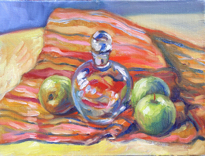

All round - oil on panel (6" x 8") by Benoit Philippe


If the glass object is round, the reflected light follows the curve of the object. Shaped glass objects will distort objects placed behind them. If the object is only in part behind the glass object, it can create a broken line at the periphery of the glass object.

The second step in painting glass object is to isolate issues and simplify your approach.

It is easier to paint glass against a dark background because the effect of the light through the glass is more obvious. It is also easier when the background is plain rather than patterned because you can concentrate on tones without worrying about the changes of colours.

It is better, when you start, to have a fixed source of light. This is possible if you set-up your still life subject in your studio and use a lamp.

The aspect of the glass will change if you move around it. Even a slight move on your left or your right may be sufficient to change the colour patterns. For this reason it is easier to use photographs at the beginning in order to understand the play of reflected colours. This way, you will avoid the variations you get when you move.

Tone is the most relevant information to convey the transparency and reflection on glass. A good way to get a grip on the “glass effect” is to start by doing some pencil drawings and then a monochrome paintings.

When I paint glassware in oil, for the preliminary drawing, I prefer to draw only the overall shape of the object and then paint directly the shapes within the glass objects. Some hyper-realist painters start by drawing all the reflection, shapes, etc. (sometime by tracing them from a photograph). I found that the result with this method looks too mechanical and artificial for my taste.

I would then build-up the glass as I paint the background. This way, I get background colours seen by transparency. Because of the transparency, some parts of the glass will disappear into the background. This effect would be much more difficult if you decided to paint the background first, reserving the glass object, and then painted the glass object once the background had dried. There are good chances that the glass would look like an afterthought.

To create the pattern of light and shadows in the glass, I paint the coloured shape rather than each single line. The trick is to simplify the shapes. If you are not sure of the way to go, squinting at your subject will help to remove unnecessary details.

Glassware objects present a mix of soft edges and sharp edges. Glass is only visible if there is some light on it. It is therefore possible to have a lost edge in the side of a glass object in the shadow. I like to work wet in wet as far as I can. Glazing white on top, when the first stage is dry, is a good way to indicate the shine on the surface of the glass.

Once you master the basics of painting glass object, you have several ways to add interest: place a coloured object behind the glassware; have a background with changing colours or patterns; vary the degree of light on the glass object; use pieces of glassware with facets (each facet will have its own reflection due to different orientations; or place a laced pattern under the glass.


Add to Technorati Favorites

Saturday, 26 June 2010

Pastel underpainting with rubbing alcohol


Using rubbing alcohol to create an underpainting with pastel is great because it dries so quickly. An advantage of pastel is immediacy and this technique keeps you going. The other advantage is that you can use the same medium (pastel) for the underpainting.


I use Conté square hard pastels and a cheap synthetic flat brush (as the surface I paint on is like sand paper and I don’t want to ruin a good brush).

A few points I noticed last time I used this technique:


  • In the final painting, I like to blend the colours together with short strokes, so creating planes by washing the pastel pigments in the underpainting creates a welcome contrast to work against.

  • I start by washing light colours to reduce the risk to muddy them. When I started with dark colours, I had to stop and wash the brush with water and soap because a few dark pigments were enough to turn the lighter colours dirty.

  • This technique works well with dark colours. Dark pastel sticks are dryer, brittle and tend to make dust. When I create a wash with rubbing alcohol, it binds the pigments together and onto the support.

  • When the brush is loaded with dark pigments, I can even paint with it elsewhere on the work.

  • I repeat the process more than once. I apply the pastel pigments, wash them with alcohol, wait until the work dries to assess the overall aspect of the underpainting and start again until I am happy with the colours and shapes.

  • It does not matter if the colours are smudged together. This is just the initial stage, not the final painting.


Add to Technorati Favorites

Friday, 4 June 2010

Home, Sweet Home (Berkeley)

This is a house in Berkeley, not far of Prince Street. I just loved the big armchair in the porch, like a throne for its proud owner.

The light and the vegetation created complex patterns. I hesitated between using pastels that I could apply in strokes or oil (painting knives would have been handy). At the end, I decided to go for pastels.


Home, Sweet Home - Pastel (31 x 39 cm) by Benoit Philippe

Friday, 21 May 2010

Degas’ pastel secret


Ambroise Vollard, in his book “Recollections of a Picture Dealer", told a story about his visits to Degas’ studio where the artist was working on one of his pastels, “these marvels of colours that some compared to the mottled wings of butterflies”.


Au Café-concert : La Chanson du chien (55 × 45 cm) – Source: Wikimedia


The painter La Touche asked the art dealer if he could find out where Degas was buying his pastels, from which he could get such extraordinary colours.

Here is the dialogue Vollard reported:

“When I saw Degas again, he had in hand some pastels that he was lining-up on a board in front of his window.

- I make the colours fade as much as possible, he said, by placing them in the sun.

- But, if so, with what do you manage such striking colours?

- With some dead colours, sir!”

This quote still puzzles me and, seeing Degas’ pastel, I share Vollard’s amazement.


Related articles

Degas’ small wooden horses

Ambroise Vollard on Renoir

Homage to Ambroise Vollard


Add to Technorati Favorites

Saturday, 1 May 2010

500 Grant Avenue (San Francisco)


This subject was ideal for a pastel painting. I could build it with large strokes yellow stripes of the crossing, the moving pedestrians and the car and bus, and then and then refine them.

500 Grant Avenue (San Francisco) - Pastel (39 x 31 cm) by Benoit Philippe

I worked on a sheet of Art Spectrum Colorfix paper with a Terra Cotta ground.

I have already done an oil painting of this location (see "Taxi in China Town") but this one is taken from a different angle and gives more importance to people crossing the street.

Monday, 12 April 2010

Jake and the Cuckoo Flower - Pastel


The field was full of buttercups, but Jake stopped and raised his right paw... and just in front his left leg was a white cuckoo flower.


Jake and the Cuckoo Flower - Pastel (6" x 8") by Benoit Philippe

Thursday, 25 March 2010

Unifying colours in your paintings


This article was first published in "Frequency Magazine" – March 2010


In this article, I will discuss several strategies to unify the colours of a painting in order to avoid an impression of a patchwork of unrelated colours. These techniques help to build a more cohesive painting.


Mid-Day San Francisco - Pastel (37 cm X 30 cm) by Benoit Philippe


One way to achieve unity is to use a tinted background that shows through. Coloured backgrounds are common for pastel and you can buy pastel cards and papers in many different shades. In oil, I like to work on tinted background and let it show between touches of colour. For watercolour, some artists start their work with a light wash over the initial drawing to get rid of the whiteness of the paper and provide some unity to the subsequent washes.


For oil, you could start with a monochromatic layer. The classic school of painting taught that the first stage of an oil painting should be a grisaille (a monochromatic layer outlining the tones in grey or earth colours). This foundation layer creates unity underneath the transparent glazes. There was an artistic as well as an economic reason to this, because earth colours were cheap and artists saved the more expensive colours by glazing them in thin layers on top of the grisaille.

I still use an equivalent of this technique in watercolour for far away background elements, like trees or mountains. I sometimes apply a diluted wash of Payne’s grey (or a mix of Payne’s Grey and Ultramarine blue) first. Once it is dry, I paint over it a second wash of colour. The first wash showing through will “knock down” the colour of the second wash and create the intended recess, pushing the element towards the horizon.

Another way to ensure some unity of colours is to restrict the number of colours you work with. This is first done by choosing the temperature for your painting: warm or cool. This choice will dictate what colours in the spectrum become your dominant colours. In addition, a limited palette makes unifying easier, because all your colour mixtures being based on a limited number of colours and being therefore related, there is less chance that the resulting hues will clash.

Finally, another tool available is a “unifying colour”.

A unifying colour is one colour used throughout the work in various quantities that will bring all areas together. It can be the dominant colour of the background that is stippled in elements of the foreground. Working all areas of the painting at once is important as, by definition, the unifying colour should be used all over the painting even if in small quantities.

What colour can be used as unifying colour? Any colour, really. It will probably be one you like, because this colour will steer the global impression given by the painting towards this colour. There are two different approaches to unifying colours:

  • Use a fairly neutral colour (on the grey scale). In this case, the colour works discreetly to glue together the background over which the brighter colours will stand out.
  • Use a bright colour as an accent colour dotted around the work. In this case, these touches of bright colour play the role of beacons guiding the eye of the viewer along the path you want him to follow.
Because of simultaneous contrasts, the same shade of colour will appear differently based on the surrounding colours. This is an easy way to create variations while maintaining consistency. Unified does not mean flat: values of your unifying colour will vary in order to create a sense of depth. The value of a colour towards the horizon is lighter and so should your unifying colour be.


Add to Technorati Favorites


Monday, 22 March 2010

Painting landscape with atmosphere by Ray Balkwill


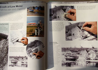
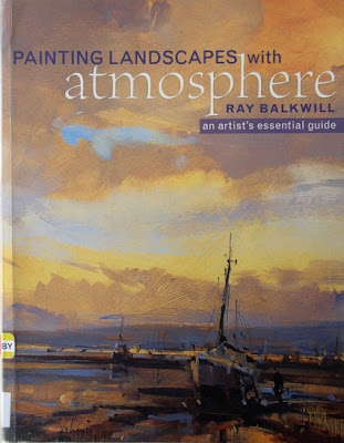
Painting Landscapes with Atmosphere, An Artist's Essential Guide is an excellent book for intermediate painters. Ray Balkwill shares his set-up (palette for watercolour and oil) and the tricks of his trade as a landscape artist.

But the real value of this book is in the artist’s exploration of mixed media, of which he has total command. His philosophy is best captured by the following quote:

“There is a certain magic when you combine media in the same painting, as the result can sometimes be totally unexpected. However, it is also important to let each medium speaks and make full use of its own qualities.”

For paintings, Balkwill uses two mixed media techniques:

  • Watercolour and gouache: he gets the best out of the transparency of watercolour and highlights with opaque gouache. This is not revolutionary as Turner already used gouache in some of his watercolours.

  • Watercolour and pastel: this combination is more interesting as pastel bring some interesting textures. Watercolour is not used as a mere background for pastel but the two medium combine their strengths to create a cohesive work. You can see the result in the galleries of Ray Balkwill’s painting on his website.

For sketching, Balkwill demonstrates two techniques:

  • Felt-tip pen and charcoal
  • Felt-tip pen and graphite


I have not made the jump into mixed media techniques, but this book tempts me to mix watercolours and pastels as Ray Balkwill’s work shows how effective it can be.

Favourite quote

In every good book, there is a sentence that makes you think. For me, the statement that caught my attention was:

“It is surprising how many artists treat the sky and landscape as two separate subjects; if you have a busy landscape, keep the sky simple, and vice versa.”


More information

Ray Balkwill’s website


Painting Landscapes with Atmosphere, An Artist's Essential Guide

Hardcover: 128 pages
Publisher: David & Charles (25 Aug 2006)
ISBN-10: 0715322923


Add to Technorati Favorites

Tuesday, 9 February 2010

Have you tried painting a still life recently?

This article was first published in "Frequency Magazine" – February 2010.

In England, it’s cold outside and we are better off staying in the warmth of our homes. This does not mean we cannot paint from nature: why not draw or paint a still life?

Still life has a long tradition in painting in all media. Flemish painters captured the beauty of flowers from different seasons in single paintings for their patrons and added insects and butterflies to their compositions. The Impressionists and Cezanne created numerous still life paintings. Cezanne was so slow that he decided to replace real flowers by artificial ones and then was upset because the paper petals would fade over time… Today, the “one painting a day” movement offers excellent examples of good still life based on very simple subjects taken from our daily life: marbles, toys or decorated cupcakes; everything can make a still life with some imagination.

The first task it to pick a subject. We all have objects we like and still life goes beyond flowers and fruits (although fruits like apples are interesting to paint with many variations of colours, their roundness and their shiny reflective surface). Pick unusual or intriguing objects you have collected. Car boot sales or antique shops are great place to find interesting objects for your prop department. You don’t have to be stuck in the past: a mobile phone or your music player could become part of the composition.


Café et croissant - Oil on panel (6"x8") by Benoit Philippe (SOLD)

Composing your scene is great fun and an important first step in a successful still life, so take your time. I like to use fabric as backdrop and vary the light. Don’t hesitate to try different arrangements until you are fully satisfied and, when you think you are, take a ten minutes break and come back to your subject with a fresh eye. I bet you will make some minor adjustments. Another way of modifying your composition is to move around it. Move your easel a step on the right or on the left and you have before you a new composition. Vary your point of views: from above, from below; eye level or aerial view. Record your ideas by drawing some quick thumbnail studies in you sketchbook. This way, you can recreate any arrangement you have tried and then changed.

Use all three dimensions. Imagine you are a choreographer and you need to make the stage come to life. Think verticals as well as horizontals. Imagine a forest with slander trees high in the sky, smaller ones underneath, bushes and then a carpet of daffodils. You find interest everywhere. How can you recreate layers of interest in your still life composition? Overlap objects in order to reinforce the cohesion of the painting (cohesion versus collection). This way, you also create interest at the rim of each object with a sense of direction, flow and movement from one object to the next.


A bowl of lemons - Watercolour by Benoit Philippe


Painting a still life brings the opportunity to work with many different textures: the transparencies and reflexion of glass, the gloss of china, the reflexions on silverware, the softness of fabrics, the veins in wood and marble.

The richness of still life is to be able to use and reuse your props and create very varied paintings. It is also a controlled environment compared to painting outside. You can control the props, the composition and the light to a great extent. You can also take your time, work at your own pace and leave your composition in place until you have finished your painting.


Add to Technorati Favorites

Wednesday, 6 January 2010

Painting snow – Learning from Claude Monet


It has been snowing all night and every inch of ground is covered in snow. I like painting snowy landscapes, so this is great news. One of my favourite paintings is a snow painting by Claude Monet with a magpie perched on top of a fence gate. I never miss an occasion to go to the Musée d'Orsay in Paris (France) to see it. This painting was done by Monet on site in the countryside near Etretat. The painting was rejected by the jury of the 1869 salon in Paris.


The Magpie by Claude Monet. Between 1868 and 1869 - (89 cm x 130 cm) Oil on canvas.


The magpie makes a perfect focus point for the painting as its black and white feathers sum-up perfectly the contrast created in a snowy landscape. It also brings some life to the landscape. The backlit scene with some rays of light peering through the hurdle and projecting the shadows towards the viewer adds to the dramatic effect.

What can we learn from this painting?

Using a limited palette: Monet used a very restrained palette compared to his other works and the snow is painted in high key, reinforcing the contrast with the dark tree bark. The overall painting is very luminous, even with the use of pale colours. If it is snowing or the sky is grey, the spectrum of colours becomes narrower with mid-tones becoming grey.

High contrasts: See how the trees and tree branches are very dark, with the use of black and dark brown. The intensity of the light on the snow makes everything look darker to our eye. In your painting, you can recreate the effect of nature by using darker tone for objects and trees covered or surrounded by snow. Another form of contrast is between the cool colours of the snow and the warmer brown tones of the trees and the buildings.

The sky tone: The sky is darker than the rest of the landscape. Normally, the sky is always lighter in tone than the landscape, except when it is snowing.

The snow is not white: Notice that there is no pure white in this painting and that the shadow of the hurdle is painted with some grey blue. Painting snow is the occasion to explore a palette of tinted white, from blue to yellowish white.

The snow covers the landscape: If you take a close looks at the foreground, you will see that the snow was painted on top of a Yellow Ochre background. Touches of paint for the snow are intertwined with spots of ground colour. In the same way, Monet painted the snow on the hurdle and on the branches last. This is why I think it is easier to paint snow landscape in oil or acrylic (that have good covering property) rather than in watercolour where you have to reserve the white.

Simplify the background: You can simplify a lot as soon as you do away from the foreground. If the snow is falling down, visibility will be reduced and far away trees will be light grey of brown masses.


Add to Technorati Favorites

Friday, 23 October 2009

Working on the same subject in different media


I work in oil, watercolour and pastel and enjoy these three media. When someone asks me which one I prefer, I usually answer that it depends on the subject. This is true in 99% of the cases, but from time to time a subject is equally suitable for different techniques.

I find interesting to work the same subject in different media to see how the works come out in a distinct way. As you become more familiar with the subject, the mind relax and I enjoy playing with textures and colours.

“Summer walk” is one of these landscapes that I could see in any media. The composition is simple yet strong. The combination of the path leading to the trees, the fields and the cloudy sky offered great opportunities to develop the composition, colours and textures.

I left several months gap between each version. I started with the watercolour, then went to do the pastel and finished with the oil painting (hence its title “The last summer walk”). I varied the size of the works and used slightly different formats. Each one was a different way to interpret this summer scene.


Golden field - Watercolour by Benoit Philippe
The watercolour was all about transparencies. I layered washes of colours and I wanted to play with colours bleeding one into the other. Shadows in the trees are blue as I built them up with Ultramarine blue. There is a light hearted feel in this painting.


Summer walk - pastel (6" x 8") by Benoit Philippe


With the pastel, I put the emphasis on texture. I was looking for an impressionist feel, as if I had painted on raw linen canvas. The rough Fabiano watercolour paper prepared with a coat of Sanfix pastel gesso from Art Spectrum did the trick. Because of the small format of the work (6” x 8”), the texture of the paper is even more prominent. To reinforce the painterly nature of the pastel, I framed it under glass without any mount (just separators between the work and the glass, hidden by the rim of the frame). The brightness of the pastel pigments and an application in non-blended strokes concurred to the brightness of colours.


The last summer walk - Oil painting on canvas (20” x 16”) by Benoit Philippe


Finally, the oil was painted in more subdued tones compared to the pastel and the watercolour versions. In a way, the two first paintings were liberating and I could use more white than I usually do without craving to put bright colours. With this painting, my aim was to achieve a great sense of depth and perspective. I used a lot of blending and smooth transitions between tones to lead the eye towards the horizon.

The advantage of working a subject as a series of pieces in different media is that you can concentrate on one particular aspect for each work. I treated each painting as independent from the next. I did not look at the work already painted when working on the next one. In fact, the gap I left between each work reduced undue influences. However, it is clear that “The last summer walk” (the oil painting that came last in the series) would have been different without the watercolour and the pastel paintings that preceded it.