Thursday 30 December 2010

6 ways your image manipulation software can help you judge your work

By the time we have finished a painting, we spent so much time looking at it that it becomes difficult to judge it.

You need to put some distance between you and your work. One way to do this consists in taking a photograph of the work. Picasso once told Brassaï: "It’s strange indeed, but it is through your photographs that I can judge my sculptures… Through them I can see my sculptures with a new eye..."

Image manipulation software like Photoshop Element Adobe Photoshop Elements 9 (PC/Mac) or GIMP (a free open source alternative) let you do much more.

1. Watch the photograph of your painting as a thumbnail. This is the equivalent to stepping back from your painting. The minute details disappear and you can check the overall composition.


2. Flip the image horizontally. This is like looking at your painting into a mirror. If the vertical elements have a slant, you will see it immediately.


3. Make a black and white copy of the photograph of your work. This way you can check values. If you took a reference photograph of your subject, you can also turn it into a black and white photograph in order to compare the value range on both photographs.


4. Convert your picture to pure black and white. Turn the black and white photograph of your painting into a notan by pushing the contrast. In Photoshop, use the “Threshold” filter in the Image/Adjustments menu. Mid-tones disappear and you are left with pure light (in white) and pure dark (in black). This way you can judge the balance between large planes of light and dark areas. This contrast dictates how well the painting will stand when looked at from a distance.


5. Frame your work. Adding a frame to your work changes the way it looks. It is easy to add a “virtual frame” to your painting. The first way to do this in Photoshop is just to create a rectangle slightly larger than your work and to put the cropped photograph of your work on top of it. Then try different colour (black, brown, gold, etc.) for the rectangle so that it complements or contrasts with the painting. You could also photograph one of the real frames in your stock, extract the frame from the picture and copy it onto a transparent background, so that you can put it on top of the photographs of your paintings.

  
6. Hang your work amongst masterpieces. A painting may look good on its own and look different when surrounded by other paintings in an exhibition. You can create a virtual gallery of paintings you like with an empty space left to hang your own painting. Wikimedia Commons will give you a choice of images of works by past masters to copy into your virtual gallery.


Related articles


Monday 27 December 2010

Moebius Transe Forme exhibition (Paris – France)


The Fondation Cartier in Paris (France) exhibits Moebius work until March 13, 2011. The theme of the exhibition is transformation or metamorphosis. The artist’s science fiction work, in particular, shows morphing worlds where characters dissolve into their universe.


There is a long tradition of “bande dessinée” (comic strips) in France with a multitude of authors. Jean Giraud is a prolific author and uses various styles. Under the name or Gir (Short for “Giraud”), he created with Jean-Michel Charlier the series Blueberry, the story of a cowboy in the Wild West.


He also developed some science fiction stories under the alias Mœbius. He took this alias after the famous Moebius strip and explained: “Going from Giraud to Moebius, I warped the strip, changed dimension. I was the same and I was different. Moebius is the result of my duality.” this strange one sided volume. These science fiction comic strips have a surrealist touch. The artist uses his exuberant imagination to create poetic and strange parallel universes. He published Arzach in1976 and Le Garage hermétique in 1979. In 1980, he collaborated with Alexandro Jodorowsky on a new series titled L’Incal.

Giraud also collaborated on a number of movies, like Alien, Tron or Besson’s “The Fifth Element”, for which he created the Diva character.

The exhibition features many original ink drawings from Blueberry as well as science fiction works, in black and white and colour. A master of the line drawing, Giraud’s technique is reminiscent of Albrecht Dürer. Some of the paintings in ink or acrylic have a luminescent quality, with a great attention to details.

Visitors will also watch “La planète Encore”, an eight minutes animation 3D movie co-created by Geoffrey Niquet and Moebius, and travel even further inside the artist’s unique world.


Discovering Moebius
Practical information


Moebius Transe Forme
12 October 2010 to 13 March 2011
Fondation Cartier
261 Boulevard Raspail
75014 Paris, France


Monday 20 December 2010

Travel sketches


The Channel crossing from Dover (England) to Calais (France) gave me an opportunity to sketch. I was able to set-up on one of the coffee table in the lounge and make a couple of quick sketches. Drawing is also relaxing after you drove for a few hours on snowy roads.

The advantage of sketching figures on a ferry is that people tend to stay longer in the same place: they sleep, rest, read a book, or check messages on their mobile phones.


This sketch was done with a black Faber Castell PITT artist pen on a Moleskine sketchbook. I tried to add a wash of watercolour, but the paper of the skekchbook is coated and does not take the water. I had to switch to my selection of Faber Castell PITT artist pens to add some colours.


The sketches above and below were done on a different sketchbook (made by Hahnemühle FineArt). It is in a landscape format and the paper, of excellent quality, takes watercolour well. Like Moleskine notebooks, it has an elastic band to close it, a pocket on the inside of the back cover and a bookmark ribbon. I had with me a Sennelier travel box with 12 half-pans of watercolour.


Thursday 16 December 2010

Visual art, not literature


Paul Signac: Portrait of Félix Fénéon , 1890 [Source: Wikimedia]


“En art plastique, la pensée ne vaut rien si la matière est mauvaise et la forme médiocre. C’est l’œil que la peinture doit émouvoir, et non par la littérature des sujets et des titres.”

That can be translated as:

“In visual art, the thought is worth nothing if the texture is bad and the form poor. It is the eye that paintings must move, not the literature of subjects and titles.”

Paul Signac in “The subject in painting”

Monday 13 December 2010

Autumn walk in Clouts Wood

I have reworked Autumn in Clouts Wood, a painting done on site (see my previous post). I wanted to give it more texture and achieve more definition for some of the threes.

Autumn in Clouts Wood - Oil on canvas panel (6" x 8") by Benoit Philippe

Monday 6 December 2010

Another try at art exhibitions labels

For my last exhibition, I tried a different way to print my exhibition labels. Instead of using a heavy card, I printed them on paper and then mounted the paper on foam board. The idea is to come closer to the type of labels you see in galleries and museums.


I proceeded this way:

  • Printed all labels using PowerPoint, each label being in a black frame (to make sure they are the same size)
  • Cut the labels leaving a seam
  • Glued the paper on a 2 mm foam board and
  • Cut each label on the foam board with a sharp craft knife, using the black frame as a guide.


The overall result looked good. The labels were light and sturdy and easy to affix to the wall with whitetack . The foam being quite fragile, I had to transport the labels in a plastic sandwich box.


There is still room for improvement:


  • I had to redo some of the labels because the paper was torn away while cutting the label. I found out that the different density of the material caused the issue. The trick was to have a first pass with the blade to cut the paper and then a second pass to cut through the foam.


  • Some labels had a thin black line on some of their sides. I will have to be more careful to cut “inside the line”. Getting rid of the frame would solve the problem, but it would also make more difficult to cut all labels to the same measurement. I should try to print the frames in a very light grey. This way, even if the line appears, it should be almost invisible from afar.


Related articles


Wednesday 1 December 2010

Watching The Blind Girl


This is another painting of visitors watching the art in the Birmingham Museum and Art Gallery.


Watching The Blind Girl – Oil on canvas panel (6” x 8”) by Benoit Philippe

The Blind Girl is a painting by John Everett Millais.


Monday 29 November 2010

Jazzing up your leaflets presentation

You need to present some leaflets on a table in a way that entice visitors to take one? You want to spread them in a aesthetic way? The video (with soundtrack) shows you a simple method to do that.


Wednesday 24 November 2010

Oil painting initial drawing with a Pentel Color Brush

I sorted out my art supply and found a Pentel Color Brush I bought earlier in the year. I did a quick sketch with it and found it is easy to work with. There are 18 colours available but I only have a “steel blue” one.


The tapered point retains its pointy shape. The ink flows well and dries quickly. By holding the pen brush lightly, you get fine lines and larger ones with a slight pressure. The calligraphic feel is interesting.

As I started a new small oil painting on canvas board, I wondered if I could use the Pentel Color Brush for the initial drawing. I gave it a try and it worked well. Because the bristles of the nylon tip are springy, the texture of the canvas is not an issue. The ink goes smoothly from the cartridge to the tip of the brush and it was easy to draw on the vertical support: The ink did not drip and I did not have to squeeze the cartridge once.


On a second painting I started, I was not happy with the scale of one of the figures in the composition. I just took a rag and wiped out the drawing to start again. This left some marks, but nothing that went in the way.


The ink is not permanent (I could not find any indication about the lightfastness of the ink), but the interference with the paint was minimal, even with the steel blue colour that is quite strong. 

What I liked is that drawing with a brush already put me in a “painting mode”, even before I started with colours.


Monday 22 November 2010

The museum guard


I painted this oil from a reference photograph I took at the Birmingham Museum and Art Gallery. The photo was blurred (without flash and tripod, it is tricky to get the focus right), but I still wanted to use it.


The museum guard – Oil on canvas panel (6” x 8”) by Benoit Philippe


Below is the initial drawing and the blocking-in stage for this painting.


I have done other paintings of visitors in art galleries before (see Cardiff Art gallery – Pastel) and I intend to carry on with a series of paintings on the same theme.

Friday 19 November 2010

Getting back into gouache


I used to paint with gouache. In fact, my first painting box (that I still have) was a wooden box with a set of large Lefranc Bourgeois tubes of gouache that I won in a painting competition when I was eight. I am not sure why I stopped using gouache. I just did.


Here is the definition of “gouache” in the The Concise Oxford Dictionary of Art Terms

“Also called bodycolour, is watercolour which is opaque (as opposed to its more common transparent form). This opacity is achieved by the addition of white paint or pigment (such as Chinese white). Gouache was used in manuscript illumination and early watercolours (for example by Albrecht Dürer). It was also employed by miniature painters in the 17th and 18th centuries. Many of the watercolours of Paul Sandby (1731–1809), generally credited as the founder of the English watercolour school, were in gouache.”

Last summer, I read a good article on gouache in a French painting magazine and decided to buy a set of colours. I bought some Talens Extra Fine Quality gouache. I took a set of the primary colours, plus black and white:

  • White
  • Lemon yellow (primary)
  • Light Blue (Cyan) 
  • Permanent Rose (Magenta)
  • Black intenso
I completed this basic set with a few colours:

  • Naples Yellow
  • Yellow Ochre
  • Carmine
  • Cerulean Blue (Phthalo)
  • Ultramarine deep


I probably need to add a dark green to this selection.

When I started “The crimson cyclamen”, I put too much water in the paint and the paint did not cover properly my dark background. You can use gouache this way, and have washes of transparent colours, but it defeats the purpose to use it like watercolour. Once you get a good consistency, gouache is easy to work and gives a nice mat finish.

I had to get used again to the fact that gouaches dries quickly. You can do some blending on the painting support, but it is easier to mix on the palette.

To answer the question of why gouache is no very popular these days, I have some ideas: when people think gouache, they think school art classes. Designers, who used gouache a lot, have switched to digital media. Watercolour is more prestigious than gouache and, finally, the rise of acrylic painting made gouache redundant.

I still like this neglected medium that allows painting quickly with opaque layers of colours.


Thursday 18 November 2010

The crimson cyclamen - Gouache


The crimson cyclamen - Gouache (6" x 8") by Benoit Philippe


Monday 15 November 2010

I was right… 3 years ago

Three years ago, after reading the correspondence between Henri Matisse and the painter Pierre Bonnard, I wrote a post titled “The art of ordinary”, quoting a postcard that Matisse sent to his friend Bonnard from Tahiti. Matisse despaired of his inability to paint anything or take any good photograph despite the beauty surrounding him.

My hunch, when I wrote this article, was that the Tahiti trip, far from being sterile, had planted the seed of what would become Matisse’s colourful cut out papers.


So I was pleased to discover I was right. In his book “Conversations with Picasso”, the photographer Brassaï remembered a visit he paid to Matisse on Friday 20 December 1946. Matisse was in bed, cutting out his coloured papers that evoked Oceania and he told Brassaï:

“The memories of my trip to Tahiti only come back to me now, fifteen years later, in the form of haunting images: stony corals, corals, fishes, birds, jellyfish, sponges ... it is curious, isn’t it, that all these enchantments of the sky and the sea did not entice me immediately... I have returned from the islands completely empty handed ... I did not even bring back photographs ... even though I bought a very expensive camera. But over there, I hesitated, "If I take pictures of everything I see in Oceania, I told myself, I will only be left with poor images. And photos may be preventing my impressions to act deep inside me ... "I was right, I think. It is more important to let things soak than wanting to catch them on the spot.”

You need to allow time for ideas and impressions to incubate. It takes months, years, and sometimes fifteen years, even for artists like Matisse. But time will come.


Wednesday 10 November 2010

How many sugars?


How many sugars? - Oil on canvas panel (6" x 8") by Benoit Philippe

Monday 8 November 2010

The making of Isabella's - Oil painting

Watch the making of the painting of "Isabella's", step by step. This painting which is part of the Californian Dream exhibition.

NOTE: This video contains (nice) music.


Friday 5 November 2010

Editing details out of your artwork

This article was first published in my newsletter "Notes From My French Easel" – July August 2009. Follow the link to receive this free monthly newsletter.

In an article on his blog titled “Editors”, Seth Godin wrote:

“Turns out that for the last seventeen twenty-seven years, every single movie that managed to win the Oscar for best picture was also nominated for best editing.”
It takes times to make things simpler, because you need to understand first the essence of what you are trying to express.


It is easier to cram everything into your picture, to go into minute details. By editing, you make a stronger statement. See building your composition as telling a story. To lead the viewer, you want a strong narrative line and that will only happen if you bring out some elements while downplaying others.


Does that mean there should be no details in your work? Not at all; details are good when used in a judicious way. A few strokes can evoke hundred of tiles on a roof and a few patches of bright red fill a meadow with poppies. They are what I call “telling details” because they bring sense and meaning. Another important role of details is to bring an area of the painting in focus.


Honfleur door - The paving is just suggested as well as the stones on the wall

Physiology and psychology are on our side when we leave details out. As visual artists, we are helped by how vision is as much the work of the brain as it is perception by our eyes. In other words, our brain is really good at filling gaps and adding details we expect to see where there are none. In this way, a painting with fewer detailed areas is more personal, as each viewer fills the gaps in his own way. It is also more interesting because it creates some sense of mystery.


Practically, what does that mean?

  • If you paint a brick wall, don’t paint every single joint.
  • Paint the tree, not its leaves.
  • Make a thumbnail or a small study of your subject. Drawing or painting small will force you to forego details.
  • Work on the whole painting at once, not square centimetre by square centimetre.
  • Go from the general to the particular. Work on large planes and masses first before you add details. This way, you control the amount of details you want to add in.
  • Paint with big brushes.
  • Try this: when you pick a brush, put it down and take one size up instead.
  • Try this: Execute the whole painting with only large flat brushes and no small pointy riggers or sable round brushes
There is no better way to end this short article than by quoting the French philosopher and mathematician Blaise Pascal (1623-1662):


"I have made this letter longer because I have not had time to make it shorter."


Wednesday 3 November 2010

Burne-Jones cathedral window in Oxford

Last Saturday, as we some family over, we went to Oxford and visited Christ Church college.

One of the stained glass windows in the cathedral of the college has been designed by Edward Burne-Jones one of the Pre-Raphaelite painters: the Saint Catherine window. According to the leaflet provided, "the face of the central figure, St. Catherine of Alexandria, is a picture of Edith Liddell."


Related articles and resources


Monday 1 November 2010

FASO Database of Known Art Scammers

From time to time, you can read a story of art scammers abusing the confidence of artists. Fine Art Studio Online (FASO) by Clint Watson (@clintavo on Twitter) put together a database of Known Art Scammers that you can consult for free.

You can search by typing in an Email address, IP address or the person's name. If you are not sure how to find the IP address from an email, please check the article "How to find the IP address of the email sender in Gmail, Yahoo mail, Hotmail, AOL, Outlook Express, etc"


This is one resource to bookmark. And thank you Clint for making this resource available.

Winston cafe (Paris)


Winston cafe (Paris) - Oil on panel canvas (6" x 8") by Benoit Philippe

I shot the reference photographs I used for this painting while in Paris. It was dawn and did not know if the photos would be any good.

I decided to play on the contrast between complimentary colours to build this painting.

Thursday 28 October 2010

An artist’s use of online colour palette generators

There are a number of colour palette generators available online. Just type “colour palette generator” and then “color palette generator” in Google and you will find a comprehensive list.


The most useful generators are the ones where you upload a photograph (or indicate the URL of a photograph) and the online tool generates a palette from the image. I selected the Color Palette Generator on the CSS Drive website for this article.

The first use of the tool, if you are a painter, is to generate a palette from your reference photograph. This gives you a good indication of the colours and hues you could use for the painting. This is interesting because the palette generated may be different from your usual palette. This way, you can grow your colour vocabulary.


A second use of the online palette generator is to create a palette based on the final painting. If you do that with several of your paintings, it may show you your colour bias.

Relaxing at Mevagissey - Oil on canvas by Benoit Philippe


You get even more interesting information when you compare the palette obtained with the final painting with the palette generated by the tool from your reference photograph.


Monday 25 October 2010

Autumn walk in Clouts Wood - my week-end plein air session

On Saturday morning, I drove to the near-by village of Wroughton (Wiltshire - England) to paint in Clouts Wood. The trail starts at the top of the hill and leads into a nice secluded valley. There is a stream and, with the recent rain, the path was muddy.

Here is the finished painting at the end of the session.

Autumn walk in Clouts Wood - Oil on canvas panel (6" x 8") by Benoit Philippe

There is nothing like painting plein air. It is hard to recapture in the studio the atmosphere of a place, unless you sketch or make a small painting to fix your memories.

First I wanted to find the right spot. I had to cross a field where cows were eating some shrubs. One of them started to run in my direction and I had to reach the gate faster than I planned to...


After that, I stopped several times, watching in all directions: your best view may be in your back. There was an old elm with yellow and orange foliage. It was tempting, but I wanted to capture a view of the valley. I crossed the shallow stream, walking carefully on some dead branches.

The Spot below was good. The overcast weather made the colours grey and it would have been difficult just to work from a reference photograph. I shot one with my digital camera, just in case the rain would come.

I sat on my folding 3-legged stool. Not the most stable seat on soft grassy ground...


Ready to paint

I get ready to paint. Colours are laid on the palette and I have a pair of mittens (it's cold and  I need to be able to move my fingers).

Below is the initial under-painting. After that, I did not stop until the end.


I did not see any rambler. The only visitors were a couple of grey squirrels, a noisy bird and a sheep with a black head that watched me from the other side of the stream and then went away.

11:00 a.m. I have finished the painting and head back to the car. I can hear the first drops of rain hitting the leaves.

Thursday 21 October 2010

My guest post on Fine Art Tips: 10 Tips to Bring Visitors to Your Art Fair Booth or Open Studio

I invite you to do read my first guest post on the Fine Art Tips blog from Lori McNee. It is titled
10 Tips to Bring Visitors to Your Art Fair Booth or Open Studio. If you like it, let people know on Twitter, Facebook or by leaving a comment...


Wednesday 20 October 2010

The power of letting things come


Sometimes, you need to let time works for you.

Kafka's Portrait


“You need not leave your room. Remain sitting at your table and listen. You need not even listen, simply wait. You need not even wait, just learn to become quiet, and still, and solitary. The world will freely offer itself to you to be unmasked. It has no choice; it will roll in ecstasy at your feet.”


Franz KAFKA (quoted by Carol Lloyd in “Creating a life worth living")


Monday 18 October 2010

The pink pick-up truck


The pink pick-up truck - Oil on canvas panel (6" x 8") by Benoit Philippe


Friday 15 October 2010

A facelift for my art website

Each time I went to my art website http://www.benoitphilippe.com/ , I knew I had to redesign it. The colour scheme and design looked outdated and amateurish. In a nutshell, there was good content there, but not very well packaged.

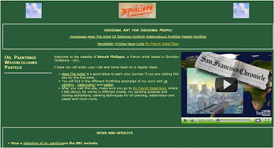
Old design for my painting website


Considering that I wrote my first website only with a basic text editor and wrote it in html and CSS, after buying a couple of books on the subject… it was not that bad. The drawback of this method was the time it took to create it and then to update it. Working this way is very repetitive and prone to mistakes. On the upside, learning to code html and CSS is valuable when I want to create something specific on my website.

The redesign was long overdue. I almost did it in April 2009 and then it fell through the cracks. I picked it up recently and did not let the project go this time.

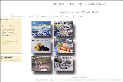
New design for my painting website

The new design

My brief was: create an uncluttered space that let my paintings speak for themselves.
I started with a blank piece of paper. It is tempting to buy a website editing software and just use one of the templates, but your website will look like hundreds of other websites out there. So, I followed the advice of experienced designers: paper and pencils is the best way to start. I just drew the elements on a blank page and tried different combinations until I found one I liked. While doing this, I reviewed many artists’ website, noting what I liked and what I did not like about them.


What is different on the new website?
  • The white background does not compete with the paintings. You can’t get more simple that this.
  • Many of the elements (titles, text and menu buttons) are grey, a neutral colour that again does not distract from the art.
  • The colour scheme is minimal. I worked with three colours: A sandy colour for the side bar, a light camel colour for the links and grey.
  • For the titles, I wanted a font that looked good and was legible. After trying many, I settled for Papyrus.
  • In the portfolios, the gallery consists only of the images, without the titles, medium or dimension of the works. This looks much cleaner and all these details are available for each painting when you click on the image to see a larger version.
I strived to have a consistent layout throughout the website. I also tried to make the navigation as straightforward as possible (I hope I succeeded).


What I added to the website and you should get

After reading many articles on creating an artist website, I added a number of elements on the website.
  1. A Google search box on the homepage. I found the script using… Google.
  2. My photograph in the “Meet the artist” section.
  3. My contact details in the “Contact” section. I also added links to my contents on Twitter, Slideshare and YouTube
The process


The best way to get a project like this done is:

  • Work with checklists. For each page you create, there are a number of operations that you will have to carry out (write the title, list key works, etc.). Unless you use checklists, you WILL forget one step. What also happen is that you will think about one thing you must do or want to add on one page in the middle of creating another page. The best way to deal with this: just add it to your list to get it off your mind.
  • Batch operations. For instance, to create JPG file in web friendly format for each work in Photoshop Element, it is easier to do all the vertical paintings in one go and then all the horizontal paintings.

  • Take small steps until you are done. If I had 15 minutes available on a particular day, I could still create a single page and get closer to my goal.

Testing phase

Check, double check and check again. After I loaded the new website, I navigated it, clicking on all the links. Result? Missing images, broken links and wrong page titles. It does not matter how careful you are, you will miss some steps. Testing is essential. I am sure there are still some glitches I need to take care of.


The tools I used
I used a photo editing software. I have Photoshop Elements 6. It is a great piece of software worth the investment and if you want to buy it, the last version is Adobe Photoshop Elements 8 (PC DVD).

If you are on a budget, GIMP is a good alternative (see below).

To edit the page, I used an open source software called KomPozer (More on this software below). It made the whole process much easier.
Free resources for the creation of your artist website

  • GIMP is a free alternative to Photoshop for photo editing and manipulation. I have not used it but read very positive reviews. If you want to learn more about this software, check out “GIMP Help: Tips, Advice, and Tutorials on How to Use GIMP”, a series of articles on EmptyEasel.com.
  • Kompozer (available Windows, Mac, Linux) is a free WYSIWYG (What You See Is What You Get) editor for web pages and site management software. The program was easy to install and use.
  • Filezilla (Windows, Linux, and Mac) is open source File Transfer Protocol (FTP) client. Kompozer has the capability to load your website onto the server, but this is a good alternative if you want a dedicated FTP software.

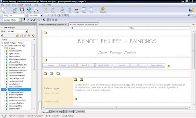
The dashboard of KomPozer

Recommended books

Although I also wrote about software tools in this article, the most important part is the design itself. The following books were a great resource for educating me on design principles: