Friday 28 November 2008

Phidias, El Greco and road markings

I am sure you wonder what the Greek sculptor Phidias, the painter El Greco (himself from Greek origin, but adopted by Spain) and road markings have in common… Let me put them in perspective, starting with Phidias.

In the golden age of Athens, a contest had been organized to create a statue to the glory of Athena. The statue of the deity was to be erected on top of a column. Two sculptors, Alkamenes and Phidias, entered the contest. When both statues arrived, Alkamenes’ one was admired by the crowd. On the other hand, Phidias’ statue raised outrage: it seemed all wrong with its mouth wide open, a distended nostril and elongated limbs. But Phidias had the last laugh. When his statue was put on top of the column, it looked perfect, while the one by his rival seemed deformed. Phidias knew about optics and geometry and has taken into account the effect of perspective on an object placed high when he carved his statue.

Paintings by El Greco can be immediately identified by his slander figures. For a long time, I wondered about this. Then, it stroke me: the reason El Greco painted this way is that many of his paintings featured religious scenes and were to be hung in churches and cathedrals. I am sure you noticed that paintings in churches are generally hung high, the bottom of the frame being two or three metres off the ground. Like Phidias, El Greco took into account how his painting would look like from down below.

This is just guts feeling. I have not done extensive research on this and I don’t have any circumstantial evidence (like letters from the artist or testimonials from his time) to back-up this theory. It just feels right. It’s like one of these things that look evident while you have seen them.

Another disclaimer: I have not read extensively on El Greco yet, and may be this has been already explained by art scholars… If you know about particular studies pointing to this, I would be most interested to get the reference. Please leave a comment at the end of this post.

To illustrate the point, let’s take the example of the painting Adoration of the Shepherds , which was painted by El Greco for the altarpiece of his own tomb. The shepherds in the foreground look like elongated giants.


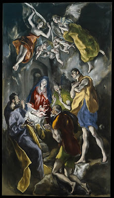
As a rudimental experiment, I printed this picture, placed it on a small easel and took a picture from below at an angle. The effect is exaggerated because of the small size of the reproduction and the steep angle of the camera, but it gives you an idea of what I am talking about.

The interesting thing about El Greco, it that this way of painting elongated figures transferred to his style and became one of his trademarks, even when the smaller size of the painting did not warrant the use of this perspective trick. You can see this on his portrait El caballero de la mano en el pecho.


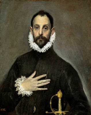
El caballero de la mano en el pecho. Oil on canvas. 81,8 x 65,8 cm. Museo del Prado. Madrid (Spain).

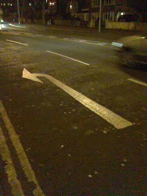
We talked about Phidias; we talked about El Greco; this leaves us with the road markings. They are a modern illustration of the same principle: road markings such as direction arrows or road numbers are painted in an elongated manner to take into account perspective and be visible to motorists.


This brings us to the end of our journey.


Related resource

The Museo National del Prado in Madrid has several El Greco's paintings in the collection.


Add to Technorati Favorites

Wednesday 26 November 2008

Yosemite's snow - oil painting


During our trip to the US this year, we went in the Yosemite National Park for a few days. The beauty and the scale of nature are hard to describe.


We went on a walk to see the Giant Sequoia. I was pleased to find places where the snow was still there. I havested plenty of subjects with my digital camera.


Yosemite's Snow - Oil on canvas (12" x 10") by Benoit Philippe


In order to get luminous colours, I painted the white canvas with a coat of vermillion acrylic paint before starting.


Thursday 20 November 2008

Happy Thanksgiving!


We don’t really celebrate Thanksgiving in Europe, but I know many of you are visiting this blog from the US, so I wanted to wish you all a Happy Thanksgiving.

As explained in Wikipedia, Thanksgiving is “an annual American Federal holiday to express thanks for one's material and spiritual possessions.” I am grateful for what I have: a lovely wife, a great family, good health, an interesting job, and time to paint.


I would like to take this occasion to thank the following artists that have a link from their blog to mine:

Susan lives with her family in California and paint with watercolours and draw with pencils and colour pencils. You can see her works on her blog Susan’s Scribbles . Susan is also behind A Day in the Arts website , which motto is “Making Art accessible to all”

Purnima Palkar, an artist living in Switzerland, features some beautiful handcrafted products and paintings on her blog Chitra Karma
. The designs are elegant and the bright colours will cheer you up. Check out Purnima art and craft for sale at Peazcreation on Etsy.

Carol Monosson, an artist from Israel behind two blogs: Carol - MyWork with some nice drawings and really interesting digital photos (I like the one with the fishes and the toirtoise) and Carol - connecting that she uses to stay in touch.


(Long) Post Scriptum

You may wonder how I found about this. I know thanks to a tip that Dan, who is managing EmptyEasel, gave in his article “An Off-site SEO Tip for Online Artists (Or, The Good Karma of Linking)”.


Yahoo has a tool called Site Explorer , which allows you to know who is linking to your site. It is simple:


  • Go to Site Explorer,
  • Enter the URL of your website at the top of the page and hit the “Explore URL” Button.
  • Click on the “Inlinks” button to see the list of web pages linking to your site

  • The links shown in the list are clickable and you can explore the pages


Add to Technorati Favorites


Monday 17 November 2008

Fruitful Sunday (oil paintings)

Some fruits picket out of our weekly delivery...


Dragon fruit - Oil painting (6" x 8") by benoit Philippe


Three plums - Oil painting (6" x 8") by benoit Philippe

Wednesday 12 November 2008

Don’t let them hang your works upside down


The Sunday Times (November 9, 2008) published an article titled "Tate gallery’s Rothkos are left in a twist
", with the subtitle: The gallery may have hung seminal works the wrong way round.

The works involved in this controversy are the Black on Maroon paintings by Rothko. The article explains:

“Curators of the blockbuster Rothko exhibition at Tate Modern in London have displayed two of the artist’s best known works on their side, contrary to Rothko’s original intentions.

The two paintings from the Black on Maroon series have been hung vertically with bold stripes running from top to bottom. However, Rothko said he wanted the works — which he donated to the Tate before committing suicide in February 1970 — to be hung with the stripes running horizontally. His signature on the back of the paintings is thought to reflect this wish. “


It’s not that Rothko did not care. The article mentions that Rothko discussed the matter with Norman Reid, who was director of the Tate, in 1970, when the paintings where first put on display. Furthermore, Reid sent Rothko a model of the gallery room in order to obtain his approval… So, in this case, you can’t blame the artist.

Tate modern has indicated that it would not be able to check Rothko’s signature on the back until the end of the exhibition. I understand it is rather embarrassing for the curator, in particular if the paintings have been reproduced this way in the exhibition catalogue (I have not checked, but I suppose it is the case).

Practically, if you paint abstract works or you think there could be any doubt on which way your painting should be hung, make sure that you indicate clearly which way you want your work to be hung:


  • Your signature should give a good indication

  • If you are signing on the back of the painting, this gives a good indication if you sign horizontally. If you sign vertically, your painting may be exhibited on its side (as the curator would think you signed the piece horizontally)

  • The best way seems to me to be explicit and trace an arrow indicating the way up on one of the vertical stretchers.

Related resources


Rothko Exhibition

26 September 2008 to 1 February 2009

Tate Modern
Bankside
London SE1 9TG
020 7887 8888

Open Sunday – Thursday 10.00–18.00
Open Friday and Saturday 10.00–22.00


Add to Technorati Favorites


Monday 10 November 2008

Lightfastness matters


On my way to the new library that just opened in town centre, I passed a shop that closed a few months ago. As you will see on the photograph below, the sign on the door telling customers where the shop relocated has now faded and is barely legible.


Does that matter? It does: if the shopkeeper had bothered writing his notice with lightfast felt pen or paint, he would still benefit from free advertising… until the premises are rented again (that can be in some times considering the current economic climate).

Just imagine the effect it would have on your buyers to discover that your paintings or drawings are fading away? Make sure you use artist material with a good lightfast index. Some media, like coloured pencils or felt pens are more likely to fade and it is even more important to double check that the ones you use are lightfast.

The same goes for prints, if you have any made from your original artworks…

Friday 7 November 2008

Three birch trees - Oil painting

The sky was grey, but you can't really wait for the ideal weather to go out and do some plein air painting....


Three birch trees - Oil painting (6" x 8") by Benoit Philippe

Wednesday 5 November 2008

Using masking fluid in watercolour


This article was first published in "Frequency Magazine" – November 2008.


In traditional watercolour, you paint on white paper and you save areas to serve as white areas in your paintings. This is where masking fluid helps. Masking fluid is made of liquid latex in ammonia. It forms a temporary water proof seal so that you can paint onto the paper and it will reserve the area it covers. It is generally tinted yellow or grey to make it easier to see on your white paper.

Areas protected by masking fluid will accept watercolour after the masking fluid has been removed. If the mark appears too white, you can always soften it with a wash of colour.

Masking fluid can be applied on white paper but also on a wash in order to reserve an area before you apply a subsequent wash. The main advantage of masking fluid is that you can paint uninterrupted washes without having to worry about “leaving the whites”.

It is recommended to carry out a test on the back of your paper to check that the masking fluid will come off easily. It works on most watercolour papers. The only time I had trouble with it was when I used an artisanal handmade paper. The masking fluid would not come off or would tear the paper away.

Before you start, shake the bottle of masking fluid a couple of times (after you made sure it is well sealed). This way, latex and ammonia will be well mixed together. Fluidity depends on the brand you use, but note that you can water down masking fluid in case you want to achieve certain effects that require more fluidity (like splattering).

You can use all sorts of instruments to apply masking fluid: a dip pen or a ruling pen for fine lines, an old bristle brush for looser marks or a colour shaper. You can also splatter some masking fluid onto your paper using an old toothbrush. Personally, I like to use a colour shaper with an angle chisel tip. This particular shape (rounded on one side and with a straight angle on the other side) allows for a variety of marks. The other advantage of this tool is that masking fluid comes off easily from the silicon tip.

Never use your best sable brush to apply masking fluid. Latex, once dry, is almost impossible to remove from the hair and your brush will be ruined. For the same reason, you should always make sure that the masking fluid is completely dry before you start painting over it. If you put masking fluid by accident on a good brush, remove it immediately with warm soapy water.

You should only apply masking fluid on dry paper and once you’ve applied the masking fluid, wait for it to dry. You can speed-up the drying process with a hairdryer. Masking fluid will change colour when dry. The grey one I am using at the moment takes a darker shade of grey when dry. In order to be sure it is really dry, I touch the thicker marks of masking fluid with the tip of my finger. It should not be tacky.

Another usual recommendation is to remove masking fluid as soon as possible. It may be hard to remove if you leave it for too long on your paper… in practice, it will depend on what brand you use for both your paper and masking fluid. Leaving the masking fluid on the paper for a few days should be fine, but try this first on a paper sample.

Ensure your painting is completely dry before you try to remove masking fluid or your paper will be ripped. To remove the masking fluid, rub gently the surface of the paper with your fingers or a rubber. If you use your fingers, wash your hands just before so that you won’t leave grease on the surface of the paper. Another effective way to remove masking fluid is to form a little ball of it when you clear a large area and then use this ball of latex as an improvised eraser.

In case you made a mistake, just wait for the masking fluid to dry, rub it gently and start again.

Regarding masking fluid storage: Keep the bottle upright and tightly capped. Put the bottle in a re-sealable plastic bag before you store it in your watercolour bag. Spillage may happen and dry latex won’t come off fabric for instance.


La Peniche - Watercolour by Benoit Philippe - I used masking fluid to reserve the light areas on the boat as well as the sunny areas on the path and in the bushes.


With masking fluid, you are only limited by your own imagination and you will soon find ways to use masking fluid to your advantage. This is a “must have” tool in the watercolourist’s tool box. Here are some examples of uses to get you started:

  • Grass blades and flowers in a field

  • Door frames and window frames

  • Fence posts in a distant field

  • Highlights in the eyes and hair for a portrait

  • Sand on the beach or granulated texture of concrete (by splattering masking fluid with a toothbrush)


Add to Technorati Favorites


Monday 3 November 2008

Jackdawing for ideas


This is how Rob Bevan and Tim Wright describe “Jackdawing” in their book “Unleash Your Creativity: Secrets of Creative Genius (52 Brilliant Ideas)”:


“One easy way to engage in this process of constant research is to keep a camera handy (preferably digital) and take photos of everything that catches you eyes. Another is to squirrel away little bits of information (and intriguing bits of rubbish!) as you find them, building up a personal collection of seemingly useless and unrelated factoids, newspaper cuttings, URL, bookmarks, postcards, brochures, food packaging… anything that catches your eyes. This process is sometimes referred to as “jackdawing”.

The authors also warn you against being carried away and getting submerged by your findings. The image of Bacon’s studio in his Kensington mews house comes to my mind…


What's left of a delicate fritillaria I found in the garden. The round seed is prisoner inside the fragile armature of the flower.


In "Memoirs of the Life of John Constable: Composed Chiefly of His Letters (Arts & Letters)", John Leslie recalls the artist’s habit to collect artefacts from nature to complement his plein air studies:
“On going into his room one morning, not aware that he had yet been out of it, I found him setting some of these sketches with isinglass. His dressing-table was covered with flowers, feathers of birds, and pieces of bark with lichens and mosses adhering to them, which he had brought home for the sake of their beautiful tints. Mr. George Constable told me that while on the visit to him, Constable brought from Fittleworth Common at least a dozen different specimens of sand and earth, of colours from pale to deep yellow, and of light reddish hues to tints almost crimson. The richness of these colours contrasted with the deep greens of the furze and other vegetation on this picturesque heath delighted him exceedingly, and he carried these earths home carefully preserved in bottles, and also many fragments of the variously coloured stone.”
Henry Moore is another artist who used to bring back bits of nature in his studio. The Henry Moore Foundation (by the way, the Henry Moore Foundation web site is incredible and I could spend hours going through their collection and information) offers a panoramic view of Moore’s studio, which is fascinating. You can see a box of bones on the table and the commentary notes that the studio contained “bones, flints, roots, shells and other natural detritus” and that:

“Often Moore would apply plaster or plasticine on to a found object such as a flint or bone, or produce a plaster cast directly from the object itself. One example of this can be seen on the stand in the centre of the table. Notice the small plaster maquette with the bone beside it. This bone was the basis for Mother and Child: Hood 1983 (LH 851) in travertine marble, currently on loan from the Foundation to St Paul’s Cathedral, London.”
The drawing Artist's Hands Holding Bone 1981 (HMF 81(186) shows the artist’s fascination for bones. It is clear that the organic shape with rounded holes went into Moore’s sculptures. An example of this is the sculpture titled The Arch (1963-69). Another beautiful sculpture is Seated Woman: Thin Neck 1961 (LH 472) inspired by a breast bones of birds. Henry Moore’s words highlight how small natural objects can transform art:

“Since my student days I have liked the shape of bones, and have drawn them, studied them in the Natural History Museum, found them on sea-shores and saved them out of the stewpot... There are many structural, and sculptural principles to be learnt from bones, e.g. that in spite of their lightness they have great strength. Some bones, such as the breast bones of birds, have the lightweight fineness of a knife-blade.” (Henry Moore quoted in Philip James (ed.), Henry Moore on sculpture: A collection of the sculptor's writings and spoken words edited with an introduction by Philip James (edition cited); Viking Press, New York 1967)


Related articles and further reading
Fire-up your imagination

Books