Tuesday 26 November 2013

Ramachandran’s nine laws of aesthetics

In his book The Tell-Tale Brain: A Neuroscientist's Quest for What Makes Us Human the neuroscientist V.S. Ramachandran looks at aesthetics from a scientist's viewpoint. He names what he calls his nine laws of aesthetics. Some of them are intuitively known by artists or form part of the art training that artists receive. Others are interesting to think about.


Ramachandran does not hesitate to speculate about the evolution of the laws of aesthetics, and he says so. After all, this is how science progress. Someone throws an idea in the arena and others work on it, either to confirm it or rebuke it.

1. Grouping

This is the fundamental idea that “a visual system tends to group similar elements or features in the image into clusters.”

Ramachandran explains that the principle of grouping evolved to defeat camouflage. The example he gives is the lion hidden behind foliage. There is a clear survival advantage if our brain can put together the disparate yellow splotches of the lion’s body behind the green splotches of the leaves.

Under the principle of grouping, another idea is that” graphic elements suggesting a continued visual contour will tend to be grouped together”.

2. Peak shift

The Law of Peak Shift My relates to how your brain responds to exaggerated stimuli.

This principle explains why we like caricatures. But Ramachandran also invite us to consider that principle make us appreciate works by Van Gogh, Rodin, Gustav Klimt, Henry Moore, or Picasso.

On the neuroscience side, this is probably achieved “by the deliberate exaggeration of posture that may activate—indeed hyper activate—mirror neurons in the superior temporal sulcus.”

Follow some fascinating explanations of experiments on animal behaviour carried out on seagulls by the Nobel Prize–winning biologist Nikolaas Tinbergen. The gull chick pecks on the red spot on its mother’s beak to get food by. Tinbergen used a rectangle with a red spot as a substitute. Tinbergen found that the chick became hyperactive when it was presented with a very long thick stick with three red stripes on the end.

3. Contrast

This one is quite obvious because without contrast, there is no form.

4. Isolation

The “law of isolation” Is when “the artist emphasizes a single source of information—such as colour, form, or motion—and deliberately plays down or deletes other sources.”

Ramachandran believe that sketches are very effective because cells in your primary visual cortex, where the earliest stage of visual processing occurs, only care about lines. Sketches also pass the “attentional bottleneck in your brain”.

5. Peekaboo, or perceptual problem solving

This principle is based on the fact that “you can sometimes make something more attractive by making it less visible.”

This one is easy to understand intuitively. We all experienced the satisfaction of finding out a visual illusion in one of Dali’s paintings for instance.

Ramachandran explains that it starts with the way we see: “When you look at a simple visual scene, your brain is constantly resolving ambiguities, testing hypotheses, searching for patterns, and comparing current information with memories and expectations.”

6. Abhorrence of coincidences

This one is interesting. An illustration of this is that we don’t like a painting when a tree is exactly in the middle. What are the chances of that happening?

7. Orderliness

Here, Ramachandran put together under this heading our abhorrence for deviation from expectations. For the artist it is a matter of balance between too much order (boring) and total chaos (not pleasing).

8. Symmetry

Ramachandran suggests that one explanation comes from…parasites: “Parasitic infestation can profoundly reduce the fertility and fecundity of a potential mate, so evolution places a very high premium on being able to detect whether your mate is infected. If the infestation occurred in early fetal life or infancy, one of the most obvious externally visible signs is a subtle loss of symmetry. Therefore, symmetry is a marker, or flag, for good health, which in turn is an indicator of desirability.”

The author then tackles the question apparent paradox that a lack of symmetry may also be appealing at times. His answer is that “the symmetry rule applies only to objects, not to large-scale scenes.”

9. Metaphors

Metaphors used extensively in visual art. Ramachandran expresses is fascination for the fact that a “visual metaphor is probably understood by the right hemisphere long before the more literal-minded left hemisphere can spell out the reasons.”

Even if the author does not make the express link, I think that the Peekaboo, or perceptual problem solving principle plays a role in our appreciation of metaphor. A metaphor is a kind of puzzle and our brain must take pleasure in resolving these riddles.

In conclusion, Ramachandran explains that these principles in a single work can enhance each other. This is what he calls “resonance”.

Even if the part on art is only one chapter, I would recommend that you read this book. It is one of the most interesting reads around and Ramachandran has a gift to explain in simple words some very complex pieces of research. This is the work of a true humanist, looking at so many aspects of our world through his neuroscientist experience.

Related resources

Get the book from Amazon in the US (Associate program link)

Wednesday 13 November 2013

Sketcher Blue Pencils and Micron Pigma Pens

I had to make some illustrations and it gave me the chance to try out two products:

  • Caran d’Ache Sketcher Non-Photo Blue Pencil (Sketcher Non-Photo Blue 2 Pc Blister Card): These pencils do not reproduced when scanned or photocopied in black & white. They are easy to erase if you have too (but you don't need to worry about this if you are scanning your drawing). They are ideal for sketching comics, cartoons, or execute a line drawing that you will then rework digitally.


  • Micron Pigma ink pens by the Japanese company Sakura (Sakura 30062 6-Piece Pigma Micron Clam Ink Pen Set, Black): The ink is archival quality. You can draw fine lines that are waterproof and fade proof. I bought two models: Number 02, for 0.30 mm lines and Number 04, for 0.40 mm lines. They are easy to hold and make smooth, regular black lines. I would recommend them for sketching or line drawing.


I first sketched with the blue pencils and then inked in with the Micron pens.


Second stage: scanning.


Then, I added the colours with Adobe Photoshop Elements 12 (I am no expert, so it took me a long time).


I like to mix the free hand drawing with the digital colours.


Thursday 10 October 2013

Marilyn quote and portrait

New addition to the mural I am working on.

Click on the photo to enlarge

Related posts

Monday 7 October 2013

How to paint clouds


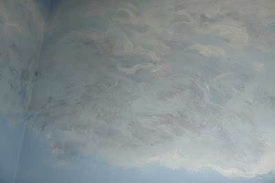
I have been asked to paint a cloudy sky in an office open meeting room. You can see below the finished room.

An overview of the finished room


Left view of the finished room


Right view of the finished room

This was done with house paint (for the blue background colours and the white) and some artist acrylic paints for the shadows in the clouds. The palette is more restricted than the one I would use in oil, but the technique remains very similar.

The first difference is that the background has less nuances. It was prepared with three levels: intense blue at the top, lighter blue in the middle section and white for the bottom section. I then mixed the two adjacent colours to do some feathering between these planes of colours.


Feathering

When I paint a sky in oil, the blue background is composed of different hues of blue: Ultramarine, Cobalt, Cerulean, etc. and I blend the colours one into another. The variation in tone would be horizontal as well as vertical: the sky is usually lighter towards the horizon. At the same time, it gets darker the farther you are from the sun. So, if the sun is on the right side of the painting, the left side of the sky will be slightly darker. 


Here are some elements to bear in mind when painting clouds:


  • Shapes: Different types of clouds have different characteristics. Even within a category, the variations in shapes are significant. The best way to learn is to paint or sketch from nature. Constable did many cloud studies. If you struggle at first to paint from nature because the clouds are moving and changing, work from photograph.
  •  Variations: Make sure you introduce variations in shape, size and grouping, and that your clouds do not seem like a boring repetition of the same formula.
  • Perspective: Clouds are three dimensional objects and are subject to the laws of perspective.  


  • Light source: you must be consistent with the way your clouds are lit. Is the sun high or low in the sky? Does the light comes from the left or from the right?

  • Clouds are not white: because of the sky around and the fact that clouds are either transparent or acting like a screen, clouds' colour will be influenced by their surrounding. The mid-tone will be related to the blue tint surrounding the cloud you paint. Keep pure white for the lighter highlights in your clouds.


Here is the process I used to paint the clouds.

  • I started with a wide brush. For the clouds against the darker blue, I quickly painted the cloud with the lighter blue.
  • Before the light blue paint was dry, I placed some lighter areas with white paint. The white blended with the blue to create a very light blue.
  • I then use the same blue as the background to blend the base of the cloud. The difference in tone should not be extreme because the cloud is round.
  • I let the paint to dry. I then worked on the shadow areas.

Palette for the shadows:
  • Ultramarine blue
  • Vermilion Red
  • Yellow Ochre
I mixed a purple with three parts of Ultramarine for one part of Vermilion. I then turn it into a tinted grey by adding some Yellow Ochre.

I painted some shadows with this mixture. As they were too dark, I lightened them with a light coat of the light blue used for the middle part of the background (I thought it was logical to do so because the underneath of the cloud would reflect this colour). I applied the blue paint with the tip of the brush so that the original shadow colour would show through.


  • Final touch of pure white on the most intense highlights. 


Monday 30 September 2013

When Churchill meets Douglas Adams


This fictional encounter between Winston Churchill and Douglas Adams took place on the wall... for the mural I am working on.


Click on the picture to enlarge


I love this quote from Douglas Adams, the author of The Hitchhiker's Guide to the Galaxy. The books in this series are really good. And I like to listen to the audio BBC radio series while painting:


  • The Hitchhiker's Guide to the Galaxy: Primary Phase (Original BBC Radio Series)
  • The Hitchhiker's Guide to the Galaxy: Secondary Phase (Original BBC Radio Series)


  • Related post

    Monday 16 September 2013

    That's a lot of coffee beans

    Last week-end was part 2 of the Swindon Open Studios 2013 and I had time to make some progress on my Brown's Cafe painting.

    I mostly re-worked the background, made of hundreds of coffee beans.


    The lower part shows how it was, with the blue background still visible. The upper part is the re-work.


    I mixed the colours with linseed oil. This gave me the creamy consistency and brilliance I was looking for. I tried to vary the tones and colours to bring some variety and different depths to the background.

    Brown's Cafe - At the end of the week-end (Click on the photo to see a larger version)

    After 7 hours painting coffee beans, you really need a break. By chance, the cafe in the library was a few steps away and making an excellent cappuccino...

    I will adjust the background by glazing different parts when it is dry.


    Friday 13 September 2013

    Swindon Open Studios 2013 press article

    The Swindon Advertiser, our local newspaper, published a nice article on the first week-end of the Swindon Open Studios 2013. And yes... its me painting on the photograph.

    Here is the online version of the article titled Town’s artists put on mass exhibition.

    (Click to enlarge)

    Thursday 12 September 2013

    Swindon Open Studios - The first week-end


    A few photographs from the first week-end of the Swindon Open Studios 2013

    I am exhibiting in the large corridor of the Central Library, with Margaret Sadler (collage, mixed media and embroidery) and Carmen B. Norris (Mix media paintings, collages and prints).

    Swindon Open Studios display


    Swindon Open Studios display

    I had time to paint, which was really nice. I brought along a painting that I started a few years ago and then put aside.

    Brown's cafe - End of day one


    Brown's cafe - End of day two


    Brown's cafe - detail


    Brown's cafe - detail


     Brown's cafe - detail


    I will carry on painting during next week-end, for the second leg of the Swindon Open Studios 2013.

    Saturday 7 September 2013

    Swindon Open Studios 2013


    I am taking part in the Swindon Open Studios 2013 which takes place over this week-end and the following week-end.


    I will be painting at the Swindon Central Library

    Regent Circus
    Swindon, Wiltshire
    SN1 1QG

    Opening hours
    • Saturdays 7th/14th September: 10 a.m.-4 p.m. and
    • Sundays 8th/15th September: 11 a.m. -3 p.m.

    Below is a sneak peek at the work I am displaying.