Thursday 29 November 2007

The Art of Ordinary


Beauty can be overwhelming for an artist. I was struck by a postcard that Matisse wrote to Bonnard from Tahiti, Pateete, on 6 June 1930:

« Ai vécu 20 jours dans une « île de corail » : lumière pure, air pur, couleur pure : diamant saphir émeraude turquoise. Poissons mirobolants. N’ai absolument rien fait excepté mauvaises photos. » [Quoted from the Matisse / Bonnard Correspondence 1925-1946 (Gallimard – ISBN-10: 2070722376 – in French)]

We can translate this as:

« Lived 20 days in a «coral island» : pure light, pure air, pure colour: diamond sapphire emerald turquoise. Fabulous fishes. Did absolutely nothing except bad photographs. »


Source: http://www.photolib.noaa.gov/index.html
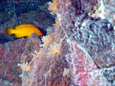
Location: Mariana Arc region, Western Pacific Ocean
Credit: Pacific Ring of Fire 2004 Expedition. NOAA Office of Ocean Exploration; Dr. Bob Embley, NOAA PMEL, Chief Scientist


In the case of Matisse, this beauty was not lost forever. I can see the influence of this experience years after, in Matisse’s cut out papers.

The power of the artist is to turn ordinary subjects into extra-ordinary works. I find a particular strength in everyday subjects because it is like waking-up viewers to their surrounding. You paint a building and people who have lived in town for years suddenly realise its existence. Beautiful landscapes don’t need any help from artists to get noted.

The artist faces a dilemma. New scenery brings many potential painting subjects because of its novelty. However, the lack of familiarity with the location makes it more difficult to capture the mood of a particular place. On the other hand, you live in a place for too long and you don’t see it anymore. As Picasso said: “Seeing, this is what is difficult, we are seeing sometime, rarely. We are watching without seeing.” (« Voir, c’est ça qui est difficile, on voit parfois, rarement. On regarde sans voir. » - Picasso quoted by André Verdet in his book “Picasso et ses environs”)
We need to learn to see as an artist, to see a painting in the landscape, right before our eyes.

You can develop strategies to revive the novelty in the familiar:

  • Painters will paint the same spot again years after a first attempt. They also travel to the same locations at regular intervals, learning each time a little bit more about the place while discovering it again each time.


  • Developing over time a series of works based on the same place.


  • Painting as part of a group to see how other painters capture the subject. Impressionist painters did this a lot. Cézannes and Pissarro went together to paint landscapes that Pissarro had first painted in the late 1860s.


Monday 26 November 2007

Travelling with your pochade box


Cars, trains and boats are not an issue. What about planes?


Couples of years ago, I took my pochade box on a trip to San Francisco. I passed the security without problem (although security officers may be more difficult with the raised security measures - there are for the moment some restrictions on the quantity of liquid you can take in your hand luggage for instance).

The key is to be prepared:
  • Obtain from the manufacturer all the Health & Safety Information. I am using Winsor & Newton paint for my pochade box because all their Health & Safety Information datasheets are posted online and therefore easy to find and print;
  • Do not take flammable product on board of a plane. The Sanodor solvent has low-flammability and can therefore go on a plane. With current security measures, you will have to pack it in your suitcase, well wrapped and protected. Put a print out of the Safety Datasheet with the bottle in case Security opens your suitcase to check it.

Related articles


Saturday 24 November 2007

"Gift Exhibition”: Painting exhibition at Swindon's Art Centre


I am taking part in the "Gift Exhibition”. This is a collective art exhibition taking place at the Art Centre in Swindon, from November until 20 December 2007.
This is an ideal time (Christmas) to offer original presents... and what's more original than a painting or a piece of art?


Invitation with the list of artists taking part

I have one watercolour, titled "Relaxing at Mevagissey". If it sells, I will show another one.


Where and when


“Gift Exhibition”
13 November - 20 December 2007


Arts Centre,
Devizes Road,
SN1 4BJ Swindon


Friday 23 November 2007

Torquay in the rain


I did this quick study in Torquay, around 5:00 pm. The light was grey at the end of the day and it was raining.


Oil painting is not water soluble, so you can paint even if it is raining. The issue you encounter is that the rain makes the panel slipery and the paint does not adhere correctly to the support first. The oil makes an emulsion in the water and form some tiny bubbles. The consequence is that small spots of the board's ground are showing.


Torquay in the rain - Oil on panel (6"X8") by Benoit Philippe

I like the greys and the browns I used in this painting. They remind me of 19th century works.

I plan to make a small canvas based on this study.


Wednesday 21 November 2007

Bonnard: working in batch and creative process


Working creatively in batch seems an oxymoron, because we associate traditional artistic creativity with originality and uniqueness. Art history tells us otherwise.

Andy Warhol’s methods took to the extreme the idea of working in batch, or in his case, on the production line model. He would have photographs endlessly screen printed on canvas by his assistants. It is not for nothing that he nicknamed his workshop “The Factory”.

Even before him, you can find examples of artists taking advantage of the working in batch method. Pierre Bonnard, the French Nabis painter, used to paint on pieces of unstretched canvas juxtaposed on the wall, in rows and near each other. He would work on eight or ten paintings at the same time, mixing one colour and applying it onto the canvasses in progress, on the wall. You can read a full account of Bonnard’s method illustrated by some photographs of the artist at work on the website of the New-York MoMA.

I can see several advantages to Bonnard’s working method:
  • By working on several paintings at the same time, using the same colours, he built a cohesive body of works, even when the subjects were different.

  • The tapestry of paintings on the wall would act as a mood board and keep him inspired. It is difficult to quantify the crossed influence between the works, but it must have happened.

  • Economical use of the paint: More than often, you squeeze too much paint on the palette. It is more practical to mix larger quantities of paint in order to make sure you don’t run out in the middle of a session. Bonnard could minimize the amount of paint wasted by using the mixed paint on several canvasses at the same time.

Related Resources

Sunday 18 November 2007

“The Art of Travel” Painting Exhibition


November 2007 is a good month. I currently have two exhibitions on. The first one is a solo show titled “The Art of Travel” at Intel Corporation, Pipers Way - Swindon (UK), until the end of the month.


Paintings from different countries

I get to travel to various places and always try to take my pochade box or my watercolour box. This painting exhibition shows places from France, the UK and the USA (in particular San Francisco).


Pulteney Bridge - Bath - Watercolour (10.5” X 15”) by Benoit Philippe


It rained on Dinan - Watercolour (37 cm X 30 cm) by Benoit Philippe

Mid-Day San Francisco - Pastel (37 cm X 30 cm) by Benoit Philippe


The gallery is a nice spacious place with good lighting. Intel's employees and visitors can enjoy a new art exhbition every month.


How to see the exhibition

This exhibition is not open to the general public, but I invite you to take a virtual tour . Feel free to click on the individual pictures in each photograph to see a larger version of the work and get additional information.

I wish you a good journey across countries and continents.

Add to Technorati Favorites


Thursday 15 November 2007

Picasso on what photography brought to painting


On several occasions, Picasso said how photography freed painting from its representational duty. He explained it clearly in his conversations with Brassaï, a well-known French photographer and friend of the artist:

« Quand on voit ce que vous exprimez par la photo, on se rend compte de tout ce qui ne peut plus être le souci de la peinture... Pourquoi l’artiste s’obstinerait-il à rendre ce que à l’aide de l’objectif on peut fixer si bien ? Ce serait une folie, n’est-ce pas ? La photographie est venue à point nommé pour libérer la peinture de toute littérature, de l’anecdote et même du sujet. En tout cas, un certain aspect du sujet appartient désormais au domaine de la photographie... Les peintres ne devraient-ils pas profiter de leur liberté reconquise pour faire autre chose ? »

We can translate this as:

« When we see what you express with photography, one realise all that painting does not need to be concerned with... Why the artist persists in rendering what can be so well captured by a camera’s lens? This would be madness, isn’t it? Photography just came along at the right time to free painting from any narrative function (“literature”), from the trivial and even from the painting subject. In any case, a certain aspect of the subject belongs from now on to the field of photography... Painters should take advantage of this recovered freedom to do something different, shouldn’t they? »

Quoted from “Propos sur l’Art” Picasso (Gallimard – Collection “Art et artistes” – ISBN-10: 207074698-4 – in French), extract from “Conversation avec Picasso” by Brassaï (Gallimard, 1964)


I believe the relationship between photography and painting has evolved into a more complex one, in particular since the advent of digital photography with its potential of images manipulation, get closer to painting.

I don’t think Picasso condemned figurative painting. He just encouraged the artist to open his mind and paint what he feels more than what he sees. The impressionists paved the way and it is no coincidence that photography grew as an art at that time.

Related article

10 ways a painter can use digital photography.


Add to Technorati Favorites


Wednesday 14 November 2007

Composing Relaxing at Mevagissey Painting

You can read the account of how this painting was created in previous posts:


Below is the finished painting.


Relaxing at Mevagissey - Oil on canvas (24” X 20”) by Benoit Philippe


I like the fact that there is no horizon. You know that there is something at the top because of the reflection in the water but you can’t see it. It’s up to the viewer to imagine the setting. The two secondary boats, which are cut, serve the same purpose: the painting becomes a window on a larger world left to the viewer’s mind to explore.


The work is composed around the diagonals. The gap between the two boats follows one diagonal, which also gives the general direction of the painting. The secondary elements (The black boat on the left and the rim of the boat in the foreground) are on each side of the other diagonal.


There are two other lines (in green below) parallel to the diagonal that mark loosely the lighter area in the middle.


From the composition standpoint, the water is divided into three areas:

  • The lower left corner in the foreground is in the shadow, with deep green and ultramarine tones.

  • The middle section of the work is the brightest one.

  • The background section is slightly darker than the middle section and has colours from reflected buoys and buildings.

The succession of dark/light/medium tones creates an interesting movement. This setting helps to have a strong composition and put the boats in the spotlight. The division of the three areas is also reflected in the different brushwork for each section.

There are finally a number of vertical lines (marked in yellow below) that help to anchor the composition and drive the eye of the viewer from the foreground up to the background.


Related post


Postcard from the South of France shows an example of how geometrical shapes can form a strong basis for a composition.


Add to Technorati Favorites

Monday 12 November 2007

Get My French Easel delivered to your inbox or news reader


It is now easier to follow what is happening on My French Easel. If you are Internet savvy, this article is not for you… but if you don’t know how to receive new blog entries in your favourite news reader or by email, here is how to do it:

Email Subscription

This one is really staightforward. You may have noticed that there is a new box at the top right side of the page.

Just enter your email address in the box, click and follow the instructions. You will receive an email confirmation with a link (to make sure that you subscribed yourself).

You can unsubscribe at any time.


RSS subscription


RSS (which stands for “Really Simple Syndication”) is a technology that allows you to track your favourite websites.


A very nice RSS Icon created by http://www.bittbox.com/


The advantage over using the ‘bookmark’ function in your browser is that you don’t have to manually return to sites you like on a regular basis to check new content. Instead, the new content will appear on the page of your reader. This happens automatically when you open your reader. This method has several advantages:

  • You don’t have to worry about missing something

  • You can pre-view the content or title of the posts

  • You don’t have to go to the site if nothing has been posted.

  • Many sites offer RSS feeds, so you can have everything you want to read in one place (a little bit like putting together your own newspaper)

  • You can get an RSS feeds reader for free. A geed example is Google Reader. You can also use MyYahoo, iGoogle and MyMSN.


You will find the RSS icon in the menue located on the right side of each page of the blog. Click on the icon and follow the step by step instructions.


Enjoy!


Friday 9 November 2007

Oil painting demonstration - Stage 4

At this stage of the painting process, I worked with an alternation of brush strokes and glazes. I used only the medium to prepare the colours. I have a dipper filled with Sanodor solvent to clean the brush between two colours.

Material used

I squeezed the following colours on my glass palette:

  • Titanium white

  • Cadmium yellow

  • Transparent Yellow
  • Cadmium Red

  • Cerulean blue

  • Manganese Azure Blue

  • King’s Blue Light

  • French ultramarine

  • Carmine Alizarin

  • Cinnabar Green Deep

I used three brushes:

  • Da Vinci Nova Synthetic. No. 8. This brush has long hair with good elasticity. The edge is thin and ideal to have more refined brush strokes.

  • A rigger for fine details

  • Manet Badger Brush. This is a very soft round brush with not point. This brush is ideal to blend glazes and create subtle changes. I use it without paint to blend or soften paint marks already on the canvas.

The Artist Painting Medium from Winsor & Newton that dries slowly and creates a non yellowing film works well for glazing. The trick is to apply the medium and wait a little bit (or to mix the colour with the medium on the palette and wait few minutes). It then takes a sticky consistency and adheres very well to the canvas, making it easy to lay the colour and stretch the stroke into a thin transparent layer.


Work on the main boats

I began with the orange buoys that glow like bright lanterns catching the sunlight.

For the blue boat, a glaze of French Ultramarine and Crimson reinforced the curve of the hull. I painted the details of the registration number and the Cornish flag with a rigger. The chrome tubes at the front of the boat consitute an interesting feature.

For the inside of the boat, I wanted to achieve a balanced composition with grey tones. The volumes were rendered by contrasting warm greys and white with cooler greys (playing between yellow and blue in the grey spectrum).


Work on the water

For the foreground, the successive glazes built smooth waves and ample movement. I started by glazing the reflection in the water of the cream boat. Glazes are ideal to paint calm water. They combine transparency and smooth transition from one colour to another. The transparent layer on the under painting creates depth.

In the middle section of painting, the brush strokes were more apparent. The yellow white brush marks on the left, which marked the glittering of the sun, were rendered with creamy and generous brush strokes. I looked for a buttery consistency. The light blue was a mixture of King’s Blue Light and Titanium white.

In the background, the shimming water was made of a weave of thin strokes layered with the edge of the small synthetic flat brush. This was built over time, alternating brush strokes charged with medium in order to break down the brush strokes of the previous stage. The intent was to tone down this area to obtain a good mid-tone while keeping interest in the upper part of the painting.

All the colours of the palette have been used to render the background up
to now. Toward the end, I reduced the number of colours and used a mixture based on Cinnabar Green to bind the background together. I then blended the colours with the badger brush. I used it without any paint, rotating the hair lightly on the surface of the canvas, like a blushing brush. The soft badger hair caught some paint and deposed it on the surrounding areas. The marks of the brushwork were blended without disappearing.

At the end, I applied again the orange and red reflections that echoed the buoys on the boats.

Work on the ancillary boats

The side of the boat visible on the right edge of the canvas has been painted in neutral tones, apart from the buoy. The buoys acted as a motive and punctuate the canvas.

The sailboat on the left in the background has a dark hull. A few light spots on the top of the deck created interest. Details were merely suggested here. The masts were fused into the background water. This was a shadow area of the painting. This boat provided a nice way to balance the composition: The masts echo the poles on the two main boats. I glazed the reflection of the sail boat with Cinnabar green deep.


The painting was finished and signed.


Add to Technorati Favorites


Tuesday 6 November 2007

Sunday Commute - Oil Painting


This railway model is located in Coate Water Country Park in Swindon. A group of enthusiasts from the North Wilts Model Engineering Society are running the train and maintain the tracks in good order.

The model railway is open at the week-end for the delight of the children visiting the park.

Swindon's economy was once built around the workshops of the Great Western Railway (GWR) where they manufactured steam engines.


Sunday Commute - Oil painting (6" x 8") by Benoit Philippe

Friday 2 November 2007

Brushwork Essential by Mark Christopher Weber


The subtitle of the book Brushwork Essentials is “How to render expressive form and texture with every stroke”.

To dedicate a whole book to brushwork is quite a challenge and Weber pretty much held up to his bet (The last chapter of the book is more a collection of traditional painting demonstrations with a short gallery showcasing the artist’s paintings at the end).

The book starts and finishes with the same warning: “One of the great things about oil painting is that there is no one way – no one hundred ways – things should be done.” You won’t find in this book miracle recipes dictating which brush to use to paint tree leaves… and it’s a good thing. Instead, the author reviews the tools of the trade and opens up their potential.

The path taken by Weber reminded me of what
Tiger Woods did in 2002-2003. Wood almost took a year off and re-examined the way he was playing. After that, he came back at the top of the game. Weber is doing just that in this book: deconstructing brushwork stroke after stroke.

The author is conscious that his approach may be “too much” for his reader and he is almost apologetic at times, as in the introduction to Chapter 3 (“This instruction may appear to be nitpicky in the extreme since we are in effect getting on our hands and knees at palette level to get the brush’s eye view” of the most basic procedures. But for those who are searching for exactly the right type of stroke for certain applications (and who else would read this book?) there is no way around acquiring these skills”).

Content of the book


The author covers in the Brushwork Essentials book:

  • Brush types and choice
  • Brush care

  • How to mix paint

  • Paint consistency
  • Mixing paint
  • Brush shaping and paint loading

  • Paint application
  • Different ways to blend
  • Skimming, glazing and scumbling
  • Rendering careful details

Weber is using water mixable oil paint, so you will get good tips in the book if you are using this type of paint. Most of the book advice applies in the same way to conventional oil paint.


This only missing part relates to the use of different painting medium and how they affect brushwork. Weber is talking in the generic way about the consistency of the paint. However, there is no discussion on how the different state of dryness or stickiness of the paint (often linked to the use of painting medium) can be used to good effect and influence the paint marks.

Who is this book for?

This book is not for beginners.

If you are an intermediate painters, this book will make you think about the way you apply paint and will save you couple of years of experimentation. Each technique is clearly illustrated with close-up photographs of the brush in action. The text is easy to read and flows well. From time to time, the style slips into informality, but not to the point of becoming irritating.

For advanced painters (i.e. you have been painting for 20 years), I am not sure you will learn a great deal (unless you have developed bad habits). It could however be useful to expand your vocabulary in the brushwork area and let you describe in clear terms your own technique when presenting your works and working methods.

The Book Details


Brushwork Essentials
Author: Mark Christopher Weber
Published by North Light Books
Hardcover: 143 pages
Language English
ISBN-10: 1581801688

About the Author and Artist

Mark Christopher Weber is painting in the style of the old masters using realistic painting techniques. He resides in Kansas City (Missouri), where he began his career over thirty years ago. He has won numerous awards.


Add to Technorati Favorites