This article was first published in "Frequency Magazine" – March 2010
In this article, I will discuss several strategies to unify the colours of a painting in order to avoid an impression of a patchwork of unrelated colours. These techniques help to build a more cohesive painting.

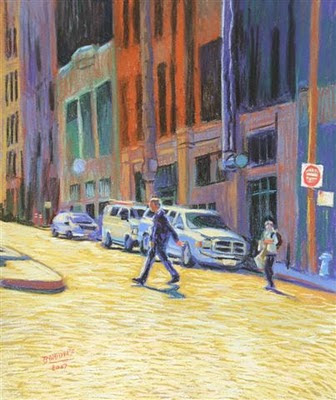
Mid-Day San Francisco - Pastel (37 cm X 30 cm) by Benoit Philippe
One way to achieve unity is to use a tinted background that shows through. Coloured backgrounds are common for pastel and you can buy pastel cards and papers in many different shades. In oil, I like to work on tinted background and let it show between touches of colour. For watercolour, some artists start their work with a light wash over the initial drawing to get rid of the whiteness of the paper and provide some unity to the subsequent washes.
For oil, you could start with a monochromatic layer. The classic school of painting taught that the first stage of an oil painting should be a grisaille (a monochromatic layer outlining the tones in grey or earth colours). This foundation layer creates unity underneath the transparent glazes. There was an artistic as well as an economic reason to this, because earth colours were cheap and artists saved the more expensive colours by glazing them in thin layers on top of the grisaille.
I still use an equivalent of this technique in watercolour for far away background elements, like trees or mountains. I sometimes apply a diluted wash of Payne’s grey (or a mix of Payne’s Grey and Ultramarine blue) first. Once it is dry, I paint over it a second wash of colour. The first wash showing through will “knock down” the colour of the second wash and create the intended recess, pushing the element towards the horizon.
Another way to ensure some unity of colours is to restrict the number of colours you work with. This is first done by choosing the temperature for your painting: warm or cool. This choice will dictate what colours in the spectrum become your dominant colours. In addition, a limited palette makes unifying easier, because all your colour mixtures being based on a limited number of colours and being therefore related, there is less chance that the resulting hues will clash.
Finally, another tool available is a “unifying colour”.
A unifying colour is one colour used throughout the work in various quantities that will bring all areas together. It can be the dominant colour of the background that is stippled in elements of the foreground. Working all areas of the painting at once is important as, by definition, the unifying colour should be used all over the painting even if in small quantities.
What colour can be used as unifying colour? Any colour, really. It will probably be one you like, because this colour will steer the global impression given by the painting towards this colour. There are two different approaches to unifying colours:
- Use a fairly neutral colour (on the grey scale). In this case, the colour works discreetly to glue together the background over which the brighter colours will stand out.
- Use a bright colour as an accent colour dotted around the work. In this case, these touches of bright colour play the role of beacons guiding the eye of the viewer along the path you want him to follow.
Painting technique Oil painting Watercolour Watercolour Pastel Colour Color Tinted background Unifying colour


No comments:
Post a Comment