This article was first published in "Frequency Magazine" – January 2010.
Painting is not only drawing with colours. Where drawing is driven by a linear approach, painting relies more on shapes. You can draw with brushes, but painting really comes along when lines are born out of planes of colours meeting each other. The world of shapes is where figurative painting meets abstract painting.
An effective painting will use the full spectrum of shapes. To make it simpler, shapes are large, medium or small and your painting should have a proportion of each. Shapes can be long or short, thin or bulky, simple or convoluted, angular or organic. Look for variety and contrast in order to sustain interest.
Thinking in terms of shapes helps to build a strong composition. Consider shapes as the skeleton of your painting, its foundation. Simplification of shapes is important to avoid a fragmented approach that makes your work look “busy”. Start with big shapes by using large brushes to block-in the design and, only when you have considered the big masses, you can start dividing them. Remember that in the background you lose definition and shapes tend to cluster together.
Shapes serve many purposes. Overlapping shapes provide a sense of perspective and guide the eye of the viewer from the foreground to the background of the painting. The flow is improved by blending one shape into the next with soft edges.
Shapes have different dynamics depending on their orientation. Horizontal and vertical shapes have a calming effect, while diagonal shapes convey energy. Another way of creating rhythm is to use repetitions with variations. An example of this would be a row of poplars along a road diminishing towards the horizon.
Pay attention to negative shapes: the shape around objects. We tend to overlook negative shapes because they are abstract and represent “what is not”, but it is often easier to carve out the subject of your painting by working on negative shapes than to try to paint the subject itself. A good example of this is sky holes in trees. Block-in the limbs and twigs as a mass, then paint the sky holes to represent the sky showing through the foliage. This gives more unity to the tree. It also ensures that the overall shape of the tree and the perspective are right.
I would like to suggest two excellent exercises to develop a better awareness of shapes.
The stained glass window exercise: Take a colour or a black and white photograph and a black felt pen and outline the main shapes. Try to synthesise shapes by overlooking small details. This will raise your awareness of the different shapes (size, orientation) and the way they interlock.
The bat exercise: The best creative exercise for shapes is to paint upside down (not you, just the reference photograph). By doing this, you have to abstract the meaning of what you see, forget what you already know about the subject your are painting and really concentrate on shapes. You can use a grid to make it easier. Trace a grid on your reference photograph and a similar one on your support, then place the photograph upside down and make a rough design of the shapes on the support using the grid for accurate placement. Only turn over your painting and your reference photograph when you consider your work is finished.
Painting technique Painting composition Shapes Creative exercises

Painting is not only drawing with colours. Where drawing is driven by a linear approach, painting relies more on shapes. You can draw with brushes, but painting really comes along when lines are born out of planes of colours meeting each other. The world of shapes is where figurative painting meets abstract painting.

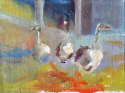
Block-in stage: there are no details, but only shape losely painted

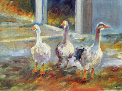
The shapes are refined to give them more definition and volume

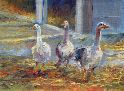
Details are only added at the end: the straw, the geese' eyes
An effective painting will use the full spectrum of shapes. To make it simpler, shapes are large, medium or small and your painting should have a proportion of each. Shapes can be long or short, thin or bulky, simple or convoluted, angular or organic. Look for variety and contrast in order to sustain interest.
Thinking in terms of shapes helps to build a strong composition. Consider shapes as the skeleton of your painting, its foundation. Simplification of shapes is important to avoid a fragmented approach that makes your work look “busy”. Start with big shapes by using large brushes to block-in the design and, only when you have considered the big masses, you can start dividing them. Remember that in the background you lose definition and shapes tend to cluster together.
Shapes serve many purposes. Overlapping shapes provide a sense of perspective and guide the eye of the viewer from the foreground to the background of the painting. The flow is improved by blending one shape into the next with soft edges.
Shapes have different dynamics depending on their orientation. Horizontal and vertical shapes have a calming effect, while diagonal shapes convey energy. Another way of creating rhythm is to use repetitions with variations. An example of this would be a row of poplars along a road diminishing towards the horizon.
Pay attention to negative shapes: the shape around objects. We tend to overlook negative shapes because they are abstract and represent “what is not”, but it is often easier to carve out the subject of your painting by working on negative shapes than to try to paint the subject itself. A good example of this is sky holes in trees. Block-in the limbs and twigs as a mass, then paint the sky holes to represent the sky showing through the foliage. This gives more unity to the tree. It also ensures that the overall shape of the tree and the perspective are right.
I would like to suggest two excellent exercises to develop a better awareness of shapes.
The stained glass window exercise: Take a colour or a black and white photograph and a black felt pen and outline the main shapes. Try to synthesise shapes by overlooking small details. This will raise your awareness of the different shapes (size, orientation) and the way they interlock.
The bat exercise: The best creative exercise for shapes is to paint upside down (not you, just the reference photograph). By doing this, you have to abstract the meaning of what you see, forget what you already know about the subject your are painting and really concentrate on shapes. You can use a grid to make it easier. Trace a grid on your reference photograph and a similar one on your support, then place the photograph upside down and make a rough design of the shapes on the support using the grid for accurate placement. Only turn over your painting and your reference photograph when you consider your work is finished.
Painting technique Painting composition Shapes Creative exercises


3 comments:
I couldn't agree more with this post. A wonderful post to share.
Great information. Thanks so much for sharing.
I suggest painting a page or two of spheres in your sketchbook. You may find it easier to draw the basic elements (use a lid or mug to draw the circle) before you start painting. If you use a watercolor pencil, the lines will 'dissolve' as you paint.
Post a Comment