In a previous post, we looked at how to use masking fluid in watercolour to create clear highlights. This time, we will go at the other end of the spectrum and explain how to achieve vibrant dark colours.
An easy solution to getting deep dark is just to use colours out of the tube: Ivory Black, Lamp Black and Mars Black, a slightly warm black, are the most current types of black available. Paynes grey (which is a very dark bluish grey) is popular in watercolour to darken colours and could replace black when used almost undiluted. The risk with overusing black is to make your colours dull and “dirty”. Black out of the tube or pan may work for small surfaces, but lack variety for larger dark planes.
I prefer to mix my own black and dark colours. It takes some practice, but the results are worth the effort. Mixing your own darks gives you greater flexibility and will expand your visual vocabulary. The basic principle is that, by mixing dark complements together, you end-up with a black or dark colour. Good pairs of colours are:
- Alizarin Crimson and Phthalo Green (or Winsor Green)
- Burnt Sienna and French Ultramarine
Depending on how much you put of each colour, you will obtain a cool black or a warm black. You can vary the temperature of your mixture by adding a third colour. For instance, adding some Ultramarine Blue to a mixture of Alizarin Crimson and Phthalo Green will cool down the resulting dark colour.
There are different methods to mixing dark colours. The direct approach consists in mixing them on your palette. Watercolour pans work well, but I found that for larger quantities, using watercolours in tubes is more effective and also gives you more concentrated pigments.
The second method is to build-up dark colours layer after layer to create rich colours. This is made possible by the use of transparent colours and Alizarin Crimson, Phthalo Green as well as Ultramarine Blue are transparent. You start by applying one of the colours on the paper. I usually start with the dominant colour or temperature: to paint the shadow in tree foliage, I would choose a Phthalo Green or Ultramarine Blue. Leave the colour to dry, then glaze it with a complimentary colour. When this one is dry, you glaze again with the same colour or with your initial one.
The layering method presents at least five advantages over the direct mixing method:
- Because colours are applied in separate layers, the pigments are also separate and the resulting colours richer.
- This method plays on transparencies and gives a more luminous dark colour than any black coming out of the tube.
- Layering colours gives you a chance to adjust the temperature of your shadows towards cool or warm tones. As a rule of thumb, objects with a warm colour will have a cool projected shadow, while objects with cool colours will have a warm projected shadow.
- You may decide not to continue until you reach a black shadow and settle with a green shadow, a red one or a purple one.
- As you proceed step by step, you can assess more accurately when you achieve the correct tonal value.

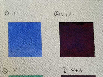
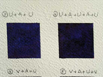
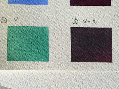
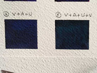
Here is a sampler to demonstrate this technique. From left to right, one layer of colour is added in each square.

Square 1: Ultramarine - Square 2: Ultramarine + Crimson
 Square 3: Ultramarine+ Crimson + Ultramarine
Square 4: Ultramarine+ Crimson + Ultramarine+ Crimson + Ultramarine
 Square 5: Green - Square 6: Green + Alzarin Crimson
Square 7: Green + Alzarin Crimson + Ultramarine - Square 8: the same + Green
Two things to remember when you paint your shadows:
- Firstly, when you paint dark colours in watercolour, they have a tendency to get lighter when they dry. I think this is due to the fact that the water makes the surface of the paper shinny and glossy colours always look more intense (like a varnished oil painting).
- Secondly, remember the law of contrasts when you look for deep shadows: the lighter the surrounding, the darker your shadow will appear.
Watercolour Watercolor Painting technique Mixing dark colours Mixing dark colors Transparent colours Shadows in painting Ivory Black Lamp Black Mars Black Alizarin Crimson Phthalo Green Winsor Green Burnt Sienna French Ultramarine Frequency Magazine

No comments:
Post a Comment