Thursday, 19 August 2010

My unique painting apron


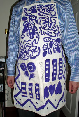
Last time I ordered some art material online, I was short a few pounds to get the free delivery. So, I browse the catalog and bought a painting apron.


As the apron is made of a plain light fabric, I asked daughter number 3 to decorate it with some purple fabric paint I had. She had a good time.

Now, I am less worried to ruin good clothes when painting (which I did) or having to stop to remove a paint stain in emergency.

Monday, 16 August 2010

Sitting on the dock of the bay


I chose the title of this painting in homage to Otis Redding whose “Sitting on the dock of the bay” is one of my favourite songs.


Sitting on the dock of the bay - oil on linen canvas (50 x 60 cm) by Benoit Philippe


And as it happens, the lyrics fit very well what was happening this morning, as I was walking along the docks, on my way to Pier 39:

I left my home in Georgia

Headed for the 'Frisco bay

'Cause I've had nothing to live for

And look like nothin's gonna come my way

So I'm just gonna sit on the dock of the bay

Watching the tide roll away

Ooo, I'm sittin' on the dock of the bay

Wastin' time

I walked all the way to the end of Pier 7. It was early morning and I was alone, apart from some amateur fishermen. There was no fog, I was lucky; but the wind was strong.

When I came back, I saw this man with his trolley. All his possessions were stacked on that trolley, secured with ropes. And he was watching San Francisco Bay, the light sparkling on the water, the boats and Bay Bridge in the background.

I wanted to do a painting using mainly greys. This was an ideal subject for it with the backlit man, the railing and the strong shadows.

I started using greys, black and white. The result was dull. So I decided to play on the contrast between blue and yellow and use greys tinted with both tones. The painting is mainly in the cool spectrum. The only warm colour I used was a Naple Yellow Reddish colour.

Here is the full palette I used for this painting:

  • Titanium White (Griffin Alkyd – Winsor & Newton)
  • Naple Yellow Reddish (Rembrandt)
  • Cadmium Yellow Pale (Winsor & Newton)
  • Davy’s Grey (Winsor & Newton)
  • Payne’s Grey (Mussini / Scmincke)
  • Cobalt Blue Tone (Mussini / Scmincke)
  • Ultramarine Blue


Add to Technorati Favorites

Thursday, 12 August 2010

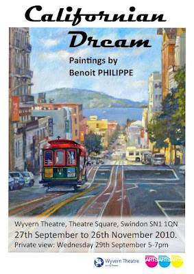
Californian Dream exhibition


After some delays (see my post Invest in the process, not in the outcome), everything is set in motion now for my Californian Dream exhibition starting late September.


Here are the details:

  • 27th September to 26th November 2010.
  • Private view: Wednesday 29th September 5-7pm
  • Wyvern Theatre, Theatre Square, Swindon SN1 1QN - 01793 524 481

“Californian Dream” exhibition is an evocation of California from the wild nature of the Yosemite to the buoyant city life in the streets of San Francisco. I will show some oil, watercolour, pastel and mixed media works.

Wednesday, 11 August 2010

Luminous shadows in watercolour


This article was first published in "Frequency Magazine"– August 2010.

The expression “luminous shadow” seems a paradox or, to be precise, an oxymoron. Are shadows supposed to be the absence of light? How a shadow could be luminous?

As usual, reality is more complex than we think and if you observe carefully shadow areas, you will find reflected lights in them.

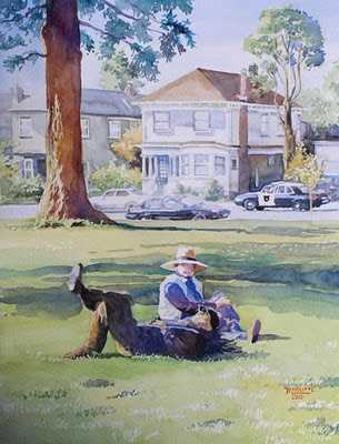
Recently, I was painting a watercolour from a reference photograph I took on a trip to California. A sequoia was framing the scene on the left in a beautiful way, but the tree trunk was just a big black mass on the photograph because the weather was sunny when the photograph was shot and digital cameras tend to exaggerate extreme values and loose details in shadows.


Nap time at Willard Park - Watercolour (31 cm x 39 cm) by Benoit Philippe


The problem I had to solve was: how to avoid a black and dull shadow and still convey the idea of bright lights and strong shadows.


I knew I had to make the shadow lighter; otherwise it would overpower the rest of the composition. A very dark element in the foreground of a composition can work as a “repoussoir” (French painters of the classic era used this trick and framed their painting with dark foliage to push further away the lighter area in a landscape and make it more striking). The tree in my landscape was in the middle ground and I did not want it to win over my main subject.


One way to keep a good contrast between the shadow and light areas while avoiding having too dark shadows is to use a higher key for the whole painting. By this I mean that if the surrounding elements are executed in a lighter tone (with lighter values), then the shadows can still appear as such, even though I am not using very dark tones. Watercolour is an ideal medium for this as it is easy to obtain lighter and subtle washes just by adding more water to your colours. You can start light and build-up colour intensity and tone with successive washes. This way, you can adjust the balance until you get it right.


The use of simultaneous contrasts within the object itself helps reinforcing the impression given by the shadow. In this case, I drew highlights on the bark with some masking fluid where the light was caught on the sculptural bark of the tree. Masking fluid creates sharp edges that contribute to the effect of much contrasted lights and shadows.


Another type of simultaneous contrast I like to use is the one between complimentary colours. For a tree trunk, if the light is yellow-orange, then I can use some blue-violet in the shadow. This makes both colours sing, not only the lighter one.


I also wanted to make the shadow colourful in order to contrast it with the background, mainly handled with a range of coloured greys. Here is the secret of a “glowing shadow”: I applied a first wash of Yellow Ochre on the whole trunk. I let it dry and only then applied a reddish purple, mixed with Alizarin Crimson and Ultramarine Blue. Both colours are transparent and therefore the Yellow Ochre underpainting showed through. It was like having some of the light glowing underneath the shadow. It also gave a greater unity to the tree trunk because of the continuity of the Yellow Ochre, even under the shadow area.


Add to Technorati Favorites

Monday, 9 August 2010

The making of Morning fog in San Francisco


While painting “Morning fog in San Francisco”, I stopped many times to take photographs of the work in progress.

I put the sequence of photographs into a slideshow that you can now watch it as a YouTube video.

Note: if you are in the office, turn the sound down or put your headset on. There is some music in the video.


If you cannot see correctly the embedded video, click on it to see it in or YouTube follow the link to The making of Morning fog in San Francisco video on YouTube.


Add to Technorati Favorites