
This article was first published in "Frequency Magazine"– August 2010.
The expression “luminous shadow” seems a paradox or, to be precise, an oxymoron. Are shadows supposed to be the absence of light? How a shadow could be luminous?
As usual, reality is more complex than we think and if you observe carefully shadow areas, you will find reflected lights in them.
Recently, I was painting a watercolour from a reference photograph I took on a trip to California. A sequoia was framing the scene on the left in a beautiful way, but the tree trunk was just a big black mass on the photograph because the weather was sunny when the photograph was shot and digital cameras tend to exaggerate extreme values and loose details in shadows.
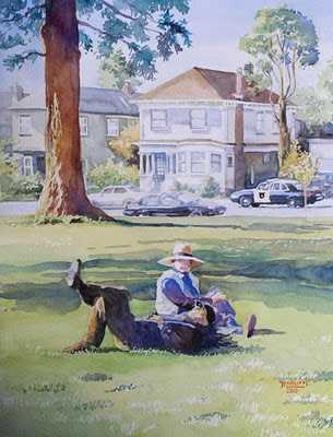
Nap time at Willard Park - Watercolour (31 cm x 39 cm) by Benoit Philippe
The problem I had to solve was: how to avoid a black and dull shadow and still convey the idea of bright lights and strong shadows.
I knew I had to make the shadow lighter; otherwise it would overpower the rest of the composition. A very dark element in the foreground of a composition can work as a “repoussoir” (French painters of the classic era used this trick and framed their painting with dark foliage to push further away the lighter area in a landscape and make it more striking). The tree in my landscape was in the middle ground and I did not want it to win over my main subject.
One way to keep a good contrast between the shadow and light areas while avoiding having too dark shadows is to use a higher key for the whole painting. By this I mean that if the surrounding elements are executed in a lighter tone (with lighter values), then the shadows can still appear as such, even though I am not using very dark tones. Watercolour is an ideal medium for this as it is easy to obtain lighter and subtle washes just by adding more water to your colours. You can start light and build-up colour intensity and tone with successive washes. This way, you can adjust the balance until you get it right.
The use of simultaneous contrasts within the object itself helps reinforcing the impression given by the shadow. In this case, I drew highlights on the bark with some masking fluid where the light was caught on the sculptural bark of the tree. Masking fluid creates sharp edges that contribute to the effect of much contrasted lights and shadows.
Another type of simultaneous contrast I like to use is the one between complimentary colours. For a tree trunk, if the light is yellow-orange, then I can use some blue-violet in the shadow. This makes both colours sing, not only the lighter one.
I also wanted to make the shadow colourful in order to contrast it with the background, mainly handled with a range of coloured greys. Here is the secret of a “glowing shadow”: I applied a first wash of Yellow Ochre on the whole trunk. I let it dry and only then applied a reddish purple, mixed with Alizarin Crimson and Ultramarine Blue. Both colours are transparent and therefore the Yellow Ochre underpainting showed through. It was like having some of the light glowing underneath the shadow. It also gave a greater unity to the tree trunk because of the continuity of the Yellow Ochre, even under the shadow area.
Painting technique Watercolour Watercolor Painting shadows

2 comments:
Great advice, thank you so much. I translated and wrote this tips and hang them on wall for future reference and practice.
Very informative post...and that was a great painting,too..thanks for sharing!
Post a Comment