
Beginners are often afraid of painting glass. It seems a daunting task to render the transparency, the reflected lights and shadows and convey the volume at the same time. In a still life, glassware objects create interesting texture and fill the space in a lighter way thanks to their transparency; so your effort will be rewarded.
The first step consists in careful observation. Glass has in general no colour (although it is sometimes slightly blue or green). The colour is determined by the surrounding, the background and the reflected objects. Observation is fundamental: move objects around the glass object you want to paint and see how it affects the pattern of colours and lights on the glass.
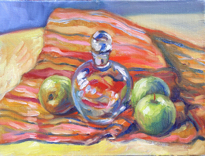
All round - oil on panel (6" x 8") by Benoit Philippe
If the glass object is round, the reflected light follows the curve of the object. Shaped glass objects will distort objects placed behind them. If the object is only in part behind the glass object, it can create a broken line at the periphery of the glass object.
The second step in painting glass object is to isolate issues and simplify your approach.
It is easier to paint glass against a dark background because the effect of the light through the glass is more obvious. It is also easier when the background is plain rather than patterned because you can concentrate on tones without worrying about the changes of colours.
It is better, when you start, to have a fixed source of light. This is possible if you set-up your still life subject in your studio and use a lamp.
The aspect of the glass will change if you move around it. Even a slight move on your left or your right may be sufficient to change the colour patterns. For this reason it is easier to use photographs at the beginning in order to understand the play of reflected colours. This way, you will avoid the variations you get when you move.
Tone is the most relevant information to convey the transparency and reflection on glass. A good way to get a grip on the “glass effect” is to start by doing some pencil drawings and then a monochrome paintings.
When I paint glassware in oil, for the preliminary drawing, I prefer to draw only the overall shape of the object and then paint directly the shapes within the glass objects. Some hyper-realist painters start by drawing all the reflection, shapes, etc. (sometime by tracing them from a photograph). I found that the result with this method looks too mechanical and artificial for my taste.
I would then build-up the glass as I paint the background. This way, I get background colours seen by transparency. Because of the transparency, some parts of the glass will disappear into the background. This effect would be much more difficult if you decided to paint the background first, reserving the glass object, and then painted the glass object once the background had dried. There are good chances that the glass would look like an afterthought.
To create the pattern of light and shadows in the glass, I paint the coloured shape rather than each single line. The trick is to simplify the shapes. If you are not sure of the way to go, squinting at your subject will help to remove unnecessary details.
Glassware objects present a mix of soft edges and sharp edges. Glass is only visible if there is some light on it. It is therefore possible to have a lost edge in the side of a glass object in the shadow. I like to work wet in wet as far as I can. Glazing white on top, when the first stage is dry, is a good way to indicate the shine on the surface of the glass.
Once you master the basics of painting glass object, you have several ways to add interest: place a coloured object behind the glassware; have a background with changing colours or patterns; vary the degree of light on the glass object; use pieces of glassware with facets (each facet will have its own reflection due to different orientations; or place a laced pattern under the glass.


