
This article was first published in "Frequency Magazine" – October 2009.
Green is a difficult colour to master and I have seen more than one landscape painting ruined by fields of acid green. In this article, I would like to bring you beyond the basic formula that blue and yellow makes green.
The first and safe approach is to buy some green colours in tube (or pan for watercolour). It is all right to start this way, even if your ultimate goal should be to mix most of your green colours. Having some readymade green shades is however handy, either to save time or because some particular hues of green are difficult to mix. Here are a few suggestions for your selection:
- Terre Verte (Earth Green) is an interesting neutral green. It will serve you well when you paint trees and foliage in the background.
- Sap green is a very nice mid-tone green. To me, it evokes the colour of old velvet and because it is transparent, this green is ideal for glazing.
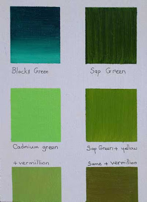 Blockx Green (top left) is a Viridian Green. The sample shows the colour pure and then mixed with white. Sap Green (top right) is a semi-transparent colour that gains opcity when mixed with yellow (middle row on the left) and makes an excellent mid-tone base green when a small quantity of read (Vermillion or Cadmium) is added to it. Cadmium Green is another useful green, either pure in small quantities or when toned down with a little bit of red (bottom left)
 - Viridian green is a strong green, so apply it with restraint as it can overpower other colours. Mixed with some Ultramarine Blue and/or Alizarin Crimson, it makes great dark greens.
- Cadmium Green Pale is the green of young shoots and can be useful for highlights in grass and trees. I like to use it in the final stage of my paintings, straight from the mouth of the tube, in order to add sparks of light green in the foreground or in the lighter areas of tree foliage. Because it is quite bright, I would not recommend the use of the pure colour in large areas (unless you make it lighter with water in watercolour and with some white in oil painting).
The fun starts with greens when you try your hand at mixing them yourself. Possibilities are almost endless and the following pointers should help you to find your own way:
- Ultramarine blue, Manganese Blue, Cerulean Blue and Cobalt Blue offer all a good basis to mix greens. On the yellow side, try Cadmium Lemon or Cadmium Yellow which is slightly orange for a warmer green tone. If you aim for a darker shade of green, start with the blue and add some yellow. For lighter greens, proceed the other way around, starting with the yellow colour as your base colour. You can of course use more than one blue in your mix in order to create different greens.
- Experiment by adding a drop of red in your green mixture. This is the best way to remove the acidity of the green without making it dull. If you try to darken your green colour by adding some black, the result will be gray and you will get a “dirty green” rather than a neutral green. By mixing a little bit of complimentary red into your green, you tune down its brightness without loosing the original colour.
- Instead of using a yellow hue, try making your greens by mixing blue and Yellow Ochre (or Raw Sienna). You can get a nice effect by layering some dabs of Yellow Ochre on the watercolour paper or canvas and then mixing some blue into it directly on the support. The imperfect mix will provide interesting variations.

Raw Sienna mixed with Cerulean Blue (left column) or Cadmium Green
- Under laying your green area with strokes of warm red, pink or orange will help to achieve greens that look good. If you don’t wait for the warm colour to dry, it will tune down your green. If you let the warm background to dry (in particular with oil paint), see what happens when you leave some areas of red show between the brush strokes of green. The simultaneous contrast will make your greens look richer and vibrant. To better understand how optical mixing works, study the works of Monet and Pissarro.

In the left column, I applied a red background and then some green (Sap green at the top and Cadmium Green in the middle), Raw Sienna, Cadmium Green and Chrome Yellow (bottom row). In the right column, the same was done with an orange background.
Colour mixing Color mixing Green Watercolour Oil painting Painting technique

2 comments:
Wow...fantastic article. What a help. Thanks so much for sharing.
I really appreciate your article it's providing a useful info!
Thanks for sharing us.
Post a Comment