Wednesday 24 February 2010

Coming eBook on creative exercises

I am working at the moment on finishing an eBook titled “CREATIVE EXERCISES - for artists, painters and everyone else”


There are excellent books on creativity, but they are mostly aimed at words and ideas rather than visual expression. This is about to change.

This eBook will be 36 pages long and will offer 17 creative exercises with the visual artist in mind. Some of these exercises were taught to me years ago and I created others to fulfill my own needs.

I already described a few of the exercises on the blog, but others are unpublished.

The target date for publication is Friday 5th March 2010.

And… I almost forgot: It will be FREE.


Call to action


  • Pencil in the 5th of March to get your free eBook

  • Keep an eye on the blog

  • Pass the word around and let your friends know


Monday 22 February 2010

Product test - Pentel Aquash Water Brush


I have known about this product for some time and finally bought one. The Pentel Aquash Water Brush is a brush pen that combines a nylon brush with a reservoir. I went for the medium one.


The packaging is all in Japanese, so not much to learn from it for me (even if I like very much the beautiful Japanese writing).

There are three models with three nib sizes: fine, medium and broad. The brushes can be bought individually or as a pack of all three models.

Easy to fill-in: Unscrew barrel and fill with water. Screw it back and you are ready. The barrel has a flattened shape that prevents the brush from rolling off your work surface.

The pen-brush is made of a transparent blue plastic and the brush tip is made of soft nylon hair. The brush is extremely light, which is a big plus when you carry around your sketching material.

The point is good and stays pointy. The pen cap means that the point won’t be damaged during transport. It is equally easy to do broad strokes or fine lines. You can hold the pen-brush comfortably like an ordinary pen and move it around with great precision.

What can you use this brush-pen for?

You can fill the barrel with any water-soluble medium, like water-soluble inks, watercolours or gouache and use the brush-pen for calligraphy or painting. It seems ideal for wet on wet techniques.


Trial with watercolour pencils and a black Cretacolor Aquamonolith pen


Personally, I plan to use it for sketching. I will be able to create some washes with my Cretacolor Aquamonolith pens. This pen brush will save me the trouble to have to carry one brush and a bottle of water.

This is a good tool to create washes and blend with watercolour pencils. In this case, you just put water in the barrel. You need to wash the tip with a tissue paper between colours (unless you want to create layers between with two different colours or blend them). The nylon-tipped brush is easy to wash. You just press a little bit on the barrel to wet the tip and wipe it clean on the tissue. One word of caution: if you press the barrel too hard, drops of water will fall from the base of the brush tip (This is a beginner issue and I am sure I will soon get use to this brush-pen and will know the correct pressure to apply). I would therefore recommend not holding the brush over your work when you squeeze the barrel.

For watercolour, I see different possible uses:

  • With the barrel full of clear water you can wet areas in a very precise way and then drop some colours in it.


  • You can make graded washes by starting with the colour with a normal brush and then switch to the Pentel brush-pen and carry on by diluting the colour on the paper with water.


  • You can lift the colour from the paper

More information

Pentel website
Pentel Europe website


Add to Technorati Favorites

Wednesday 17 February 2010

I wished I noted that


This article was first published in my newsletter "Notes From My French Easel" – January 2010. Follow the link to receive this free monthly newsletter .


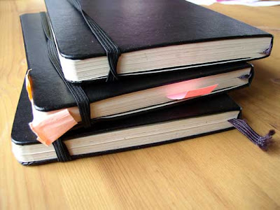
I have been using notebooks for years to record ideas or tasks to do, to note interesting facts when visiting exhibitions and to doodle or sketch compositions. Notebooks are wonderful laboratories for ideas: you can capture a burgeoning idea, let it grow and find it later. The great advantage over loose paper is that everything is in one place and you can also see the chronology and evolution of your ideas.


I use my notebook as a ubiquitous capture tool. The truth is that if you don’t note it, you won’t remember it (you will only remember that it was important!) or you will keep thinking about it all the time. Don’t let circling thoughts nag you when you paint.

There are a number of things that are worth noting as an artist. Colours sold under the same name vary from one manufacturer to the next, so you want to keep precise references of what you buy so you can replace it or avoid it (if you don’t like the colour or texture). A typical example is watercolour pans. After unwrapping a watercolour pan, I write the reference on the bottom of the plastic pan with a permanent marker. I also stick the label on a card and file it. It is also wise to make a colour chart with your pastel stick with the name of the colour, the brand and the reference number before the stick goes in the box and loose its label.

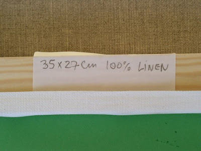
Some other pieces of information that I want to gather for my inventory is the nature, size and brand of the support I use. By the time I finish a painting, I have often forgotten the brand and characteristics of the canvas I used. The easy remedy is to write the relevant information with a pencil on one of the stretcher bars. For watercolour paper that I cut from larger sheets, I also mark the information with a pencil at the back. Before I frame the watercolour, I make sure I transfer all the information into my paintings inventory, but the information is also at the back of the work and will follow it everywhere if it is ever needed in the future.


Add to Technorati Favorites

Monday 15 February 2010

Going Green


This article was first published in "Frequency Magazine" – October 2009.


Green is a difficult colour to master and I have seen more than one landscape painting ruined by fields of acid green. In this article, I would like to bring you beyond the basic formula that blue and yellow makes green.

The first and safe approach is to buy some green colours in tube (or pan for watercolour). It is all right to start this way, even if your ultimate goal should be to mix most of your green colours. Having some readymade green shades is however handy, either to save time or because some particular hues of green are difficult to mix. Here are a few suggestions for your selection:
  • Terre Verte (Earth Green) is an interesting neutral green. It will serve you well when you paint trees and foliage in the background.

  • Sap green is a very nice mid-tone green. To me, it evokes the colour of old velvet and because it is transparent, this green is ideal for glazing.
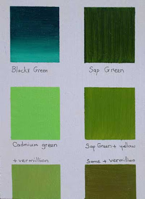
  • Blockx Green (top left) is a Viridian Green. The sample shows the colour pure and then mixed with white. Sap Green (top right) is a semi-transparent colour that gains opcity when mixed with yellow (middle row on the left) and makes an excellent mid-tone base green when a small quantity of read (Vermillion or Cadmium) is added to it. Cadmium Green is another useful green, either pure in small quantities or when toned down with a little bit of red (bottom left)
  • Viridian green is a strong green, so apply it with restraint as it can overpower other colours. Mixed with some Ultramarine Blue and/or Alizarin Crimson, it makes great dark greens.
  • Cadmium Green Pale is the green of young shoots and can be useful for highlights in grass and trees. I like to use it in the final stage of my paintings, straight from the mouth of the tube, in order to add sparks of light green in the foreground or in the lighter areas of tree foliage. Because it is quite bright, I would not recommend the use of the pure colour in large areas (unless you make it lighter with water in watercolour and with some white in oil painting).
The fun starts with greens when you try your hand at mixing them yourself. Possibilities are almost endless and the following pointers should help you to find your own way:
  • Ultramarine blue, Manganese Blue, Cerulean Blue and Cobalt Blue offer all a good basis to mix greens. On the yellow side, try Cadmium Lemon or Cadmium Yellow which is slightly orange for a warmer green tone. If you aim for a darker shade of green, start with the blue and add some yellow. For lighter greens, proceed the other way around, starting with the yellow colour as your base colour. You can of course use more than one blue in your mix in order to create different greens.
  • Experiment by adding a drop of red in your green mixture. This is the best way to remove the acidity of the green without making it dull. If you try to darken your green colour by adding some black, the result will be gray and you will get a “dirty green” rather than a neutral green. By mixing a little bit of complimentary red into your green, you tune down its brightness without loosing the original colour.
  • Instead of using a yellow hue, try making your greens by mixing blue and Yellow Ochre (or Raw Sienna). You can get a nice effect by layering some dabs of Yellow Ochre on the watercolour paper or canvas and then mixing some blue into it directly on the support. The imperfect mix will provide interesting variations.
    Raw Sienna mixed with Cerulean Blue (left column) or Cadmium Green
  • Under laying your green area with strokes of warm red, pink or orange will help to achieve greens that look good. If you don’t wait for the warm colour to dry, it will tune down your green. If you let the warm background to dry (in particular with oil paint), see what happens when you leave some areas of red show between the brush strokes of green. The simultaneous contrast will make your greens look richer and vibrant. To better understand how optical mixing works, study the works of Monet and Pissarro.


In the left column, I applied a red background and then some green (Sap green at the top and Cadmium Green in the middle), Raw Sienna, Cadmium Green and Chrome Yellow (bottom row). In the right column, the same was done with an orange background.
You have more than enough to work on your greens for a month. Happy painting and let’s go green!


Add to Technorati Favorites

Tuesday 9 February 2010

Have you tried painting a still life recently?

This article was first published in "Frequency Magazine" – February 2010.

In England, it’s cold outside and we are better off staying in the warmth of our homes. This does not mean we cannot paint from nature: why not draw or paint a still life?

Still life has a long tradition in painting in all media. Flemish painters captured the beauty of flowers from different seasons in single paintings for their patrons and added insects and butterflies to their compositions. The Impressionists and Cezanne created numerous still life paintings. Cezanne was so slow that he decided to replace real flowers by artificial ones and then was upset because the paper petals would fade over time… Today, the “one painting a day” movement offers excellent examples of good still life based on very simple subjects taken from our daily life: marbles, toys or decorated cupcakes; everything can make a still life with some imagination.

The first task it to pick a subject. We all have objects we like and still life goes beyond flowers and fruits (although fruits like apples are interesting to paint with many variations of colours, their roundness and their shiny reflective surface). Pick unusual or intriguing objects you have collected. Car boot sales or antique shops are great place to find interesting objects for your prop department. You don’t have to be stuck in the past: a mobile phone or your music player could become part of the composition.


Café et croissant - Oil on panel (6"x8") by Benoit Philippe (SOLD)

Composing your scene is great fun and an important first step in a successful still life, so take your time. I like to use fabric as backdrop and vary the light. Don’t hesitate to try different arrangements until you are fully satisfied and, when you think you are, take a ten minutes break and come back to your subject with a fresh eye. I bet you will make some minor adjustments. Another way of modifying your composition is to move around it. Move your easel a step on the right or on the left and you have before you a new composition. Vary your point of views: from above, from below; eye level or aerial view. Record your ideas by drawing some quick thumbnail studies in you sketchbook. This way, you can recreate any arrangement you have tried and then changed.

Use all three dimensions. Imagine you are a choreographer and you need to make the stage come to life. Think verticals as well as horizontals. Imagine a forest with slander trees high in the sky, smaller ones underneath, bushes and then a carpet of daffodils. You find interest everywhere. How can you recreate layers of interest in your still life composition? Overlap objects in order to reinforce the cohesion of the painting (cohesion versus collection). This way, you also create interest at the rim of each object with a sense of direction, flow and movement from one object to the next.


A bowl of lemons - Watercolour by Benoit Philippe


Painting a still life brings the opportunity to work with many different textures: the transparencies and reflexion of glass, the gloss of china, the reflexions on silverware, the softness of fabrics, the veins in wood and marble.

The richness of still life is to be able to use and reuse your props and create very varied paintings. It is also a controlled environment compared to painting outside. You can control the props, the composition and the light to a great extent. You can also take your time, work at your own pace and leave your composition in place until you have finished your painting.


Add to Technorati Favorites

Saturday 6 February 2010

Viewing the world as an artist


Self-portrait by Sir Joshua Reynolds - Oil on canvas (63.5 × 74.3 cm / 25.00 × 29.25 in) - National Portrait Gallery [source - Wikimedia Common]


“I cannot help imagining that I see a promising young painter, equally vigilant, whether at home, or abroad in the streets, or in the fields. Every object that presents itself is to him a lesson. He regards all nature with a view to his profession; and combines her beauties, or corrects her defects. He examines the countenance of men under the influence of passion; and often catches the most pleasing hints from subjects of turbulence or deformity. Even bad pictures themselves supply him with useful documents; and, as Leonardo da Vinci has observed, he improves upon the fanciful images that are sometimes seen in the fire, or are accidentally sketched upon a discoloured wall.”

Sir Joshua Reynolds - A discourse Delivered to the Students of the Royal Academy, on the Distribution of the Prizes, December 11, 1769, by the President.


Add to Technorati Favorites


Monday 1 February 2010

The Russian tea cup


Recently, we bought some loose leaf tea: Earl Grey Blue Lady; Green tea flavoured with Vanilla; Rose tea (a flavoured black tea) and Sencha Fukujya, a Japanese green tea. So, I wanted to paint one of our Russian tea cups.


The Russian teacup - Oil on canvas panel (6" x 8") by Benoit Philippe