Friday 29 August 2008

Two boats at Clovelly - Oil painting


This is a quick study of two boats in Clovelly's harbour, done from a photograph I took when visiting this village.


Two boats at Clovelly - Oil on panel (6" x 8") by Benoit Philippe

Friday 15 August 2008

Painting on the edge - Part 2

This article was first published in "Frequency Magazine" - August 2008.


How to create soft and hard edges

The law of contrast applies to edges as it does for colours: the softer the surrounding, the crisper a hard edge will seem. In other words, to make an edge look harder, you can soften the ones around it. The edge will seem hard when you create a high contrast between the two planes it delineates. Contrast can be created with tones (dark against light), colours (complimentary colours, like green next to red) or temperature (warm against cool). Edges will appear soft if adjacent colours are close in tone colour or temperature.

The way to work with edges will depend on what technique you are using. For oil painting, I find easier to soften all edges first and then create few hard edges. You can always redefine edges at a later stage.


Working wet on wet will tend to produce soft edges as the paint you apply naturally blend with the underpainting. To create soft edges, blend the edge between two planes of colours with a brush, a rag or lose the edge by smudging the paint with your fingers. (You will be in good company as Leonardo da Vinci was blending with his fingers. If you do so, make sure that you clean your hand very well at the end of your painting session as some paints are toxic). A practical tip: don’t apply the paint too thickly or it will become difficult to control the degree of blending you want to achieve.

To create a smooth transition between two planes of colours, you can also mix separately the colours of the two planes and apply the paint on your canvas with a gap in between. Then, mix the two colours together to obtain a transitional tone and apply the new mixture in the gap.

If you need to create hard edges, you can use a small sable brush. This works well for calligraphic marks like tree branches. You can also do so with a painting knife. Some painting knives have a square end and are ideal to create hard edges of buildings for instance.

In watercolour, wet on wet technique will create soft edges as colours diffuse with water. For hard edges, wait until the paper is dry and paint wet on dry. This way, your marks will be crisp and well defined. Masking fluid is an easy way to create light shapes with hard edges.

Pitfalls when working with edges
Don’t assume that because an object has sharp edges, it should in all cases be represented in your work with hard edges. Observe, for instance how the sides of a mug in an even light blends into the background despite the fact that it has straight edges.

A common mistake in still life paintings is to have hard edges all around the main subject of the painting, in particular if the artist uses a dark background for dramatic effect. With hard edges all around, the subject will appear flat and stuck onto the background rather than protruding towards the viewer. Nature is not made of cut-out shapes and this is what you would get by using only hard edges.

In landscape painting, there are no hard edges where the sky meets the landscape itself. Because of the layers of air between yourself and the horizon, edges get softer the farther you go.

You are now well prepared to observe and recreate soft and hard edges in your work. In the end, it is a matter of balance and judgement. Too many soft edges and your painting will look inconsistent; too many hard edges and it will look unnatural and harsh. You need to find the right proportion by successive adjustments.


Tuesday 12 August 2008

Painting on the edge - Part 1

This article was first published in "Frequency Magazine"– July 2008.

The form of an object results from different factors: colour, value, light, atmosphere, temperature and edges. Some of these factors influence each other.

Soft and hard edges are essential tools in building a cohesive painting and creating the sense of space and perspective. Taking care of edges will make a dramatic difference to your paintings. They are often overlooked because they seem less important than colour or composition but, unless you get them right, your painting will not come together and drive the eyes of the spectator where you want to lead them.

Edges are the frontier where one shape meets another. Two pairs of adjectives are often associated with the word “edge” in painting books and articles: “hard edges” opposed to “soft edges” on the one hand and “found edges” opposed to “lost edges” on the other hand. These expressions are close but not necessarily interchangeable. A lost edge is generally a soft edge but the reverse is not always true. These terms are explicit enough not to require any explanation. If you want to see lost edges in action, look at still life paintings from the Dutch school and see how the dark side of the composition disappears in the shadow of the background.

As always, observation is essential and you should study nature to find soft and hard edges. Lost edges occur in the shadow but you will also find them in the light: intense sunlight will “eat” the edges of an object, like the summer sun shinning through foliage.

Atmosphere influences edges. If you paint during a foggy day, edges will be blurred and soft. By contrast, in sunny weather, the sun around noon will create more hard edges.


You will also observe that edges get softer the farther you look. Leonardo da Vinci described in his notebook how edges get softer with distance, due to atmospheric perspective: “In the distance the boundaries of bodies which are of similar colour are the first to be lost, when the boundary of one is on the top of the other, like that of the boundary of one oak tree on top of another similar oak. At the next stage of distance the boundaries of bodies of moderately different colour are lost when one above the other, such as green, such as is to say, trees, against cultivated land of walls or broken mountains or stones. Finally are lost the boundaries of bodies which have borders of dark against light or light against dark.”

The function of hard and soft edges

  • Hard edges will draw attention by their sharpness because the eye (and the brain) is used to only see sharp edges of the area we focus on. Everything in the periphery fades and, being out of focus, loses its sharpness. So try to keep your hard edges in the centre of attention, around the focus point. Does that mean that you can only have hard edges in one place in your painting? No, but you should plan where you put them and hard edges should drive the eyes of the viewer towards the path you want them to follow. The human eye can only focus on one thing at a time and to avoid having the eye of your spectator wandering aimlessly, you need to limit the number of hard edges and place them with care. Hard edges distributed at random will just create distraction and confusion.
  • As already mentioned, in nature, edges will appear softer with distance. The farther an object is, the softer its edges are. You can imply distance in you painting by creating atmospheric perspective. Softening edges in the background is one way to imply distance. Soft edges will make an object recede; hard edges will bring it forward.

  • Use edges to suggest the physical properties of the objects you are painting. For instance, a leafy bush has a rounded form and wrinkled edges best rendered with soft edges.
  • Edges contribute to the mood of a painting or areas of a painting not only at the level of the elements composing your work but also at the scale of individual marks. Brushwork also relies on edges. Sharp and decided marks convey energy and excitement; softer strokes express reserve and quietness. Soft edges will also bring mystery areas for your viewer to explore, leaving room for their imagination.
  • Soft edges create a smooth transition between different elements in your painting and therefore help to make your composition look like a whole. Hard edges will become the few landmarks on the unified backdrop of your painting.


Thursday 7 August 2008

Painting Better Landscapes by Margaret Kessler


Painting Better Landscapes: Specific Ways to Improve Your Oils " by Margaret Kessler is aimed at improving your landscape paintings (the subtitle reads: “Specific ways to improve your oils.”).


The book is well structured and covers, in fifteen chapters, the following topics:

1. Visualizing and planning
2. The format
3. Division of space
4. Lines and compositional movement
5. Artistic grouping
6. Center of interest
7. Linear perspective
8. Depth
9. Overall tonality and atmosphere
10. Value relationship
11. Underlying abstract patterns
12. Negative shapes
13. Colour harmony
14. Brushwork and details
15. Gallery readiness


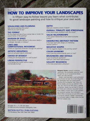
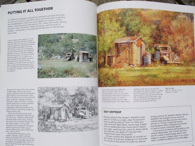
At the end of each section, a box lists points to consider and questions so that artists can carry out a self-critic of their work.

Margaret Kessler gives good practical advice. Don’t skip the small print by the author’s paintings. These paragraphs contain good information and are not necessarily a repeat of the main text.


This is not your typical “how to” book with step by step illustration on how to paint a particular landscape.

You know the saying: “Give a man a fish; you have fed him for today. Teach a man to fish; and you have fed him for a lifetime”. To use this metaphor, Margaret Kessler’s aim is not to give you a fish, nor to teach you how to fish but rather to improve your fishing technique so that you catch bigger and better fishes. One thing you will find in this book is food for thoughts.

You can read this book from cover to cover or one bite at a time, when you want advice on a particular topic. It is an excellence reference book to keep in your artist’s library.


Favourite quotes


These are quotes I found interesting or unusual to give you a taste of the content and style.
“Keep in mind that when you include people or animals, they generally become the center of attention. Plan the painting around them from the start. Adding people or animals at the end can be risky as they may, at the very least, distract from your intended focal point.”
Here is here advice on painting openings in buildings:

“Speaking of openings, don’t paint black holes! Create varied light and dark patterns within each opening. Reflected light bouncing around within the scene and within the building itself affects the values in these openings. They are not totally without light.”


Any negative points to consider?


  • Margaret Kessler uses photographs as reference and does not discuss plein-air painting and how plein-air and studio works link together (if you are interested in these topics, then have a look at "Painting the Outdoors Inside: Capture the Vitality of Outdoor Painting in Your Studio with Oils" by Kevin D. MacPherson). You may find this limiting, but the wealth of material in this book compensates for this.


  • The author’s style of painting may not be for you. She is painting in a realistic way, with quite a lot of details. Although I did not like all the paintings, I found excellent the winter landscapes with the snow.
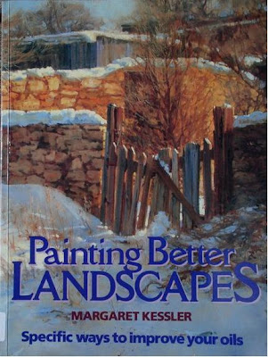

  • Landscapes covered in this book are mainly countryside ones (no cityscapes).
Overall rating for this book
“Painting Better Landscapes” by Margaret Kessler is an excellent book that will give you a practical approach to improving your landscape paintings. This is not a book for beginners, but it will give intermediate and advanced painters many bits of information to think about and tips to implement.


Related articles


Monday 4 August 2008

My Blog Tools


The magic of blogging is that most tools come free but nevertheless offer great features. If you think about starting a blog, I am sharing with you what is in my blogger’s toolbox.


  • A moleskin notebook: it offers a flexible way to gather idea for articles, quotes and other material. Sometime, I write the first draft in my notebook, some other times, I just do a mind map or I list all the ideas that come to mind around the subject I am writing on.

  • Microsoft Word: The reason I type first in Word is the possibility to save the draft and come back to it to add to it and move sentences and paragraphs around. I can also use the program to check spelling and grammar. I have created a template for blog entries with the different scripts I am using (like Technorati and Digg) and the link to resources I frequently use when writing (like Amazon).

  • Blogger: A very easy to use blogging platform with excellent functionalities. The last one that really adds value is the possibility to write posts in advance and schedule their publication. No more excuse, even if you go away.

  • A digital camera (or the camera on my mobile phone): I take photographs of my paintings, but also photographs for illustration purpose. My rule of thumb is to have at least one photograph per post.

  • A photo editing software: Until now, I have used a program called Arcsoft PhotoStudio 2.0 that offers good basic functions. I just purchased Abode Photoshop Elements 6 (PC) and I am impatient to explore its possibilities.

  • ResizR : a website to resize your photographs online.

  • Blake’s Technorati link generator. You type the list of keywords for your article and the site creates the Technocrati html code for you.

  • Feedburner: This free service let your readers subscribe to your blog with the option to receive your articles by email or by using an RSS reader.

  • Google Analytics allows you see how many readers you have, where they come from, how long they stay on the site, etc. The data presented is impressive and you just need to be careful not to check your statistics every hour.


Related resources


  • If you have questions and want to learn more about blogging, the best resource I have found is ProBlogger.


Add to Technorati Favorites