Thursday, 31 December 2009

The Colorist Top 10 Posts 2009

What a wonderful way to finish 2009 and to get a boost for 2010! Casey Klahn, the pastel artist behind The Colorist awarded The French Easel a virtual medal for the post on Working on the same subject in different media.


It is an honour to be in such good company as the other artists represented in this selection. Make sure you check the full list of winners . I am also proud of this nomination as I like very much what Casey paints and his use of colours.

Happy New Year 2010 to all!

Benoit

Wednesday, 16 December 2009

The benefit of small studies


It is tempting to put a large canvas up on your easel and start painting straight away. However, a small study made before a larger work acts as a roadmap and the investment made upfront pays tenfold. One of the main shortfalls of beginner painters is an inability to see in the burgeoning stage of a painting the potential of the finished work. Because of the insecurity this creates, there is a tendency to push too far the degree of finish in a single area of the painting before moving on a repeating the same, rather than developing the work as a whole.


"Night roadwork" - Oil on panel (6" x 8") - the initial study

A preliminary study works as a rehearsal for the finished work. It is a good way to resolve composition issues. Small studies done on site are also ideal to capture fleeting moments and bring these impressions you had during a field trip into the studio.

Digg this! - Oil on canvas by Benoit Philippe


When you plan to paint a large painting from a photograph, executing a smaller version of the subject is an excellent way to put distance between you and the photograph. When you paint the smaller version, you start to see and think as a painter and edit out all the unnecessary details that photographs can offer.

Monday, 14 December 2009

We never know what we are going to do


“We never know what we are going to do. We start a painting and it becomes something totally different. It is curious how the will of the artist does not count much.”

Picasso (Daniel-Henry Kahnweiler “Entretiens avec Picasso au sujet des Femmes d’Alger”, in Aujourd’hui, no.4, September 1955)

Friday, 11 December 2009

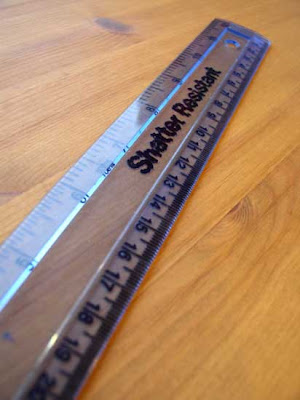
10 ways to improve your watercolours with a ruler


This article was first published in "Frequency Magazine"– December 2009.

A ruler is a familiar object, part of every child’s school kit and a rather unglamorous piece of office supply, but do not discount this mundane tool and you will get lots of mileage out of it.

To be able to perform all of the techniques described below, you should buy a clear acrylic ruler that is sturdy enough. Some models feature a grid or vertical lines that prove useful to check alignment and draw right angles. A 300 mm ruler divided into imperial and metric will be suitable in most situations while being transportable. Avoid metal rulers that risk marking the paper in some of the uses described below.


  • Measuring: This use is obvious, so I won’t spend too long on this. If you work from photographs, taking measurements of key features will make keeping accurate proportions between the different elements in the picture a breeze.

  • Materialising the horizon: By placing the ruler on your paper to materialise the horizon, you can visualize how the composition would look. In a landscape, this will help you to decide how much sky or land you want to show.

  • Tracing objects in perspective: I would rather draw everything free hand to get a more natural feel, but there is one case where I always welcome the help of a ruler: drawing buildings in perspective. Remember that all lines which are not in the plane of the paper will converge and vanish on a point located on the horizon (could be one or two points depending on the perspective). Verticals remain vertical and this is also something you can check with a ruler.


  • Use the ruler as a mahl stick: For oil painting, a mahl stick is used to rest the hand holding the brush in order to paint details without touching the surface of the wet canvas. It is composed of a long thin pole with a rounded pad at the end. You can use your ruler in the same way by having one end of the ruler resting on the drawing board just on the side of the stretched paper while your free hand holds the ruler in position across the paper, a few centimetres above its wet surface. You then rest your hand holding the brush on this improvised mahl stick to paint with accuracy.

  • Use the ruler as a hand rest: In this case, the paper is dry and the ruler can rest flat on the paper surface. One reason you may want to do this is to avoid the grease on your hand transferring onto the paper. This is more relevant in hot weather.

  • Use the ruler as a guide to apply masking fluid: Rest one edge of the ruler on the paper, hold the ruler at a 45 degrees angle and use the other edge to guide the ferrule of the tool you apply masking fluid with. This technique is useful to reserve light ripples on calm water.

  • Paint straight lines with a ruler: This technique is based on the same principle as the previous technique but with paint rather than masking fluid. In order to get the correct position, align the side of the ruler you are going to use as a guide with the line traced on the paper, lift the ruler into position and then proceed as described before. This technique works well to paint boat masts, lampposts and telegraph poles.

  • Use the ruler as a temporary mask: Lay the ruler flat on the paper and paint over the edge. When you are done, lift the ruler carefully and wipe it clean with a paper towel. Your colour plane will have one straight edge. It is likely that some paint (in particular if highly diluted) will go under the ruler and the result will not be as clean as with masking tape. This type of accidents makes it an interesting technique.

  • Use the ruler as a stamping device: Apply paint on part of the edge of the ruler and use it as a stamp to print a straight line onto the paper. Wipe the ruler clean between applications. This is an effective way to paint dark railings.

  • Use the ruler as a squeegee: In this technique, the ruler is used in the same way the operator uses a squeegee (or rubber blade) in screen printing. Apply some colour on the paper, and then hold the ruler with both hands at a 45 degrees angle to the paper and drag the paint down using the edge of the ruler. Wipe the ruler clean with tissue paper as soon as you are done. A reverse use of this technique is to start with a graded wash and then, before it dries, to push the pigments up with the ruler. This will create a lighter area where the pigments have been removed and a darker zone where the pigments have been pushed to.

One last word: Overusing a ruler when drawing your composition may lead to a stiff and rather mechanical look, but use it with moderation or in a creative way and your watercolours will benefit greatly from this simple tool.


Add to Technorati Favorites


Friday, 4 December 2009

My exhibition kit

When I set-up an exhibition, I want to have everything I need at hand so that I don’t waste time or have to come back. The photographs below show what I take with me when I set-up or take down an exhibition.


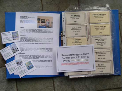
Binder with labels; signs with contact details on how to buy and business cards


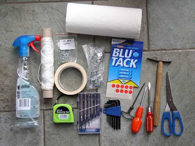
From top to bottom and left to right: paper towel, window cleaner spay, cord, screws, masking tape, framing rings, Blu Tack, measuring tape, 6 piece precision slotted screwdrivers set, Allen keys, hand drill, screw drivers, framer hammer and a pair of scissors

  • Repair kit for framed works: screws, screw drivers, hammer, string, rings and a pair of scissors.
  • Measuring Tape: To check appropriate spacing between paintings.
  • Window cleaner product and paper towels: A quick wipe to remove dust and finger prints from glass.
  • Blu Tack®: I use it to stick the labels below the paintings as well as my bio information and the signs with my contact details for people who want to purchase a painting. Another use of this product consists in sticking two balls of Blu Tack at the bottom of a frame in order to make it steady. If paintings are hung on a metal wire, it may be the only way to keep them from being ajar.
  • Precision screw drivers and Allen keys: Some hanging rods have small screws for the hook.
  • Masking tape: Now, I use masking tape to seal-off bubble wrap around my paintings. I found that it works better than packing tape as it comes off without damaging the bubble wrap (this way, I am able to reuse it over and over).

In addition to what is shown in the photographs, I also have the following items:

  • Digital camera: I always take a series of photographs of the exhibition when I finish setting it up. It serves a dual purpose: first for my record and future marketing use; then to complete my inventory and add the details of the exhibition to the comments section for each painting on display.
  • Pen and paper (or a small notebook): You never know when you need to take some notes.
  • Details for the venue: The email with the address of the exhibition venue, the name of the person in charge of the exhibition space and a telephone number to call in case of problems. If you are running late, you want to make sure you can call as a courtesy. The other time when a phone number is handy is when you don’t find the venue or the venue is closed the public and you cannot get in.
  • Some large IKEA carrying bags: You can buy them cheaply from their store. These blue bags do not look nice, but they are sturdy and ideal with their long handles to carry paintings. I also put in the bags all the pieces of bubble wrap in as I unpack the paintings in order to keep the space tidy when I set-up.

They best way to make sure you have a complete kit ready at all time is to keep everything you need in a separate bag of crate. This means you may have to buy duplicate tools and material.

If you cannot afford the cost or do not have the space to get duplicate of some of your tools, then you should put together a checklist with the content of your kit. There is always something to do at the last minute and, with the pressure to get ready, you don’t want to forget a vital piece of equipment. Having a checklist will bring you peace of mind (why do you think surgeons and pilots use checklists?)


Add to Technorati Favorites

Monday, 30 November 2009

New exhibition

I have a new exhibition at RWE nPower in Swindon for the whole of December. It is only accessible to RWE's employee but it is still a great opportunity as it is their headquarter.
I have 27 paintings on show (oil paintings and watercolour paintings)

Tuesday, 24 November 2009

Museum of Contemporary Art Kiasma in Helsinki


Kiasma was opened in May 1998. The building, located right in the centre of Helsinki (Finland) was designed by the American architect Steven Holl. The design is pure with curves and white walls with plenty of natural light coming from the roof.


The main entrance with the reflection in the window of the nearby statue of Marshal Mannerheim.


The curved roof of the building is made of solid zinc that has been patinated to emulate the effect of about 5 years' weathering.


One thing that modern museums got right is to create an uncluttered space for visitors to enjoy the art and to give ample space for the works to breathe.

For copyright reason, I could not take any photographs of the art inside the museum. Most of the works on exhibit are by Finish artists.

In the exhibition “Traces”, Darth Vader with a bendy neon lightsaber by Anssi Kasitonni made me smile. You can see it on
Anssi Kasitonni’s website. I like modern art when it is humorous, crafty, clever, or makes use of new materials in interesting ways.


Another sculpture I liked was Drop by Heikki Ryynänen. It shows a drop falling in four different stages (as if the scene was a sequence of high speed photographs). Forms made of painted birch wood are beautiful and this is a clever way of implying movement with stillness.


Practical information

Kiasma is open
Tue: 10-17
Wed-Fri: 10-20.30
Sat-Sun: 10-18
Closed on Mondays

Tickets 7e/5e
Under 18 year-olds free.
Free admission on the first Wednesday of the month at 5-8 pm.

Kiama museum website


Add to Technorati Favorites

Wednesday, 18 November 2009

Ambroise Vollard on Renoir


“I have been a model a number of times. Renoir, in particular, painted several portraits of me, including one as a matador. A that time, Renoir was seventy-five. Crippled with rhumatism, he carried on working with the enthousiasm of youth. I can still see him, going painting plein-air, carried in an armchair by the tall Louise and Baptistin, the gardener. Brushes had to be tied-up between his fingers.”

Ambroise Vollard in “Recollections of a Picture Dealer”


Ambroise Vollard Portrait, oil on canvas, 102x83 cm,1917r, in private collection.
Source: Wikimedia


Add to Technorati Favorites


Friday, 13 November 2009

Helsinki's harbour - oil painting


I painted this scene from a reference photograph I took with my mobile phone in Helsinki last week, one day after the first snow fall of the year. This part of the harbour runs in parallel with the street named Docksgatan.


Helsinki's harbour - oil on panel by Benoit Philippe


In order to get the subject right, I had to shot the picture from afar and use the ditigal zoom, which means loosing some resolution. The resulting photograph is not very luminous and a little blurry. However, I found that sometimes, bad photographs make good reference for painting because they don’t dictate too much. To get the most out of it, I looked at the picture on the screen of my laptop while painting rather than trying to work from a print out.

I selected seven colours that I found suitable to compose a winter palette:

  • Titanium White
  • Chrome Yellow
  • Transparent Yellow Oxide (by C. Roberson & Co.)
  • Terra Piozzuoli (by Mussini / Schmicke)
  • Vermilion red
  • Phtalo blue
  • Ivory Black

Apart from Phtalo Blue that I used to mix cool greys and the greenish grey of the water, these colours are on the warm side. Terra Piozzuoli was useful for the brick walls of the docks.


Add to Technorati Favorites

Wednesday, 11 November 2009

Cretacolor pencils product test


I bought some new pencils manufactured by Cretacolor for sketching.


I did a quick drawing to test then.


Waiting at Helsinki airport - by Benoit Philippe


The Monolith Graphite pencil

The Monolith Graphite is a woodless pencil. The pencil is a pure graphite lead covered with a thin lacquer coating. The feeling is strange at first as the pencil is colder than a wooden one but the lacquer coating is really smooth and comfortable.


I chose a 9B as I wanted to be able to get very dark marks. It is easy to get a good spectrum of tones from very dark to very light, just by varying the pressure of the lead on the paper. Because there is no wood, you can achieve a broad stroke with the side of the lead or fine lines with the point.

These graphite pencils can be sharpened with a regular sharpener and are available in six grades: HB, 2B, 4B, 6B, 8B, 9B.


AquaMonolith pencils

These aquarelle pencils are made out of a water-soluble lead protected with a thin coating of lacquer.

The diameter of the lead is 7 mm is and as there is no wood, it is easy to obtain broad strokes by inclining the pencil when working.

The AquaMonolith pencils can be sharpened with standard sharpeners.

I bought the following colours:


Ivory Black – Number 252 50


Dark grey - Number 252 35


Blue Grey – Number 252 37


and the Light Grey – Number 252 32


The verdict

These pencils are heavier than wood pencils. This is an advantage when it comes to balance and precision but could be more tiring over a long drawing session. The possibility to have fine lines with the point and broad strokes with the side of the cone is a definite plus.

The quality of the graphite and water soluble graphite is very good and these pencils offer a great range of tone and texture (from rough to subtle washes when brushed over with water).

Overall, these pencils are great products worth adding to your sketching kit.


Add to Technorati Favorites

Monday, 9 November 2009

Looking outside - mural


This is different from my usual paintings. My youngest daughter wanted to have a window painted in her room, with a cat looking outside. I painted it in one week, while the family was away.


Looking outside - mural in oil painting by Benoit Philippe


Looking outside (detail)


Thursday, 5 November 2009

Painting the sky


This article was first published in "Frequency Magazine" – November 2009.


If you are a landscape painter, you already know that the sky plays a major role in your overall painting. In order to avoid a bland division of space, I would advocate not placing the horizon line right in the middle of your painting. This means that, if you choose a low horizon, the sky could take more than two third of the painted surface and, if you go for a high horizon, around one third of the surface. The last thing you want is a boring sky.


Weymouth Bay - Oil painting by John Constable - National Gallery (Source: Wikimedia)


The sky is more than a backdrop on a theatre’s stage because it conditions the quality of the light and therefore the brightness and tone of all colours. A blue sky reflects on all objects in the landscape. In the same way, a stormy sky will shed a grey light on the land and bring out very specific colours. If you work from photographs, you cannot just take a scene captured on a sunny day, change the colour of the sky to grey and hope it works as a rainy day scene. The whole palette is affected by the quality of the light and this artificial juxtaposition would just feel wrong.

There is nothing like a blue sky. What I mean by this is that you will find many types of blue colours in the sky, many nuances and variations; and this is what makes the sky so interesting to paint. An excellent way to analyze and compare the colour of the sky in different areas is to take a sheet of white A4 paper in portrait format and cut out two small square windows (one square inch will do) ; one two inches from the upper edge and another one two inches from the lower edge. Then, hold the piece of paper against the sky you are observing and compare the two “samples” of sky in the square windows. Because you isolate these two areas, you can see the difference in colour.

Imagine that the sky is like a high ceiling that goes down as it recedes and merges with the horizon. The colour of the sky fades and its intensity lessen as it goes towards the horizon.

Let’s now talk about clouds. They are the most interesting features as they bring diversity, volume and movement to the sky. They also have an abstract quality that fires the imagination. Do you remember looking at clouds as a child and finding all sorts of figures, animal and objects in these morphing clouds?

Clouds come in various forms and shapes. Be aware that different types of clouds are found at different altitudes: high level clouds include Cirrus; medium-level clouds include Altostratus and Altocumulus. Stratocumulus, Stratus, Nimbostratus; and Cumulus are all low-level clouds. Finally, a Cumulonimbus is a cloud that develops vertically. As painters, we are interested in different texture and clouds can be transparent like Cirrus or opaque and creamy like Cumulus.

Here are some pointers when you paint clouds:

  • Clouds are not flat but three dimensional objects subject to the rules of perspective. Think of them as rounded objects lit by the sun.

  • As they recede towards the horizon, clouds appear smaller.

  • Introduce variety in the shape of your clouds, while maintaining the characteristics of the family they belong to.

  • Take note of the position of the sun and make sure your light and shadows are consistent in all your clouds.

  • Clouds are not white. They also reflect the colour of the sky. Reserve the white for highlights.

  • Clouds have shadows in them. The difference is sometime subtle but you will always have some type of shadow areas with slightly darker tones. I like to use a mix of ultramarine with a hint of Yellow Ochre and Carmine Alizarin to create shadows in clouds.

  • By default, you should treat the edges of clouds as soft edges. Even if you see a well defined outline of a Cumulus, chances are that some blending happens on the edge due to the misty nature of clouds. Also observe how the tone at the base of clouds is very close to the tone of the sky touching such a base, so that an optical blending happens between the two.
The best way to capture the variety of the sky and clouds is to go out and do some plein-air painting. During windy days, clouds move fast and if you are inexperienced, I would recommend that you take a couple of reference photographs for your peace of mind. When you paint from nature, quickly draw the general shape of the clouds, mark their position and outline their shadows. You can make some adjustments and refine them after you have painted the colour of the sky.


Add to Technorati Favorites

Monday, 2 November 2009

Pulteney Bridge - oil painting


I did this painting on location one week ago. The weather was good but windy.


Pulteney bridge (Bath) - Oil on canvas (12" x 10") by Benoit Philippe


The bridge, located in the city of Bath in Avon (England), was designed by the architect Robert Adam in the Palladian Bridge. Completed in 1773, the bridge was named after Frances Pulteney, the heiress of the Bathwick estate. It is one of the few bridges in the world with shops build across the bridge on both side of the road

Wednesday, 28 October 2009

Why I never liked the “Lunch on the grass” by Edouard Manet

“Le déjeuner sur l'herbe” (the title can be translated as "Lunch on the Grass") is a large painting on canvas (2.08 m high and 2.645 m large) painted by Edouard Manet in 1862-1863. The artist exhibited it at the Salon des Refusés and it sparked controversy at the time because it featured a female nude with men dressed in contemporary clothes. It is interesting to note that mythical scenes with nudes were perfectly acceptable and on display in the Louvre museum.


I saw the painting many times when I visited the Galerie du Jeu de Paume in Paris, where it was exhibited until 1986, before being transferred to the Orsay museum.

The reason I don’t really like this painting is because of its inconsistencies that break the realism pact.

Rather than being blended into the surrounding nature, the figures are superimposed onto the landscape as if the landscape was just an after-thought. This is particularly flagrant for the women taking a bath in the background. You can see how she completes the three figures in the foreground, fitting into the triangular shape of the overall composition. However, compared to the tree and the boat on her right, she is out of proportion. To be in scale with the landscape where she is supposed to be, she would have to be twice as small as she appears on the canvas.


The second element that destroys the illusion that these four figures are really having lunch in the middle of the woods is the base of the trees. Many of these trees do not seem to have roots. The trunks are like straight lollipop sticks planted into the ground and the large tree by the side of the bathing women’s head looks stuck into the water.


Presented with these anomalies, I cannot refrain from thinking that these figures, far from being outside surrounded by nature, are in the artist’s studio and on a theatre stage with a painted backdrop.


Related resources


Wikipedia article on “Lunch on the grass”

Monday, 26 October 2009

Lunch break in the Yosemite - oil painting

This oil painting is part of the Californian paintings that I plan to exhibit in the first half of 2010.


Lunch break in the Yosemite - oil on canvas (18” x 14”) by Benoit Philippe

Friday, 23 October 2009

Working on the same subject in different media


I work in oil, watercolour and pastel and enjoy these three media. When someone asks me which one I prefer, I usually answer that it depends on the subject. This is true in 99% of the cases, but from time to time a subject is equally suitable for different techniques.

I find interesting to work the same subject in different media to see how the works come out in a distinct way. As you become more familiar with the subject, the mind relax and I enjoy playing with textures and colours.

“Summer walk” is one of these landscapes that I could see in any media. The composition is simple yet strong. The combination of the path leading to the trees, the fields and the cloudy sky offered great opportunities to develop the composition, colours and textures.

I left several months gap between each version. I started with the watercolour, then went to do the pastel and finished with the oil painting (hence its title “The last summer walk”). I varied the size of the works and used slightly different formats. Each one was a different way to interpret this summer scene.


Golden field - Watercolour by Benoit Philippe
The watercolour was all about transparencies. I layered washes of colours and I wanted to play with colours bleeding one into the other. Shadows in the trees are blue as I built them up with Ultramarine blue. There is a light hearted feel in this painting.


Summer walk - pastel (6" x 8") by Benoit Philippe


With the pastel, I put the emphasis on texture. I was looking for an impressionist feel, as if I had painted on raw linen canvas. The rough Fabiano watercolour paper prepared with a coat of Sanfix pastel gesso from Art Spectrum did the trick. Because of the small format of the work (6” x 8”), the texture of the paper is even more prominent. To reinforce the painterly nature of the pastel, I framed it under glass without any mount (just separators between the work and the glass, hidden by the rim of the frame). The brightness of the pastel pigments and an application in non-blended strokes concurred to the brightness of colours.


The last summer walk - Oil painting on canvas (20” x 16”) by Benoit Philippe


Finally, the oil was painted in more subdued tones compared to the pastel and the watercolour versions. In a way, the two first paintings were liberating and I could use more white than I usually do without craving to put bright colours. With this painting, my aim was to achieve a great sense of depth and perspective. I used a lot of blending and smooth transitions between tones to lead the eye towards the horizon.

The advantage of working a subject as a series of pieces in different media is that you can concentrate on one particular aspect for each work. I treated each painting as independent from the next. I did not look at the work already painted when working on the next one. In fact, the gap I left between each work reduced undue influences. However, it is clear that “The last summer walk” (the oil painting that came last in the series) would have been different without the watercolour and the pastel paintings that preceded it.


Wednesday, 21 October 2009

Art writings online for free

Vincent van Gogh's letters

There is a new edition of Vincent van Gogh's letters in six volumes with annotations and numerous illustrations: Vincent van Gogh - The Letters: The Complete Illustrated and Annotated Edition by Leo Jansen, Hans Luijten and Nienke Bakker.

This publication coincides with an exhibition (until 3 January 2010) at the Van Gogh museum in Amsterdam presenting a selection of these letters. The exhibition will then come to England at the Royal Academy of Art in London from 23 January 2010 until 18 April 2010. The good news is that you can also read the letters online.

Van Gogh - The letters is an extraordinary web resource. The site gives you access to the letters in their original language, an English translation and the facsimile. Even better, you can search by correspondent, locations, or search all the letters using key words.


Self-portrait - Oil on cardboard 1887 (42 × 33.7 cm) - Collection of The Art Institute of Chicago. Source: Wikimedia


Other artists’ writings available online for free


Leonardo da Vinci


are both available on the Guttenberg Project site

John Ruskin (1819-1900)


James McNeill Whistler (1834-1903)


Sir Joshua Reynolds (1723-1792)


If you know about other artists' writings on the internet, please share your source by leaving a comment.

Friday, 16 October 2009

Raoul Dufy: bringing flat colours to life

This article was first published in my newsletter "Notes From My French Easel" – September 2009. 


Raoul Dufy was a French painter born in Le Havre (Normandy – France) in 1877, where he was able to study the work of Eugène Boudin in Le Havre Museum. He attended the Ecole Nationale Supérieure des Beaux-Arts in Paris at the same time as Georges Braque. In the early stage of his career, he was influenced by Camille Pissarro and Claude Monet and some of Dufy’s paintings done on the beaches of Normandy have a clear connection with Monet’s paintings of the same subject.

Dufy was most impressed when he saw in 1905 the painting “Luxe, Calme et Volupté” by Henri Matisse and he turned to Fauvism. Dufy produced in this style some vibrant and colourful paintings during this period.


Le Havre museum has a good collection of works by Raoul Dufy

Later he went for flat colours and line drawings, with scenes of beaches, crowed avenues, yachting, horse racing and views of the French Riviera (in the South of France). Some parallels can be drawn with Henri Matisse’s works, although he solved the issues raised by using flat colours in a different way.

Matisse and Dufy shared a taste for decorative patterns found in fabrics and wallpapers and used them to introduce variety in their compositions of flat colours. Both Matisse and Dufy were relying on a combination of flat colours and line drawing in their paintings, but with Dufy the line is more open and less definitive.

One feature that makes Raoul Dufy stand out is his use of what he calls “the theory of colour-light”. He wrote in one of his notebooks: “By following the light of the sun, one wastes his time. The light in painting is altogether something else, it is a light of repartition, of composition, a colour-light.” (Quoted in the catalogue of the exhibition “Raoul Dufy – Le Plaisir” – Musée d’Art Moderne de la Ville de Paris). The idea is to make light radiate from the colour rather than having it brought to life by the external light of the sun (“I paint with my colour-light which get its shinning power from itself, where in reality, the sun brings colours to life by lighting them.” - Notebook 9, pages 44 – MNAM documentation).

In some of his late water lilies paintings, Monet drew outlines for the lily pads that were shifted from the colour of the pad, creating some interesting tension and movement in his work. Raoul Dufy took it one step further by having some abstract blocks of colour in the background of his painting very loosely connected to the drawing of the subject in order to create a certain mood and add another dimension to the painting. It seems to me that Dufy transposed in his oil paintings a technique he found when he created ceramics.

While being a successful artist during his life time, Dufy suffered from being labelled as a “decorative painter”. He branched out and created ceramics, some fabric designs for the fashion designer Paul Poiret and he produced a great number of tapestries. Art critics marked him down for not staying in the field of “pure art” (if such a thing exists).

Where to see Raoul Dufy’s worksArtcyclopedia provides numerous links to museum having works by Raoul Dufy in their collection.


Add to Technorati Favorites

Wednesday, 14 October 2009

The Artpoint interview


During the Swindon Open Studios, Swindon Viewpoint went around and interviewed artists taking part in the event. In this 3 minutes Artpoint interview, I talk about my painting Relaxing at Mevagissey.


A “new” Leonardo da Vinci

A picture executed in chalk, pen and ink and previously known as Young Girl in Profile in Renaissance Dress (33 x 23cm or 13 x 9in) has been identified as a work by Leonardo da Vinci, thanks to a fingerprint in the top left corner of the vellum.


Peter Paul Biro, a Montreal-based forensic art expert, found the fingerprint when he examined the work using a multispectral camera. The fingerprint matches one on Leonardo’s St Jerome in the Vatican. Carbon-14 analysis of the vellum gave a date range of 1440-1650, consistent with an attribution to da Vinci.
Martin Kemp, Emeritus Professor of History of Art at the University of Oxford, has rechristened the picture, La Bella Principessa. He has identified the women as being Bianca Sforza, daughter of Ludovico Sforza, Duke of Milan (1452-1508). He has written a book about the discovery (to be published)

Leonardo da Vinci is known for using his palm and finger to blend colours in his works.

Timothy Clifford, director-general of the National Galleries of Scotland from 1984 to 2006, commented: “What is so exciting is that no drawings by Leonardo on parchment are known, although we do know from the Codex Atlanticus that Leonardo was interested in the technology of drawing, in colour, on vellum.”

In the paper version of his article “How I know the new portrait is by Leonardo”, he details “A six-point Leonardo test”, he also made an interesting point: “Leonardo, unlike any of his contemporaries, was left-handed and so shaded from the top left to the bottom right.” This somehow corroborates the conjecture I made in my previous article The left-handed conjecture


Read the press articles


Related blog articles

Monday, 12 October 2009

Canvas formats

Before I came to England, it was obvious to me that canvasses came into three types of formats: Landscape (“Paysage”), Portrait (“Figure”) and Seascape (“Marine”). Then I realised that this classification was very French and that different countries had different formats.

Nowdays, with global trade, you can find or get these various formats in pretty much all countries.

Canvasses formats in France


You can see that, for a given canvas numbers, the longer side is common to the three formats (Landscape, Portrait and Seascape). There is a practical reason for this: it reduces the number of off-cuts in a roll of canvas (see below the first figure showing the three formats one on top of the other).


The interesting point is that these formats give you a different feel:
  • Landscape: Rectangle
  • Portrait: Rectangle going towards a square format
  • Seascape: long format ideal for pamoramas. This format is the less usual one

In Belgium, Germany and Italy, you find some «metrics formats»:


Winsor & Newton offers stretched canvasses


It would be interesting to see how the size of canvasses has evolved over time and when canvas sizes became standardized.