Tuesday, 29 January 2008

Rotonde du Parc Monceau - Final Oil Painting

I started this painting on location in Paris. I then worked again on it in the studio. In fact there is very few I did not touch:
  • I glazed over the sky,

  • Refined the building, getting more body to the colours

  • Corrected the curves of the building

  • added a runner. There were many joggers when I painted this view on site and I thought it would look artificial not to have any figure in a public garden.

  • The bushes on the left side catch the light.


Rotonde du Parc Monceau - Oil on Canvas by Benoit Philippe


Despite the fact that I worked again on the whole painting and made some additions, I think I managed to keep the freshness that you get when you paint on location. This is an advantage of starting a painting on site and finishing it in the studio.


Add to Technorati Favorites


Friday, 25 January 2008

Collecting Art: The Fair Way


If you’re planning on shopping at an art fair, an art correspondant from the Times who goes to the London Art Fair explains how to hunt out the best in show. Read her article: The finest of the fair by A. S. Byatt.


Art fairs are less intimidating than galleries. It is also a chance to see a vast array of different works. Here are some notable quotes from A. S. Byatt’s article:

“An art fair is more like a souk or like Vanity Fair – corridors and levels of booths containing mingled brightness, beauty, oddness and kitsch.”

“Over many years we have revisited the same galleries, but the art fairs still offer the pleasure of looking without being talked to or persuaded.”

“The real joy of an art fair is finding the unexpected.”


Related articles


  • The art of collecting : a news report video by Judith Greer, Frieze veteran and co-author of 'Owning Art', demystifies art collection and suggests how to get the most out of the fair.


  • Samson Spanier, assistant editor of Apollo Magazine, maps out the hazards of the modern art market. Read the article.


Add to Technorati Favorites


Wednesday, 23 January 2008

Art Material – The Tube Squeezer

What is the tube squeezer?

The tube squeezer (or tube wringer) is a simple tool to squeeze all the paint out of your paint tubes. You just open up the tool, place your half-empty tube between the two rollers, close the squeezer and turn the key. Tube squeezers come in plastic or metal versions.


ShinHam Tube Squeezer


The tube squeezer concentrates paints to keep them soft. Because it lays the walls of the tube flat together, it also reduces risks of breakage.

Another possible application of this tool is as a paper corrugator for craft.


Why bother?

High quality oil paint can be expensive. If you pay £27 for a 40 ml tube of Cerulean Blue, you want to get the last drop of it. The math is easy: if you get only 10% more paint out of the tube, you save £2.7. If you add-up all these little savings along the way, this tool pays for itself.


Add to Technorati Favorites


Monday, 21 January 2008

A Brush with Nature – A Triton Museum of Art Exhibition

While in the US last week, I had the chance and pleasure to visit the Triton Museum of Art in Santa Clara, which exhibits a selection of California plein air paintings by 30 contemporary painters. The works are mainly oil paintings, but also some pastels.


Going around the exhibition, I noted several works I liked:

  • “Crest Canyon Vista”, oil canvas on board by Jan d’Alvise.

  • “Glowing Horizon”, an oil on canvas board by Albin Selora . The artist uses a luminous palette and the purple and blue sky works very well against the yellow ochre of the ground.

  • “Morning Light”, pastel by Terri Ford displays a striking blue sky with some turquoise blue and deep purple shadows. The light catches the top of a row of trees on the right side of the pastel.

  • “Red Barn”, oil on panel by Nancy McDonald: This painting features a typical American barn. The artist masters the neutral tones to render the dry grass and the road. The Composition is interesting, as almost no sky is visible.

  • “Alameda crane”, pastel by Ann Mc Millan. The vivid colours of this pastel caught my eyes as soon as I entered the exhibition room. The composition is deceptively simple, with the crane as the focal point and one boat on each side. The sky is green blue and the concrete structure of the crane outlined by the afternoon sun.

Several of the artists exhibited belong to the California Academy of Painters, like Brigitte Curt and Jim Smyth.

Many artists in the exhibition belong to the
Bay Area Plein Air Artists group and you can see some of their paintings by following the links below:

Where and when


A Brush with Nature
California Plein Air Painting

January 19 – 22 March, 2008

Triton Museum of Art
1505 Warburton Avenue
Santa Clara, California 95050

Monday - Wednesday: 11:00 a.m. to 5:00 p.m.
Thursday: 11:00 a.m. to 9:00 p.m.
Friday - Sunday: 11:00 a.m. to 5:00 p.m.

FREE admission


Add to Technorati Favorites


Friday, 18 January 2008

Picasso on finding new subjects


« Le peintre qui fait un pas en avant dans l’histoire de la peinture est celui qui a découvert un nouveau sujet. » (Picasso, quoted in « Vivre avec Picasso », Françoise Gilot and Lake Carlton, Calmann-Lévy Publisher, 1973, page 277)

We can translate this as:

« The painter who moves a step forward in painting history is the one who has discovered a new subject.»

Related article

Claude Monet Stole My Subject


Add to Technorati Favorites


Wednesday, 16 January 2008

Storing Your Exhibition Labels

When exhibiting my work, I would create a label for each painting. At the end of the show, everything would go in a plastic bag in the rush of taking down the exhibit... labels ended-up torn or bent. The next exhibition coming, I would print again the labels because I could not find them.

In an effort to get more organised, I started to stack all the labels together like a pack of cards and secured them with an elastic band. At least I could find the labels, but I also had to go through the whole deck each time to find the correct label.

Then I found out that plastic sleeves sold in office supply stores for business cards work very well for art exhibition labels that are of similar size.


Multiple advantages to this storage method:


  • The plastic sleeves are transparent and it is easy to see the labels without taking them out of the sleeve. You can actually store 2 labels back to back in each slot. It only takes seconds to scan a page and find the label you are looking for when to put the exhibition up.


  • When I take down the exhibition, I just store back the labels in the plastic sleeve in no particular order.


  • These sleeves are sturdy enough to protect the labels: no more bent corners.


  • You can store your plastic sleeves in a ring binder. All you labels are in one place, easy to find, easy to carry around, and the binder provides extra protection for the labels.


Add to Technorati Favorites


Monday, 14 January 2008

John Constable on painting from nature

Memoirs of the life of John Constable

When it comes to discovering John Constable’s thinking on painting from nature, the best is to hear it from the master himself. “Memoirs of the life of John Constable” by John Leslie is a book mostly composed of John Constable’s own correspondence, so you can hear him speak and grow as a landscape painter.


John Constable Self-Portrait 1806Pencil on paper support: 190 x 145 mm (Tate Gallery - London)

John Leslie knew Constable. His acquaintanceship with the artist began in 1817. Being an artist himself, Leslie was in the best possible position to bring Constable’s writing to posterity. The added advantage is that the closeness of style between the biographer and his subject makes this biography a cohesive work. Leslie put the letters in order, filled the gaps and explained some of the references made in the letters.

Painting from nature
Son of a gentleman farmer, Constable grew-up in the countryside at East Bergholt in Sufolk and had a sincere devotion to nature. He admired the infinite variations of the landscape:

“But such it is the enviable state of a painter that he finds delight in every dress nature can possibly assume.” (May 23rd 1803 - page 13)

“The world is wide; no two days are alike, nor even two hours; neither were there ever two leaves of a tree alike since the creation of the world; and the genuine productions of art, like those of nature, are all distinct from each other.” (Note found by Leslie in Constable’s papers – page 233)
Early on in his career, he decided to work from nature, making sketches and small studies on site:

“I am determined to finish a small picture on the spot, for every large one I intend to paint. This I have always talked about, but have never yet done.” (February 1814 - page 39)

“I live almost wholly in the fields, and see nobody but the harvest men. The weather has been uncommonly fine; though we have had some very high winds that have discomposed the foliage a great deal.” (East Bergholt, August 27th, 1815, letter to Miss Bricknell – page 49)


Boat-building near Flatford Mill (1815) Oil on canvas (50.8 x 61.6 cm) by John Constable (1776-1837) V&A museum collection. According to John Leslie, Constable painted this landscape entirely on location, from nature.


Because of the changing beauty of nature, the only safe option is to try to match it, even if Constable saw this goal as a hard task:

“Nothing can exceed the beauty of the country; it makes pictures appears sad trumpery, even those that have most of nature; what must those be that have it not?” (Letter to Leslie, July 5th, 1831 – page 165)

He was very much in favour a making studies, learning by observing and discovering, pencil in hand. Leslie described Constable’s cloud study and how the artist would take notes of the direction of the wind and other elements to better understand the setting:

“They are painted in oil, on large sheets of thick paper, and all dated, with the time of day, the direction of the wind and other memoranda on their backs. On one, for instance, is written ‘5th of September 1822. 10 o’clock, morning, looking south-east, brisk wind at west. Very fast and fresh grey clouds running fast over a yellow bed, about half way in the sky. Very appropriate to the “coast at Osmington”.’
Constable’s hard work to transcribe nature is best summarised in the following statement he made when giving the last of six lectures on the history of landscape painting: “The art of seeing nature is a thing almost as much to be acquired as the art of reading the Egyptian hieroglyphics.” (Sixth Lecture, 25th July 1836 – page 277)

Constable opposed to the true observation of nature – which he embraced – mannerism – which he despised. To him, “The deterioration of art has everywhere proceeded from similar causes, the imitation of preceding styles, with little reference to nature.” (Lecture 2, June 2nd 1836 – page 266). The imitation of preceding style is what he called mannerism and “Manner is always seductive. It is more or less an imitation of what has been done already, - therefore always plausible.” (Page 235)

His practical advice was to always go back to nature and focus on its reality without any pre-conception: “When I sit down to make a sketch from nature, the first thing I try to do is, to forget that I have ever seen a picture.” (Quote reported by Leslie – page 239)

Constable did not discount copying masters as a way to learn the correct technique, but he preferred a painter in the field than a painter in the academy. Imitation of masters brings you to a certain technical level; imitation of nature brings out the true artist’s originality.

Read the book

Memoirs of the Life of John Constable: Composed Chiefly of His Letters (Arts & Letters)


Friday, 11 January 2008

A Big Thank You To Empty Easel Blog


Empty Easel blog just reviewed my work. It is very exciting to read someone else's comments on your paintings.

The article is titled:
Benoit Philippe:Impressionist Watercolor Paintings from the United Kingdom.


The first interesting point is the choice of works from my watercolour portfolio. The three selected paintings would have made my selection too. Here are few comments that I particularly liked:

"Each of Philippe’s watercolor pieces reflect his French Impressionist style—you can see it in the loosely painted foliage and the multi-colored water—and yet there’s some great detail work in many of his paintings too."

and:

"Philippe has the natural eye of an Impressionist, finding beauty in the ordinary things of life and nature, like this sunset behind a row of trees."

I am convinced that you can find "beauty in the ordinary things of life", which I consider one of the privileges of artists. I already discussed this in The Art Of Ordinary.

While you visit the Empty Easel Blog, make sure you go through their excellent articles section.

Thursday, 10 January 2008

Learning from the Astronauts

I listened to a BBC4 radio show called Frontiers. The journalist Andrew Luck-Baker went to NASA’s Goddard Space Flight Centre where astronauts are preparing for the fourth servicing mission to the Hubble Space Telescope scheduled for August 7, 2008.

Andrew talks to two crew members, Scott Altman who commands the space shuttle and the astronaut John Grunsfeld. Andrew also talks to Jeff Hoffmann a former astronaut who is now part of the support team at the Centre.


One of the astronauts explains the training they have:


“When we train to service Hubble, we do an extensive amount of analysis and choreography to try to make sure everybody knows where the have to be at any given minute, all the way down to sometimes which arm we are going to use and which minute to pass things back and forth so that with all these tethers which are holding everything we don’t get a big snarl that will delay things by five or ten minutes.

You might ask: ‘do we execute this space walk that way?’ and usually not, because there are always surprises. But we find that if we are really prepared to execute the plan the way that we script it and practice and practice and practice and train here in the clean room at Goddard, that when these surprises do come-up, we are able to quickly overcome them
and keep moving. The really unique thing about having people in space is that we are able to adapt in real time, to get over and continue to work.”


What Astronauts can teach to artists?


  • Training, Training, Training. Training is the time when you analyze, when you try new things and learn by making mistakes, correcting and adjusting your technique and your vision. If you are a painter: paint. You will learn a lot. Training also means learning from others, attending workshops, going to museums to study the masters, read art books.

  • Think of what you do in term of choreography. Art is a physical activity as much as a mental one. When you paint, your hand, your arm and your shoulder are learning. Gestures become second nature. You want to reach a state of flow, where you are so much into what you are doing that you don’t need to think about how you should be doing it. I fully agree with Picasso when he said: “It’s the hand that does everything, often without the intervention of the mind.”


  • If you rehearse, you become apt to cope with surprises when they come. You may be caught by surprise when someone asks you a question about your art or yourself. If you have rehearsed your pitch, you can come back to known territories after the surprised has passed.


  • The most important lesson we can learn from astronauts is that there is no dream that can’t be fulfilled with the will to succeed, patience, passion and dedication… even going into space or landing on the moon.


Add to Technorati Favorites


Monday, 7 January 2008

Check your values: working with tones

Colours have 3 distinct characteristics. You need to distinguish them to be able to mix your colours and achieve a desired effect:
  • Hue is the chroma. This is the generic name of the colour: blue, red, yellow, etc.
  • Value: how light or dark is the colour? Value is measured by reference to the grey scale. Dark tones, mid-tones and light tones refer to the value of a colour.
  • Intensity: this characteristic describes the brightness or strength of the colour. The two extreme on the intensity scale would be bright at one end and muted at the other end. Practically, you can mute a colour by mixing it with its complimentary colour.

In this article, we concentrate on values. This creative exercise will help you to become more conscious of values and teach you how to simplify your vision of tones.


Material

  • Photographs cut out in newspapers or magazines (black & white photographs work best, but colour photographs work well too)
  • A black marker (or any one with dark ink)

The Exercise

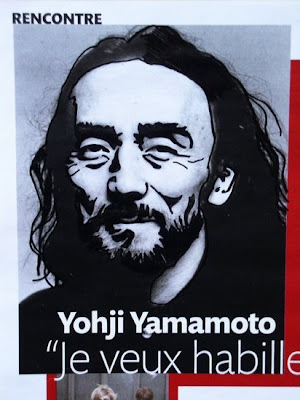
The exercise consists in blackening the shadow areas of the photograph in order to obtain, at the end, a pure black and white drawing.

You cannot use hatching for mid-tones. This is a binary representation: an area is either black or white. The rule here is that a shadow “on the dark side” becomes black.

This exercise is more difficult that it seems at first. Here are 5 tips to help you along the way:


  • To make the exercise easier, select photographs with good contrast, where shadows are well defined. Avoid dull weather photographs or foggy ones.
  • Go first over the darkest areas of the photograph, which are already black or almost black.
  • If you see some dark lines (for instance the eye lines in a portrait), mark them with your black marker.

  • For areas that gradually fade from light to shade, determine first the border (e.g. at what point the shadow goes “on the dark side”) and trace it with a line. Then blacken the shadow area.
  • If you are in trouble and cannot decide where to draw the line between a light and a dark area, squint. This removes the mid-tones and the dark zones will appear.

Examples

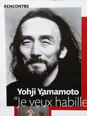
For the first example, I used a black & white portrait of the fashion designer Yohji Yamamoto that I found in a magazine.


Portraits are good candidates for this exercise as the photograph is often taken in a studio by a professional photographer and under good lighting conditions.


The result is, by definition, more contrasted than the original photograph but you can still recognise the sitter.

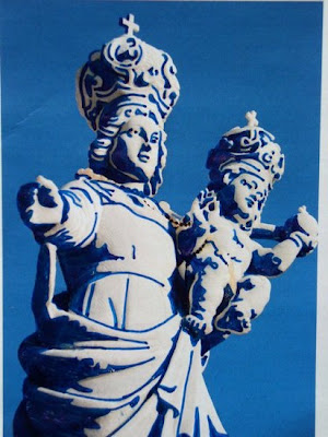
The second example uses a colour photograph of a statue. Although the photograph is in colour, it is almost monochrome and therefore suitable for this exercise.


Some areas proved more difficult to handle (like the shadow underneath the faces) because the shadow was fairly light and it seemed a stretch to blacken it all.


A number of details have been lost when blackening the shadow areas in the dress. This is normal: remember that one benefit of this exercise is to teach you how to simplify your vision of values and build a strong composition. This will be a great help for the block-in process when you paint with oil or acrylic.


There are other exercises you can do to work on tones (like making a linocut), that I will cover in later articles. This one has the advantage to be quick, cheap and can be done almost anywhere, provided you put your hand on a newspaper and you carry a pen or a marker.


Add to Technorati Favorites


Friday, 4 January 2008

Wrap-up Your Sale


In November, I sold a few paintings during an exhibition. There were mostly Christmas presents, so I decided to go the extra mile and wrap the works with gift wrapping for the large watercolours and gift bags for the small oil paintings.


The buyers would have said nothing if the paintings just came wrapped into some protective bubble wrap, but the paintings looked so much better with their festive wrapping…

This made me think about packaging for artworks and packaging in general.

Once in Montpellier (South of France), my wife and I went to a shop to buy a wedding present. We chose a nice set of breakfast cups and saucers arranged on a painted wooden tray. The shop owner took the time to fashion an elaborate wrapping with Cellophane wrapping, dried flower petals and coloured ribbons. The present looked so much more expensive that it was with this original presentation. It also looked unique.

Another sector that put a great deal of work into packaging is the luxury industry. How would you feel if a bottle of expensive perfume was coming in a cheap square glass bottle and a plain cardboard box? The perfume would not feel expensive. Art is a luxury for many. You don’t buy art as you would buy a dozen of eggs. As an artist, you are not only selling a work of art, you are selling an experience and your packaging is part of this experience.

You may have to adjust what you do based on the cost of the work you sell, but the cost should remain reasonable, in particular if you compare it to the advantages this extra step brings:


  • It saves time for your customer. They don’t have to run around to buy the wrapping paper and take the time to wrap the painting.

  • Even if the painting is for someone else, it’s like receiving a present for your customer when you deliver your painting nicely wrapped.

  • For your customer, this is an unexpected extra. You just created the “free gift” effect. It makes your customer feel good and reassures her or him that spending money on your art was right.

  • It gives you control over the way your work is packaged. The packaging is the first impression the recipient of the painting will get. Your packaging is a good way to develop your branding. Go beyond functionality and get creative in the way you package your work.

  • Ready-to-offer artworks, all wrapped, may be one of your Unique Selling Points (USP), something that other artists don’t do in your area.

I would like to finish with a quote from an article on self-presentation on Behance:


"Spend some time on the packaging your product arrives in. You owe it not only to your clients, but to your work and most importantly, to yourself."


So, what your packaging is telling about you?


Related articles


Add to Technorati Favorites


Wednesday, 2 January 2008

Rue de Rivoli – Oil painting

This painting completed on location shows the Rue de Rivoli that runs along the north wing of the Musée du Louvre. This street was built at the time of Napoleon 1er and is famous for its arcaded facades that extend up to the Place de la Concorde.


Rue de Rivoli – Oil on linen canvas (24 x 18 cm) by Benoit Philippe


I painted this work standing, my pochade box resting on top of the stone of the balusters that enclose the Louvre museum. Rain was clearing away and the sky still heavy with grey clouds.

The wet surface of pavement and the street was catching the reflection of the buildings, the car red lights and the tourists on the sidewalk.


Add to Technorati Favorites