Wednesday, 26 September 2007

Claude Monet stole my subject


There was one of the water lilies paintings in the “Impressionism from France and America” exhibition I visited in August in Montpellier (France).

While I admired the audacity of the treatment, I could not resist the thought that painting water lilies had become almost impossible after Monet. This subject is so associated with Monet that either you paint water lilies as homage to the great impressionist artist or you pass for a pale imitator. Whatever you do, you cannot escape the comparison.

The only option would be to reinvent the subject by taking a radical new approach to it and find a new artistic treatment.

What can we learn from Monet’s choice?
  • When Monet started the series in 1885, water lilies were not an obvious subject for a painting. I am not aware of any other painter who has used them as his main painting subject. In a way, Monet “invented” the subject.

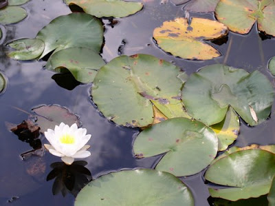
  • This subject has a lot to offer: the curves of the plants, the reflexions in the water, the white flowers acting like a screen to catch reflected lights and shadows, the transparence of the water. The large panels represent the water without edges or boundaries, punctuated with the water lily pads and flowers and clouded by the inverted image of the surrounding trees. Monet turned an ordinary subject into extraordinary paintings celebrating calm and harmony.

  • Monet was a keen gardener and his passion for plants and flowers shows in his paintings. You have to embrace your painting subjects. You should not paint anything that does not appeal to you.


  • This subject was on Monet’s doorstep. I concede that any painter would be happy to have free access to a garden like Giverny’s garden to paint in. The advantage for Monet was the proximity of the studio. In summer, he could paint in the garden and complete plein-air studies. In winter, he would retreat into his close-by studio and work on the large panels, using his studies and working from memory. We often overlook interesting subjects that lay few hundred metres from our houses or even in our back garden.

  • The groundbreaking idea was to blow-up the subject and paint water lilies pads and flowers on large canvases. Monet did around 300 paintings of the water garden, including more than 40 large panels. Most of the large panels (like the murals of the Musée de l'Orangerie in Paris) show life size water lilies.

  • Monet built-up a series of works inspired by his water garden between 1885 and 1926 (the year of his death). He used the subject like a musician practices scales and arpeggios, playing on the full extent of his palette. As time went by, works became more and more abstract. Colours and textures took precedence over the subject itself, now well known to the painter. In the last years, Monet suffered of a double cataract that led to a blurred vision and left him almost blind in the end. This probably accounts in part for the abstract nature of his latest work.
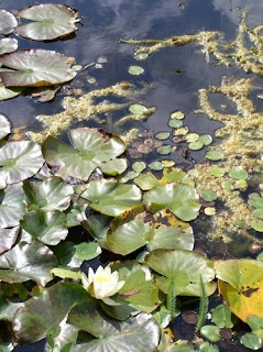
So, water lilies are a difficult territory because Monet mastered them, put his trademark on the subject and raised the bar for any follower. The good news is that there are plenty of subject that we can make ours.


Where can you see Monet’s water lilies paintings?

The Marmottan museum in Paris (France) offers a good selection of Monet’s paintings.
Monet’s sketchbooks , also at the Marmottan museum, contain some preparatory drawings for the water lilies paintings.

The Musée de l'Orangerie (in Paris) exhibits the water lilies murals in a special oval room. You can take a Virtual tour of the Water lilies murals here .

The following American museums also have water lilies paintings in their collections:


  • Tuesday, 25 September 2007

    Parsley and Garlic - Oil Painting


    A bunch of parsley we had in a nice pot on the kitchen window sill inspired this painting. The reflection on the glossy white paint as well as the back lit pot and garlic heads offered a variety of light effects.

    I used a limited palette, playing on the harmonies in yellow and blue.


    Parsley and garlic, Oil on panel (6"x 8") by Benoit Philippe


    Thursday, 20 September 2007

    Your art portfolio in your pocket

    You bump into someone (a potential client, a gallery owner or an old friend) and you wish you could show them your paintings… but your portfolio is at home. You can’t go around carrying an A3 presentation portfolio everywhere you go.

    Technology can help you here. When I bought my iPod couple of years ago, I went for the video model with 30 Gigabite of memory. I am not using it for video, but I store my portfolio on it.


    • Although the LCD screen is small (5.2 cm x 4 cm), it has an excellent definition and is backlit.


    • In the menue, the pictures are presented as a mosaique and it is easy to find and select the one you want to show.


    • There is a slide show function if you want to show the whole porfolio. You can set-up the time per slide.


    • For the slideshow mode, the Apple software let you chose between different types of transitions between the slides (page flip, push accross, radial, etc.) or can pick the transition mode at random. It makes the presentation look very professional.
    It is also possible to use the iPod as a harddrive to store documents. You could have some key Word documents always available:

    • Your artist statement


    • Your artist CV
    In practice :
    • Take a model with sufficient memory to put your photographs in addition to the songs and podcast you will download.


    • Take the habit to refresh the portfolio on your iPod on a regular basis to make sure it is up-to-date and contains your most recent works. The best way is to schedule in your calendar a monthly refresh.
    Take it further :

    • You may own another device like a Palm personal organiser or smart phone that could store your portfolio.


    • Take the different devices you own and think about how you could use them for your art or your art carreer.


    Wednesday, 19 September 2007

    Sunrise in the Lawns oil painting (2)


    I have completed the oil painting Sunrise in the Lawn that I started on site in August on location in one of the parks in Swindon (Wiltshire). You can read the account of this plein air session here.

    I then worked on this painting in the studio from the memory I had of the light in the early hours of the morning. I used glazes to give depth to the sky, give more definition to the tree leaves and capture the golden light of the sun both on the trees and on the dry grass.


    Sunrise in the Lawns - Oil painting on canvas (16” X 12”) by Benoit Philippe

    Monday, 17 September 2007

    Sir Peter Blake on the Kaupthing Singer and Friedlander / Sunday Times Watercolour Competition


    The Times online offers a video of Frank Whitford discussing with Sir Peter Blake the Kaupthing Singer and Friedlander / Sunday Times Watercolour Competition.

    Asked about the particularities of the watercolour medium, Sir Peter answers:
    “The main rule is to keep your paper wet as long as you can. So, you are almost painting backward. Instead of applying paint from the beginning, you are remembering that the eye has to remain white until the very end. So, it is a kind of negative process.”
    In this interview, Peter Blake discusses:

    • His experience as juror for juried art shows,

    • The winners of this year competition,

    • White in watercolour,

    • His work in watercolour

    Click here to watch the video.


    Sir Peter Thomas Blake is an English pop artist born on 25 June 1932 in Dartford (Kent). Some of his paintings are exhibited at Tate Modern. He also designed some famous album cover, including The Beatles' album Sergeant Pepper's Lonely Hearts Club Band .


    Friday, 14 September 2007

    10 ways a painter can use digital photography


    Photograph I took in a pine forest in Prades-Le-Lez, South of France


    1. Paint from photographs: Build an images bank for your rainy days. For copyright reason, avoid using third parties’ photographs as model for your paintings (unless you have a written authorisation to do so from the author). Use your photographs as reference and don’t hesitate to combine several ones to compose your studio painting.
      Watercolour done using the photograph


    2. A safety net for your plein-air painting sessions. When I do a painting on location, I always shoot some photographs of the scene before I start painting. Having these photographs will ease your mind. You don’t need to worry in case the weather changes and the pouring rain forces you to pack. The photographs will help you to continue working and finish the painting in the studio.


    3. Capture moving subjects: People, animals, cars, and boats may move too fast to be accurately captured on the spot. Digital photography is an ideal tool to make what moves still.


    4. Field notes to record potential subjects. An image is worth a 1000 words. Sometime, you see a scene with a good potential but the sky is grey or the sun casts the shadow the wrong way. You think: the trees would look good with the colours of autumn… but it is July and you will forget unless you take some notes. In this case, you can take photographs and keep them as thumbnails. If you can find a map of the area on the Internet, you can even make a digital collage of your pictures on the map to pinpoint the locations to paint. The illustrated map will jog you memory, even after several months.


    5. Create a mood board: A mood board is used by designers to find the right mood for a particular work or project. Put all the elements you collect on a cork board or on the wall of your studio. You can cut out photographs in magazines, pin some postcards, use fabric samples or print your own photographs and add them to the mix. The emphasis here is not on the subject but more on the impression, textures, colours… in a nutshell: the mood.


    6. Record the different stages of your creative process: You can create an illustrated painting demonstration. Even if you don’t plan to share the photographs of the intermediate stages of your work with your customers, you will learn a lot by going back and analyzing how you created you art.


    7. Keep a record of all your works: Nothing should leave your studio without been properly photographed and documented. Make it a habit. As soon as a work is completed, take several photographs and check that you have at least one good photograph of each work.


    8. Illustrate your marketing material: Brochures, invitations, business cards, web sites, blogs come alive with pictures of your works.


    9. Experiment: Digital photography creates a risk-free environment. You can take as many photographs as the memory card of your camera will let you. Keep what you like and discard the rest. Shoot in the light, close-up or using weird angles. Go wild.


    10. Study composition: You cannot change the landscape in front of you, but you can move and choose what you are shooting and where you are shooting from. If you take photographs of a still life, you have total control over the setting and the composition. You can learn what works and what does not by composing your photographs and then you can apply the same principles to your paintings.

    Let me know how you use digital photography to serve your art.


    Wednesday, 12 September 2007

    Postcard from the south of France


    I painted this postcard as part of a competition organised by a French publication named Artistes Magazines...


    I like the whole idea of this competition. You are given with the magazine a free sheet of watercolour paper to paint your postcard. The idea is to paint something from the place where you spend your vacations. You then have to send it as a postcard (no envelope).
    I chose a picturesque view of the village of Assas, near Montpellier in the South of France.

    Because of the small format (20 cm x 15 cm), the subject and the way it is treated has to be bold. With hundreds of entries, the only way to be noticed is to go for a strong composition, good contrast and vibrant colours. Here is how I achieved it:
    • The medieval tower in the sun offers a strong focal point. The main architectural elements provide a variety of shapes. More generally, the whole composition is based around basic shapes (a circle for the tree on the left, a cylinder for the tower, a parallelogram for the ancient wall and a triangle for the house).


    • The play of lights and shadows paints a stark contrast. The shadows of the trees on the ground were built-up in successive transparent layers of Ultramarine blue, Crimson and Yellow ochre. I put some Yellow ochre on top of the dark purple. This seems counter-intuitive to lay a light colour on top of a dark one. However, the yellow ochre is a semi-transparent colour (I used the Sennelier brand in tube for this painting) with sufficient body to leave golden traces on the purple.

    • The sky is made of intense blue. I used a mixture of Cobalt blue with some Ultramarine at the top of the wash to give more intensity to the highest part of the sky. There was a mark in the middle (washes tend to dry quickly under the sun of the South of France). I am not normally bothered with this type of incident which creates interest and variety in a wash, but I wanted a smooth wash for this sky. To obtain a perfect graded wash, I covered the first wash, once dry, with a second wash of Cobalt blue and Cerulean blue.

    • The tractor, which was parked as represented (There are many vineyards around Assas), adds a nice touch to the scene. The touches of orange and red contrast nicely with the rest of the painting built around the blue / ochre / green trio. The projected shadow of the tractor is crisp and dark in order to bring it into the foreground.

    Monday, 10 September 2007

    My watercolour brushes


    My current favourite watercolour brush, that I use 90% of the time, is a Manet grey squirrel mop number 3 (reference 448). You can see on the picture the shape of the tuft and plastic with wire to bind the hairs instead of a classic ferrule.

    • This squirrel mop has excellent watercolour holding power. You can make long marks on the paper without having to recharge the brush with paint on the palette.

    • More importantly, it can hold a lot of paint while maintaining a perfect point, which makes it the perfect tool to paint all sorts of marks, including fine details. Squirrel is the finest hair available.


    • The brush is well balanced and easy to manipulate.

    I urge you to try this sort of brush if you have not done so already. It dramatically changed my watercolour technique and brought it to a new level. The superiority of natural hair over synthetic ones is a natural power of absorption and water retention. This is due to the scales present on natural air, where synthetic hair is smooth.

    This type of brush is expensive, but well worth the investment. A good Christmas gift idea. If you take care of it and store it properly, it will last you a long time.

    To complete the set-up, I sometime use 3
    Pro Arte brushes at the beginning of the painting process to do some washes:


    • A large flat brush, 1” Pro Arte Prolene 106 (Reference 50739493)

    • A flat brush 5/8 Pro Arte Prolene Plus Series 008 (Reference 50654772)

    • A round brush Arte Prolene Plus Series 007 (Reference 50655038)


    Friday, 7 September 2007

    Inside my pochade box


    In this article, I open the lid and look inside my pochade box.


    Ready to paint in Paris

    Paint tubes:
    The space constraint means that the selection of paint tubes must be made carefully. I found this exercise salutary. The amazing range available from paint manufacturers often turns us into collectors and we loose sight of the unity and livelihood that a restricted palette and good mixing abilities bring to a painting. My pochade box stocks the following colours in 37 milliliters tubes:
    Titanium White (Griffin™ Alkyd from Winsor&Newton)
    • Cadmium Yellow 
    • Yellow Ochre 
    • Cadmium Red 
    • Crimson Alizarine 
    • Burnt Umber 
    • Cerruleum Blue 
    • French Ultramarine Blue 
    • Viridian Green

    I sometime limit myself to four basic colours: yellow, red, bleu and white.

    The reason I use the Titanium White Griffin™ Alkyd is that Alkyd oil colours are fast drying. You can mix them with conventional oil paint as I do, and speed-up the drying time of your colour mixture.

      Brushes
      : I use a selection of hog brushes. I you want to put them in the box, you will have to saw the handles to size.

      Panels: I use two sorts of panels that I prepare myself:


      Canvas panels that I make by gluing canvas cut to measure onto the same 3 millimeters thick MDF panels.


      3 millimeters thick MDF panels primed with a tinted grey gesso. To tint the white gesso, I prepare some grey by mixing Yellow Ochre, Vermillion Red and French Ultramarine acrylic paints into the white gesso. The panels are covered with 2 layers and sanded between the 2 applications.

      The advantage of the gessoed MDF panels is that they absorb the oil and the paint tend to dry more quickly than on the canvas boards.

      Solvent: I have settled for the Sanodor® from Winsor&Newton as thinner for several reasons:
      • As its name suggest, this product has low odour, unlike white spirit or distilled turpentine. When travelling, you can store it in your box inside your luggage without fear of smelly clothes.
      • It help speeding-up the drying process. Unless you paint very thick, the panel will be touch-dry within few days.
      • You can paint inside without upsetting people around with the strong pines odour of traditional turpentine. This is particularly important if you paint in premises serving foods or drinks. I could sit in a café and paint the customer there, without disturbing them, and while sipping a latte.
      • This product is classified as low-flammability and compliant with rail and air safety. It can therefore goes into a plane, unlike traditional solvents.

      Other equipment: The kit is completed by a pencil and eraser, a small rag and a plastic dipper with a lid (lighter than the metal ones) that you can clip on the side of the palette.

      Wednesday, 5 September 2007

      Monet’s Sketchbooks from the Marmottan Monet Museum (Paris)


      The Marmottan museum offers you to explore Monet’s sketchbooks on its web site.

      Each album contains drawing spanning over several years. Some sketches were studies for later paintings (Luncheon on the grass; The Saint-Lazare Station; Haystack at Giverny ; Water lily pond).

      The lines are fluid and forms are refined by the artist in sucessive waves. The drawing is quick and free, straight from the brain onto the paper. Almost no shadows to be seen (apart from the drawings of the children reading).

      On the numerous water lily pond studies, the lines have an abstract beauty, like the marks the wooden rake leaves on the gravel of a Zen garden.

      The presentation of the sketchbooks is superb. You can navigate the pages, zoom in and out, flip the page around (Monet was using the sketchbooks both ways). Each sketchbook has an introduction and dates and legends for each drawing.

      Click
      here to start your visit.

      Tuesday, 4 September 2007

      Style your brushes with hair conditioner

      While researching different methods to care for artist brushes, I found the following tip involving hair conditioner on Rosemary & Co Web site:
      “Another special tip for longevity of brush heads is to recondition your sables as you would your own hair! Once a year, take ordinary hair conditioner and
      apply just one or two drops to the heads allowing to soak, then rinse well before storing again. This will greatly enhance the performance of the brush.”

      Considering that brushes tips are made of hair, it makes sense to care for them using hair products. I will give it a try.
      Rosemary has been making brushes for over 20 years, so she certainly knows what she is talking about.


      Related articles