Showing posts with label Art and Science. Show all posts

Monday, 2 June 2014

Cyanometer revisited

In July 2008, after reading about Horace Bénédict de Saussure and his cyanometer, I decided to build a simple one. A cyanometer is an apparatus that allow you to determine what shade of blue is the sky. It turned out that the cyanometer had no scientific usefulness. But I thought it would be a good observation tool, as the sky is not just blue — it is made of many blue colours.

I even suggested that painters could use a model of cyanometer with more hues to analyze and mix accurately the blue colours of the sky they paint. You can read my two earlier posts: Blue sky research with a cyanometer and How to build a cyanometer.

I had forgotten everything about the cyanometer when Cathy FitzGerald who was preparing a radio program for BBC3 titled “Skylarking” (documentary to be broadcast shortly) contacted me. She wanted me to make the larger version of the cyanometer I had dreamed of (my original attempt only counted 12 shades of blue)… and I accepted the challenge.

Building the cyanometer

I started with an A4 size (21 cm x 29.5 cm) piece of plywood, which is a good size to carry around in a bag. I was looking for a light sturdy material I could paint on and plywood became an obvious choice.

I traced with a pencil the margins and then 6 rows of 9 squares (1.5 cm x 1.5 cm each). I then added all the diagonals to pinpoint the centre of each square. I drilled 54 holes with a power drill.


Why holes rather than square windows? I thought first about cutting out small square windows as I had done in the 2008 cardboard version of the cyanometer. However, cutting out these windows in plywood would have been complicated and time consuming; I also feared the wood would split in the end. This was when I thought about the Camera obscura and how a whole image could go through a pinhole. If did not need a large window after all. By drilling holes, I could have larger samples of each hue because the space taken by the window was minimal. But there was more to it — the result was aesthetically more pleasing: the colours formed an uninterrupted patchwork of 54 blue hues; the holes were evenly spaced; and I would have a nice contrast between the shape of the squares and the rounded windows.


As the power drill damaged the wood at the back of the board, around the holes, I had to mend the surface with wood paste. When the wood paste was dry, I sanded the whole board.

I applied a light coat of acrylic gesso on both sides of the board and its edges to prepare the surface for painting. I painted the margin with several coats of white acrylic paint.


Just for fun, I painted a blue sky with clouds on the back of the board.


For the cyanometer colours, I worked with a selection of blue hues from the Winsor&Newton Griffin range (plus a Cobalt Turquoise, which is only available in classic artist oil paint). The pigments are in oil modified alkyd resin and the paint dries faster compared to traditional oil colours. As I painted on wood with a thin layer, the paint was touch-dry in one day.


From left to right, the base colours at the top of each column are:
  • Column 1: Prussian Blue
  • Column 2: 1 part Prussian Blue + 1 part Phthalo Blue
  • Column 3: Phthalo Blue
  • Column 4: French Ultramarine
  • Column 5: 1 part French Ultramarine + 1 part Cobalt Blue
  • Column 6: Cobalt Blue
  • Column 7: 1 part Cobalt Blue + 1 part Cerulean Blue Hue
  • Column 8: Cerulean Blue Hue
  • Column 9: 1 part Cerulean Blue Hue + 1 part Cobalt Turquoise
 Each colour or mix of colours is then lightened with Titanium White to get lighter and lighter shades down each of the 9 columns. The final result is a beautiful patchwork of blue hues in different tones.


How to use the cyanometer

To work out the shade of an area of blue sky, you hold the cyanometer in front of you and peek through the holes. Move it around until you find a close match between the bit of sky you see through the hole and the blue hue painted in the square around the hole.


Related articles


Tuesday, 26 November 2013

Ramachandran’s nine laws of aesthetics

In his book The Tell-Tale Brain: A Neuroscientist's Quest for What Makes Us Human the neuroscientist V.S. Ramachandran looks at aesthetics from a scientist's viewpoint. He names what he calls his nine laws of aesthetics. Some of them are intuitively known by artists or form part of the art training that artists receive. Others are interesting to think about.


Ramachandran does not hesitate to speculate about the evolution of the laws of aesthetics, and he says so. After all, this is how science progress. Someone throws an idea in the arena and others work on it, either to confirm it or rebuke it.

1. Grouping

This is the fundamental idea that “a visual system tends to group similar elements or features in the image into clusters.”

Ramachandran explains that the principle of grouping evolved to defeat camouflage. The example he gives is the lion hidden behind foliage. There is a clear survival advantage if our brain can put together the disparate yellow splotches of the lion’s body behind the green splotches of the leaves.

Under the principle of grouping, another idea is that” graphic elements suggesting a continued visual contour will tend to be grouped together”.

2. Peak shift

The Law of Peak Shift My relates to how your brain responds to exaggerated stimuli.

This principle explains why we like caricatures. But Ramachandran also invite us to consider that principle make us appreciate works by Van Gogh, Rodin, Gustav Klimt, Henry Moore, or Picasso.

On the neuroscience side, this is probably achieved “by the deliberate exaggeration of posture that may activate—indeed hyper activate—mirror neurons in the superior temporal sulcus.”

Follow some fascinating explanations of experiments on animal behaviour carried out on seagulls by the Nobel Prize–winning biologist Nikolaas Tinbergen. The gull chick pecks on the red spot on its mother’s beak to get food by. Tinbergen used a rectangle with a red spot as a substitute. Tinbergen found that the chick became hyperactive when it was presented with a very long thick stick with three red stripes on the end.

3. Contrast

This one is quite obvious because without contrast, there is no form.

4. Isolation

The “law of isolation” Is when “the artist emphasizes a single source of information—such as colour, form, or motion—and deliberately plays down or deletes other sources.”

Ramachandran believe that sketches are very effective because cells in your primary visual cortex, where the earliest stage of visual processing occurs, only care about lines. Sketches also pass the “attentional bottleneck in your brain”.

5. Peekaboo, or perceptual problem solving

This principle is based on the fact that “you can sometimes make something more attractive by making it less visible.”

This one is easy to understand intuitively. We all experienced the satisfaction of finding out a visual illusion in one of Dali’s paintings for instance.

Ramachandran explains that it starts with the way we see: “When you look at a simple visual scene, your brain is constantly resolving ambiguities, testing hypotheses, searching for patterns, and comparing current information with memories and expectations.”

6. Abhorrence of coincidences

This one is interesting. An illustration of this is that we don’t like a painting when a tree is exactly in the middle. What are the chances of that happening?

7. Orderliness

Here, Ramachandran put together under this heading our abhorrence for deviation from expectations. For the artist it is a matter of balance between too much order (boring) and total chaos (not pleasing).

8. Symmetry

Ramachandran suggests that one explanation comes from…parasites: “Parasitic infestation can profoundly reduce the fertility and fecundity of a potential mate, so evolution places a very high premium on being able to detect whether your mate is infected. If the infestation occurred in early fetal life or infancy, one of the most obvious externally visible signs is a subtle loss of symmetry. Therefore, symmetry is a marker, or flag, for good health, which in turn is an indicator of desirability.”

The author then tackles the question apparent paradox that a lack of symmetry may also be appealing at times. His answer is that “the symmetry rule applies only to objects, not to large-scale scenes.”

9. Metaphors

Metaphors used extensively in visual art. Ramachandran expresses is fascination for the fact that a “visual metaphor is probably understood by the right hemisphere long before the more literal-minded left hemisphere can spell out the reasons.”

Even if the author does not make the express link, I think that the Peekaboo, or perceptual problem solving principle plays a role in our appreciation of metaphor. A metaphor is a kind of puzzle and our brain must take pleasure in resolving these riddles.

In conclusion, Ramachandran explains that these principles in a single work can enhance each other. This is what he calls “resonance”.

Even if the part on art is only one chapter, I would recommend that you read this book. It is one of the most interesting reads around and Ramachandran has a gift to explain in simple words some very complex pieces of research. This is the work of a true humanist, looking at so many aspects of our world through his neuroscientist experience.

Related resources

Get the book from Amazon in the US (Associate program link)

Tuesday, 29 May 2012

Painting dappled light

Sunny days are back in England and trees are full of leaves. The sunlight going through the trees’ foliage forms spots of light on the ground. I took some snapshots of the patterns form by the light spots on a path.


Observe these spots of light and note the following:

  • Some spots are more luminous than others;
  • When the spots overlap, their intersection is more luminous;
  • The light spots have a soft edge rather than a hard edge;
  • Spots of lights are subject to the law of perspective and are seen as ellipsis from a distance.

But why are these spots round when the holes between the leaves are not? The answer is that these round spots of lights are the sun projected on the ground. The physics is the same as for the pinhole camera.


So, if each spot of light is a projection of the sun, their shape would be different during a solar eclipse. This is correct: the spots become crescents of light.


Image of the sun during a solar eclipse through the leaves of a tree. October 3, 2005, St Juliens, Malta – picture by User:Ellywa - Source: Wikimedia Common

Dapple light is a good way to bring variety to a landscape or a scene. You can selectively bring some elements of the subject under the spotlight. The difficulty is to avoid having a patchwork of colours and tone without any focus. Renoir used dapple light in an effective way in his painting Bal du moulin de la Galette.


Bal du moulin de la Galette by Auguste Renoir (Oil on canvas - 1876) Musée d'Orsay – Source: Wikimedia Common


Monday, 3 October 2011

Camera obscura and photography

Last week-end had a feel of summer in the South of England and we went to Lacock to visit the Abbey.


The entry of the Abbey's


A mansion has been built on top and around Lacock Abbey and at one point was the house of William Henry Fox Talbot.

The botanic garden of Lacock Abbey


Fox Talbot was a British inventor and a pioneer of photography.

In the museum, they showed an example of camera obscura, a device that Vermer used and that gave Fox Talbot the idea of building one of the first cameras.

Camera Obscura

In his book, The Pencil of Nature, William Henry Fox Talbot recalled:

One of the first days of the month of October 1833, I was amusing myself on the lovely shores of the Lake of Como, in Italy, taking sketches with Wollaston's Camera Lucida, or rather I should say, attempting to take them: but with the smallest possible amount of success. For when the eye was removed from the prism—in which all looked beautiful—I found that the faithless pencil had only left traces on the paper melancholy to behold.

After various fruitless attempts, I laid aside the instrument and came to the conclusion, that its use required a previous knowledge of drawing, which unfortunately I did not possess.

I then thought of trying again a method which I had tried many years before. This method was, to take a Camera Obscura, and to throw the image of the objects on a piece of transparent tracing paper laid on a pane of glass in the focus of the instrument. On this paper the objects are distinctly seen, and can be traced on it with a pencil with some degree of accuracy, though not without much time and trouble.

I had tried this simple method during former visits to Italy in 1823 and 1824, but found it in practice somewhat difficult to manage, because the pressure of the hand and pencil upon the paper tends to shake and displace the instrument (insecurely fixed, in all probability, while taking a hasty sketch by a roadside, or out of an inn window); and if the instrument is once deranged, it is most difficult to get it back again, so as to point truly in its former direction.

Besides which, there is another objection, namely, that it baffles the skill and patience of the amateur to trace all the minute details visible on the paper; so that, in fact, he carries away with him little beyond a mere souvenir of the scene—which, however, certainly has its value when looked back to, in long after years.
Such, then, was the method which I proposed to try again, and to endeavour, as before, to trace with my pencil the outlines of the scenery depicted on the paper. And this led me to reflect on the inimitable beauty of the pictures of nature's painting which the glass lens of the Camera throws upon the paper in its focus—fairy pictures, creations of a moment, and destined as rapidly to fade away.

It was during these thoughts that the idea occurred to me…how charming it would be if it were possible to cause these natural images to imprint themselves durably, and remain fixed upon the paper!

And why should it not be possible? I asked myself.”


The instrument with a prism Fox Talbot referred to at the beginning of this extract is another tool used by artists: the camera lucida. The principle is totally different from the camera obscura. The prism of the camera lucida allows the user to see the subject as superimposed on the paper, making it easy to trace it. The instrument folded neatly into a case and had a clamp to fasten it to the drawing board or table.


Related resources

The Pencil of Nature by William Henry Fox Talbot is available as a free eBook (including as a PDF) on Project Gutenberg.


   Technorati Tags    :                             
                                                  

Monday, 25 April 2011

Square in a rectangle composition with golden ratio

While researching on paintings composition, I found a very interesting post by Stapleton Kearns on Building a square within a rectangular composition

These compositions work very well because the square brings an element of stability and harmony (with the four equal sides), while the rectangle creates a secondary interest.

Here are a few example of compositions based on a square in a rectangle in addition to the ones shown by Stapleton Kearns.


Seaport with the Embarkation of Saint Ursula by Claude Lorrain, [Source: Wikimedia]


Diego Velázquez, The Forge of Vulcan (1630) - Oil on canvas, 223 x 290 cm (87 3/4 x 114 1/8 in), Museo del Prado, Madrid [Source: Wikimedia]


Painting by Diego Velazquez, 1628-1629, titled The Triumph of Bacchus, or the Drunkards. [Source: Wikimedia]

In The Triumph of Bacchus, you can see how one of the diagonals of the square goes along the back of the character beeing crowned.

The use of the square in a rectangle can be associated with the golden ratio. The value of the golden ratio (also called the “divine proportion”) is approximately 1.6180339887.

There is an easy way to build a rectangle which proportions are based on the golden ratio without any calculation. The method, illustrated below, has the following steps:
• Draw a square as a starting point

• Divide the square in two equal rectangles

• Trace a diagonal in one of the rectangles (see illustration below)

• Using a pair of compasses and that diagonal as the radius, draw an arc that defines the long dimension of the rectangle.


The ratio between the long dimension of the rectangle and the short dimension is the golden ratio. Another interesting fact is that it is also true for the smaller rectangle (light pink one).

Practically, you may not be able to use these proportions if you buy ready made canvasses. However, if you make your own boards for acrylic or oil painting, or work on paper, you can try the square in rectangle composition based on the golden ratio.


Wednesday, 5 January 2011

The influence of language on paintings

Lera Boroditsky, assistant professor department of psychology at Stanford University, has conducted a number of studies on the influence of language on how we perceive the world. She noted in particular how linguistic differences between different languages influences the way we see and the way artists paint.


For instance, “Russian speakers, who make an extra distinction between light and dark blues in their language, are better able to visually discriminate shades of blue.” (Wall Street Journal article: Lost in Translation)


Language is of particular influence with non concrete words and concepts and how we visualize them.


Knight, Death and the Devil by Albrecht Dürer 1513. Engraving. 24,6 × 18,9 cm. Rotterdam, Museum Boijmans van Beuningen [Public domain], via Wikimedia Commons

“In fact, you don't even need to go into the lab to see these effects of language; you can see them with your own eyes in an art gallery. Look at some famous examples of personification in art — the ways in which abstract entities such as death, sin, victory, or time are given human form. How does an artist decide whether death, say, or time should be painted as a man or a woman? It turns out that in 85 percent of such personifications, whether a male or female figure is chosen is predicted by the grammatical gender of the word in the artist's native language. So, for example, German painters are more likely to paint death as a man, whereas Russian painters are more likely to paint death as a woman.” (How does our language shape the way we think? [6.12.09] By Lera Boroditsky)


Further readings

Lera Boroditsky’s website with a selection of her papers and articles. She has a refreshing sense of humour (scroll over her picture and you will understand what I mean)


Wednesday, 14 October 2009

A “new” Leonardo da Vinci

A picture executed in chalk, pen and ink and previously known as Young Girl in Profile in Renaissance Dress (33 x 23cm or 13 x 9in) has been identified as a work by Leonardo da Vinci, thanks to a fingerprint in the top left corner of the vellum.


Peter Paul Biro, a Montreal-based forensic art expert, found the fingerprint when he examined the work using a multispectral camera. The fingerprint matches one on Leonardo’s St Jerome in the Vatican. Carbon-14 analysis of the vellum gave a date range of 1440-1650, consistent with an attribution to da Vinci.
Martin Kemp, Emeritus Professor of History of Art at the University of Oxford, has rechristened the picture, La Bella Principessa. He has identified the women as being Bianca Sforza, daughter of Ludovico Sforza, Duke of Milan (1452-1508). He has written a book about the discovery (to be published)

Leonardo da Vinci is known for using his palm and finger to blend colours in his works.

Timothy Clifford, director-general of the National Galleries of Scotland from 1984 to 2006, commented: “What is so exciting is that no drawings by Leonardo on parchment are known, although we do know from the Codex Atlanticus that Leonardo was interested in the technology of drawing, in colour, on vellum.”

In the paper version of his article “How I know the new portrait is by Leonardo”, he details “A six-point Leonardo test”, he also made an interesting point: “Leonardo, unlike any of his contemporaries, was left-handed and so shaded from the top left to the bottom right.” This somehow corroborates the conjecture I made in my previous article The left-handed conjecture


Read the press articles


Related blog articles

Friday, 17 April 2009

Whiter than white?


Looking at the title, you could think that I am trying to sell you some washing powder, but this is an article about using white in our paintings (Although, I write a little bit about washing later on).

Let’s go straight to the point: it is most unlikely that you will see pure white in nature. It’s all a matter of contrast and reflected lights on white objects.

White and simultaneous contrasts

The way we perceive based on context was brought home for me when I visited the last year
The Exploratorium in San Francisco. They had an experiment in the section on “seeing” where they were displaying in the dark a succession of lighted squares. When the first one appears, it looks white. Then, the second square pops-up. You see it has a lighter shade and, by comparison, the first one looks grey. It goes on and on… and you cannot believe your eyes that each new square appears lighter than the previous one.

This exhibit focuses on how the environment affects the way we see everything: colour, tone and brightness. The same goes with the light areas of your paintings.


The checker shadow illusion is also a striking way to remind us that our brain is easily tricked into seeing as different tones that are identical, based on the context.


Square A and B seem to be of a different shade


The two vertical bars show you that, in fact, square A and B share the same shade of grey

You can read an
excellent explanation of this illusion by Edward H. Adelson from the Department of Brain and Cognitive Sciences at the Massachusetts Institute of Technology.


What colour is your white?

White surfaces act as a screen where the coloured light and surrounding object can reflect. For this reason, you will have bluish whites or yellowish whites depending on the time of the day and the quality of the light.

Using a palette of light colours rather than pure white out of the tube makes your painting more interesting in subtle ways. The modulation creates movement and interest and stays closer to real life.

In fact, there may be some cultural influences on how we perceive the quality of the tinted white as white. Washing powders contain some agents to make white a little bit blue. Historically, people noticed that it did not matter how well they washed them, white fabrics always had a slight yellow shade. Physicists found that you could neutralise this yellow colour by adding some ultramarine blue to the rinsing water. This habit stayed and we today perceive white fabrics with a slight blue shade as fresher and whiter.

In practice

We talked about how our eyes perceive reality. How does that translate in practical terms?


  • It is a good idea to use a piece of white card to judge the brightness and whiteness of an object you are painting.


  • Remember that pure white is rare in nature and that a good way to make light colours appear lighter is by simultaneous contrast (of tone, colour and brightness).


  • A coloured ground, in particular with a mid-tone or neutral colour, will make it easier than a white ground to set the lighter tones at the correct level.


  • Tinted whites (with blue, pink, yellow, etc.) offer endless possibilities to make your light areas more interesting.

To end this article, I will leave you with what Ambroise Vollard remembered in his book “Recollection of an Art dealer”:

“Later on, I happened to hear Renoir talk about a white on white effect that he was trying to render.
- It is pretty difficult, he said, but nothing is more exciting to paint nor provides a nicer effect.”

Vollard (and probably Renoir) did not explain what this effect consisted of, so we will all have to go to the museums and study carefully any Renoir’s painting we can find in order to try to see and understand this effect.


Related articles

White or white?


Add to Technorati Favorites

Wednesday, 4 February 2009

Monet’s Palette

This article was first published in my newsletter "Notes From My French Easel" – December 2008.


At the "Monet, impressionist eye" exhibition at the Musée Marmottan in Paris, one of the displays was about the colours Monet used. Here are two quotes the curator for the exhibition selected on the topic :

« The major point is to know how to use colours for which the selection is only a matter of habits. In short, I am using Silver White, Cadmium Yellow, Vermilion, Dark Madder, Cobalt Blue, Emerald green and that’s it. » (Letter from Monet to G. Durand-Ruel – Giverny, 3 July 1905)

« Claude Monet, apart from a period when he bought colours from a shop in Laval Street – today named Victor Massé – never had other provider than us (…). His palette had (…) Silver White, Light Cobalt Purple, Emerald Green, Extra-fine ultramarine. Sometime – occasionally – some Vermilion. Then a trinity of Cadmium : Light, Dark, Citrus. I also sell to him a Citrus Yellow Ultramarine, since a few years. » (Tabarant, « Couleurs » in Le Bulletin de la Vie Artisitique, 15 July 1923, pages 287-290)


La Gare Saint-Lazare de Claude Monet – Source Wikimedia

One of the exhibits was a reconstruction of Monet’s palette over time, put together by Claude Yvel (they are not a perfect match with the quotes above). Here are the different pigments the artist used at different times of his career according to Claude Yvel:

1870
  • Flake White
  • Naples Yellow
  • Chrome Yellow
  • Red Ochre
  • Yellow Lake
  • Emerald Green
  • Cobalt Blue
  • Rose Madder Lake (Laque de Garance)
  • Vermilion Red
  • Burst Sienna
  • Ivory Black
1884
  • Flake White
  • Cadmium Yellow
  • Cobalt Blue
  • Rose Madder Lake (Laque de Garance)
  • Vermilion Red
  • Yellow Lake
  • Emerald Green
  • Milori Green
1919
  • Zinc White
  • Cadmium Yellow
  • Chrome Yellow
  • Cadmium Orange
  • Vermilion Red
  • Rose Madder Lake (Laque de Garance)
  • Cobalt Purple
  • Cobalt Blue
  • Guimet Ultramarine
  • Emerald Green
I like, as an exercise, to study a painting and try to figure out the palette used by the artist.


Add to Technorati Favorites


Monday, 14 July 2008

How to build a cyanometer


A cyanometer, step by step

My previous post, Blue sky research with a cyanometer , I introduced you to the cyanometer and its use for artists. I will now explain how I built mine.

  • I cut a rectangle of cardboard (15 cm x 10 cm)

  • I traced on the cardboard three rows of squares (1.5 cm x 1.5 cm). Each row was separated by 1 cm.


  • I cut out the windows in the cardboard

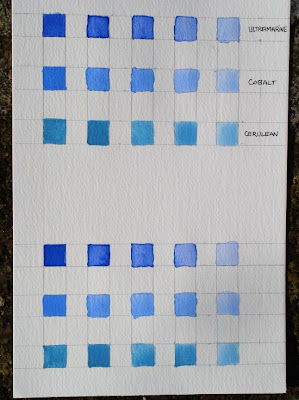
  • I painted on a sheet of watercolour paper two identical sets of blue squares using watercolour paint that I diluted more and more with water in order to get graded blue shades. I used some Ultramarine blue, Cobalt blue and Cerulean blue.


  • I cut one of the sets and numbered the colours from 1 to 15 (the reason I painted 15 squares rather than 12 is that I anticipated that some shades would be too close to each other to make a real difference. I gave myself the possibility to eliminate 3 of these too similar shades)


  • I then ordered the shades from darker to lighter and reported the order onto the reference chart.

Afterthoughts
  • The dimensions of the cyanometer and of each coloured square do not really matters. The idea is that you want your cyanometer to be small enough to be able to pack it in your painting box or bag when you go on your field trips.
  • On reflexion, it would be better to have many more shades of blue to have closer matches with the colour of the sky. Around 40 shades would give a better spread and there a higher chance to find the perfect match. I found that Turquoise blue was missing and Blue Rex could prove useful. Additional shades of blue could also be obtained by mixing together some of the blue I used on their own. For instance, you could mix “Ultramarine + Cerulean” and then lighten the new colour with white to generate a new series.

  • It is probably easier to grade colours with oil or acrylic paint rather than with watercolour because you can use some white paint to get a nice and regular gradation. I found more difficult to control how much water I had to add to my colour from one square to the next.
Building a cyanometer is child play… and would also make a great week-end project for children. What better way to make them observe the sky and discover that there is nothing like a one-blue-only-sky?

Related articles
Blue sky research with a cyanometer ,


Add to Technorati Favorites

Friday, 11 July 2008

Blue sky research with a cyanometer

Science and art have a long history of crossovers: botanical illustrations, anatomy drawings… Observation is key to both scientists and artists. Accurate depiction of the observed reality moves science forward. Artists can better paint or draw what they understand. It is easy to forego what is in front of you if you don’t “know” it is there.

Artists can develop this ability to “see”. They also have a creative mind. The combination of the two leads to breakthrough intuitions. Some artists painted what they observed so well that scientists relied on their paintings to describe certain physiological conditions.

The cyanometer

The cyanometer is a device invented by the Swiss scientist Horace Bénédict de Saussure to measure the blueness of the sky. The picture will give you a better idea than a long description.


De Saussure’s name is linked to the birth of mountaineering. In 1760, he offered a reward for whoever would climb on the top of the Mont-Blanc. This feat was accomplished in 1786 by two climbers: Jacques Balmat and Gabriel Pascard. A year later, on August 3rd 1787, de Saussure himself went on top of the mountain with his butler and eighteen guides. He needed that many people to carry all the devices he wanted for his scientific experiments. One of the devices was a cyanometer.

De Saussure hoped that the information collected on the blueness of the sky could be used for weather forecasts. The cyanometer proved of little use for this task. It could however be useful to the painter.


The artist and the cyanometer

A cyanometer provides an easy way to study the sky and find out about the different hues of blue that compose it. The windows in the divice play the role of isolators. You can observe the exact hue because the blue you observe is mostly framed with a neutral colour, removing the interference of simultaneous contrasts.

There are many paths to explore:
  • Where is the sky of a lighter blue?

  • Is the sky lighter or darker towards the horizon?

  • How many kind of blue can you find in the sky?

  • How the morning sky compares to the afternoon one?
If you use the cyanometer in conjunction with a reference chart (where you noted how you mixed the different shades of blue), the cyanometer will help you to determine how to mix your blue colours to paint the sky.

You could even use the cyanometer in the same way to judge the different shades of blue on your reference photographs.

I will soon explain the way to build a simple cyanometer.


Add to Technorati Favorites


Wednesday, 9 July 2008

Art and medical conditions


The Times recently (July 5, 2008) published an interesting article by John Naish titled “The painter who sees through the eyes of the blind”. Adam Hahn, a visual artist, painted portraits of people affected by age-related macular degeneration (AMD) the way they would see themselves. The portraits are blurred in places, depending on the level of degeneration of the eye.


The article contains reference to famous past artists and how their medical conditions could have affected their painting.


  • Degas had retinal eye disease.

  • Monet suffered from cataracts for ten years before he had surgery to recover a clear view.

Michael Marmor, an ophthalmologist from Stanford University, argued that both Degas and Monet became more abstract in their work because of their eye problems.

The same goes for Turner:
“Likewise, Michael Lamensdorf, an ophthalmologist in Sarasota, Florida, believes that Turner's fuzzy landscapes were the result of bad eyesight. He compared the fine detailing and clear blues in the 19th-century painter's earlier work with his later work, which is limited to reds. “In my opinion, Turner developed a dense, red-brown cataract that blocked out all the blue and green colours,” he argues.”
Another comment in the article gives an excellent insight into the reaction of art critics when confronted with these theories:

“Such medical views are, however, greeted sceptically by many art historians and critics, who prefer to believe that the artists' development was driven by intellect, instinct and inspiration, rather than ocular degeneration.”

I am not surprised by the reaction of some art historians but I think they miss the point. Does the fact that Monet’s medical condition is likely to have influenced his art in a significant way make him and ordinary painter? Does this mean he was not a genius? I would say his genius transpires from how he transcended and used his medical condition to serve his art. Far from accepting the limits imposee on him by illness (although he complained about his condition), he used his deteriorating eyes the best he could to express his different vision of the world.

Artists don’t give-up in the face of adversity, they look for ways to use in their artisitic venture what life throws at them.


Wednesday, 11 June 2008

The wonderful world of fractal geometry

Did you like geometry in school or did you find it dry and out of this world subject? There is another kind of geometry that has emerged in the 70’s. It is called “Fractal geometry”.

Mandelbrot discovered the so-called "geometry of nature" that goes away from the Euclidean geometry where everything is smooth and simple but feels inadequate to model the world around us. Mandelbrot describes himself as a deeply visual person and explained how he solved complicated mathematical algebra by visualising the result and describing it afterwards.


If you are curious to learn more about fractal geometry, you should watch
“Clouds Are Not Spheres” , a 51 minutes documentary on fractal geometry and its creator, Benoît Mandelbrot available on the Teacher TV website.

Mandelbrot's famous quote gives a good idea of the underlying principle of his theory:

"Clouds are not spheres, mountains are not cones, coastlines are not circles, bark is not smooth, nor does lightning travel in a straight line." (B. Mandelbrot, introduction to "The Fractal Geometry of Nature")

Now, stop and read again the quote above with your artist’s hat on: can you see texture and patterns of the convoluted reality? Fractals are everywhere: animal, vegetal, mineral.

One of the scientists interviewed in the program said that, after reading Mandelbrot’s book on fractal geometry, you can’t look at a cloud in the same way again.

Fractals break the barrier between figurative and abstract geometrical art in the sense that, when you start to look at nature closely, you find geometrical patterns that repeat themselves on decreasing scales. In other words, abstract and geometrical patterns are everywhere in the natural world.

Fractal designs are not only intriguing but really beautiful. You can see some examples in the articles provided below.


Related articles and resources