Monday 29 June 2009

Three onions - oil painting


A simple subject: just three onions on a tea towel, but much fun painting them.

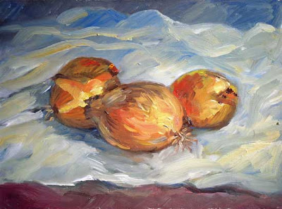
Three onions - oil on panel (6"x8") by Benoit Philippe

Tuesday 23 June 2009

Camoin on working at your art away from your easel


«Since my arrival (8 days), a marvellous period of sunshine and I started to get into it seriously, to recognise a little bit the character of this region, but today I have to stop, grey weather, I took advantage of this to visit around the village and I realised that when we look at nature while trying to make sense of it and to understand it in order to memorise it, we work as much as if we had brushes in our hand. And this is the only way to watch; otherwise you don’t see. »

Charles Camoin – letter to Matisse sent from the Hôtel des Lions, Martigues (Bouches-du-Rhônes) on 2nd December 1904 - in “Correspondance entre Charles Camoin et Henri Matisse” - by La Bibliothèque des Arts.


Additional resource

Wikipedia article on Charles Camoin


Add to Technorati Favorites


Wednesday 17 June 2009

Correspondence between Camoin and Matisse

This article was first published in my newsletter "Notes From My French Easel" – Mai 2009. 


I just read the correspondence between Charles Camoin and Henri Matisse (Presented and annotated by Claudine Grammont and Published in French by “La Bibliothèque des Arts”).


Born in Marseille on 23rd September 1879, Camoin died in Paris on 20th May 1965. He attended the Ecole des Beaux-Arts in Marseille and then in Paris and became part of Fauvism with Puy, Manguin, Rouault, Matisse and Marquet. The later was a close friend of both Matisse and Camoin and is frequently mentioned in their letters. The three of them went to Morocco in 1912–13.

The correspondence covers the first and second World Wars and both artists tried to help each other, morally but also in concrete ways. For instance, Matisse sent on several occasions some parcels with necessities to Camoin. During World War I, Camoin was mobilized and served as stretcher-bearer and then as a painter for the camouflage unit.

The two friends shared their work, their thoughts and their doubts. Talking about Seurat and himself, Matisse wrote in 1915: “I know that Seurat is everything but a romantic, that I am a romantic, but with a good half of science, of rationalism, that make the struggle from which I something emerge the victor, but out of breath.”

Matisse tried to join the army but his application was rejected. On several occasions, he tells in his letter how he worked hard and it was his way to go through this troubled period. Camoin was kept away from Paris and the art world during the war and this may explain why he is not very well known today. In a way, Camoin was painting by proxy through Matisse. He wrote to his friend: “You are right to work as this generation is pretty much lost and at least someone like you needs to represent it.”

During World War II Camoin lived mainly in St Tropez and Matisse and Camoin kept writing to each other from time to time. When his wife and daughter get arrested, Matisse wrote to Camoin who supported him and tried to help.

The most revealing letter was for me the one dated 12 August 1941, where Matisse asked Camoin a detail about an old anecdote. This question tells a lot about the relationship and sometime rivalry between Picasso and Matisse:

“Jean Puy told me that during World War I, there were two different sections of the camouflage unit, one headed by Segonzac and the other…. By whom? Anyway, each had a rabbit as mascot which names were Picasso for one and Matisse for the other. In comparative discussions about the two animals, no mention was made of rabbits, but it was said: “Our Picasso is more beautiful than your Matisse!” Who led the second section?”


Related articles


Monday 15 June 2009

Ideaspotting: How to Find Your Next Great Idea by Sam Harrison


Sometimes, it seems that we are running out of ideas, repeating ourselves, and we need something fresh and different – a new idea. The book Ideaspotting: How to Find Your Next Great Idea by Sam Harrison is all about this.

The author coined the title of his book on the word “trainspotting” (which describe the activities of train fanatics who try to sight as many different trains as possible and keep lists of them).


My copy of the book with multiple bookmarks for pages I want to go back to


The book is a quick read, well designed with an elegant typography and sepia illustrations. Points made are illustrated by real world stories on how entrepreneurs turned around their businesses after spotting ideas. There are also inspiring quotes along the way.

It is the sort of book you can pick and dip into at random. The book alternates explanations and practical exercises with flow charts, checklists and questionnaires. It starts your journey by exploring your current world and then expands to the outside, teaching you how to use all your senses to get new ideas. There are also parts on networking and listening and how to get ideas from others.

Although it has been written with the designer or marketing person in mind, the techniques described will serve well any artist or creative person and will also help you on the business side of your practice.

Here are 3 things I really liked in this book:

  • The “Wow worksheet” (page 107) is an exercise inviting you to study how people react so that you can better understand how to create yourself a “wow” factor.


  • “Explore the masters for material” (pages 124 and 125) is just what the title says: exploring the work of masters to admire in order to see what you can borrow from your own work.


  • “Build an antibiosis file” (page 231): As the author expplains, “Antibiosis means a restoring to life from a death-like condition.” The concept is that you should keep a file of rejected ideas and review it on a regular basis. You never know where old ideas combined or viewed in a different way will lead you.


The activities you will find in this book and the ideas you should generate by trying some of the techniques explained will keep you busy for a long time.

Related articles and resources

Ideaspotting: How to Find Your Next Great Idea

Paperback: 256 pages
Publisher: How Design Books (28 Jul 2006)
Language English
ISBN-10: 1581808003
ISBN-13: 978-1581808001
Product Dimensions: 18.3 x 13.2 x 2 cm


Sam Harrison’s web site
Zingzone


Add to Technorati Favorites

Friday 12 June 2009

On the beach at De Hann

The girls where playing well on the beach at De Hann (Belgium), although the weather was grey and windy.

On the beach at De Hann - oil on canvas board (6" x 8") by Benoit Philippe

Tuesday 9 June 2009

Palette for oil painting


This article was first published in "Frequency Magazine" – June 2009.


The word palette refers both to the physical surface used by painters to lay-out and mix their selection of colours and to the selection of colours itself.

The Concise Oxford Dictionary of Art Terms defines a palette as “a thin oval or oblong board with a thumb hole and fingerboard at one end on which the painter arranges his colour. Traditionally made of light wood, some are now made of aluminium or plastic.” A few comments on this definition. Many palettes are rectangular so that they fit inside paint boxes or easel boxes and a plastic palette would work for watercolour or acrylic, but not for oil. Some painters prefer to use a glass palette because it is easy to clean and you can change the background by placing a sheet of tinted paper under the glass. Glass palettes are fragile and only suitable for work at home or in the studio, placed on the flat surface of a table.

If your palette has a thumb hole, you can hold it with one hand while painting with the other hand. The palette rests on your forearm. The thumb that sticks out of the thumb hole can clip a small rag folded and laid on the palette. It is also possible to hold at the same time a couple of brushes, secured between the edge of the palette and the dip between your thumb and your index finger. It seems complicated, but with a little bit of practice, you can hold all your material with a comfortable grip.


Add a dipper full of thinner clipped on one side of the palette and you have everything you need to paint. The advantage of this set-up is that you can step back to look at your painting and your subject at the same time and continue to mix your paints.


Any non porous surface will make a suitable palette. If you make a palette yourself with a piece of wood, you will need to finish it by either varnishing it or rubbing some linseed oil on its surface to seal the grains of the wood. Pick a good size palette to have a large surface to mix your paints on.

With proper care, your palette will last you many years. It is important to clean your palette at the end of each session, before the paint hardens. Start by wiping out the paint with a rag. To finish cleaning the surface, I pour in the centre of the palette the dirty thinner left in the dipper after I cleaned my brushes and wipe the surface with a rag. A grey film will form over time on the top of the palette and create a nice neutral background to mix your paint on.

The word “palette” also refers to the range of colours used by an artist. There are no firm rules on colours selection as your palette is a matter of style and personal taste. As an example, my typical palette consists of: Titanium White, Cadmium Yellow Pale, Yellow Ochre, Cadmium Red, Alizarin Crimson, Cerulean Blue, Manganese Blue, Ultramarine Blue, Sap Green and Viridian green. I may use a subset of these colours or some variations. For instance, if I am working on a marine painting, I will use more hues for blue and green colours.

There is no right or wrong way to lay-out your palette. It’s down to personal preference and experience. Here are a few possibilities:


(1) You could arrange colours according to the spectrum: red, orange, yellow, green, blue, violet, brown, black and white;


(2) Group warm colours together on one side of the palette and cool colours together on the adjacent side of the palette;


(3) Lay colours from light to dark; or


(4) Put colours that you often mix together next to each other.

You need to find the arrangement of colours that suits you. Try an arrangement for some time and see how it works. Give it some time before you alter the way you lay out your palette. Once you have found your way of doing it, systematically arrange your palette in the same order. This is important as it is not easy to recognise some dark colours when they have been squeezed onto the palette. You need to be able to reach for a particular colour without having to think about it every time. See your palette as a keyboard: it would not make sense to have to learn each time the location of the notes before being able to play a tune on a piano.

Colours are spread in the periphery of the palette, the centre being left free for mixing. Squeeze enough paint to avoid having to interrupt your flow when painting. Squeeze twice the amount of white compared other hues; you will need more of it. Squeezing the paint in a line instead of a puddle makes it easier to pick a small part of it with the brush or the painting knife while keeping the rest of the colour clean. Some painters pre-mix their colours (either together or with white to have different tonal values) before they start painting. This method saves time later and, by mixing colours with a palette knife rather than the brush, the mixture will be more homogeneous.

If at some point the mixing area of your palette becomes too busy, stop for a moment and clean the centre of the palette with a rag and some thinner.


Related articles


Add to Technorati Favorites

Wednesday 3 June 2009

“The harvest is done” - oil painting


Another painting I did last week. The harvest his not yet done in France, so I used one of the photographs I took last August in the North of France (in Vertain, near Valencienne).


“The harvest is done” - oil painting (6" x 8") by Benoit Philippe

Monday 1 June 2009

Tin pitcher and apples - oil painting


Last week, I went to France and had time to paint. I composed this still life painting around a small tin pitcher I found in the house we were staying in.


Tin pitcher and apples - Oil painting (6" x 8") by Benoit Philippe