Monday 30 March 2009

Product test - Art Spectrum Colourfix primer

I have been using Art Spectrum Colourfix Paper for some time. I started to use their primer to prepare my pastel surfaces myself.

The advantages of preparing your own surface with the primer over buying the Colourfix paper are that:


  • I can use various surfaces. For instance, for my pastel Summer Walk, I used a textured Fabiano watercolour paper. The primer made it suitable for pastel, while the grain of the paper created an effect close to oil painting on a coarse canvas.


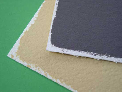
  • When you buy the readymade Colourfix paper, it comes with a white margin. Unless you use the whole sheet of paper, you are going to waste some paper. With the primer, you cut your surface to size first and prepare it, so you can leave the margin you want on the format you want. This gives more flexibility and no waste.


This acrylic primer is lightfast, acid-free and give to the surface a fine tooth. So, provided you use an archival surface (like a cotton rag based watercolour paper), your support will have archival qualities.

The primer is quick drying. For best results, you need to apply two coats. Two thin coats are better than one thick coat. I used a household paint brush to do the job. It was easy and quick. As it is an acrylic primer, you clean your brush with water. Make sure you clean your brush immediately; otherwise, you will have a hard time to get it back in shape. You can also apply the primer with a sponge or a roller if you want to create some texture.

Regarding the type of surfaces the primer can be applied to, the possibilities are wide: paper (preferably heavy paper 300lb or more), canvas, card, plastic, ply, timber, masonry, terracotta (bisque fired) pots, ceramic, metal and glass. Ensure the surface is clean and dry.


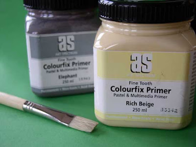
20 colours are available in 250ml pots (Rich Beige, Sand, Soft Umber, Storm Blue, Aubergine, Blue Haze, Burgundy, Fresh Grey, Leaf Green Dark, Rose Grey, Deep Black, Elephant, Deep Ultra Blue, Terracotta, Burnt Umber, White, Clear). All colours can be intermixed, or tinted with ink, gouache or acrylic.

One use I have not tried yet if for collages. The manufacturer advertises the “strong bonding qualities” of the Colourfix Primer that can be used as a good adhesive for all types of materials. According to Art Spectrum, “cloth, canvas, paper, rubber, plastic and other objects can be embedded in a wet coat of Colourfix. Individual items can be coated and glued onto papers, cardboard, plywood or other similar porous surfaces.” This could be really interesting for mixed media project or to pre-texture a surface with paper coated with the primer and then stuck onto a board or a canvas.

The primer, once dry, is waterproof. Pastel underpainting with pastel washed with alcohol or oil paint underpainting works well. By contrast, watercolour did not work well as the surface would not absorb the water. This is the only limitation I have found to using this product so far.

A one page document titled “Techniques for Removing Pastel from Art Spectrum Colourfix Papers” explains all the techniques that can be used. The most important point is that the surface will take repeated erasure, so most techniques will work.


Add to Technorati Favorites


Friday 27 March 2009

Bringing depth to your painting

This article was first published in "Frequency Magazine" – March 2009.

How do paintings, which are two dimensional surfaces, create the illusion of a three dimensional world? There are many aspects of a painting that you can manipulate in order to create depth. The final impression will result from a combination of all the elements discussed below. See them as control knobs on your mixing table: there are many possible permutations and with experience you will learn to balance them in the right way.

    Ramsgate harbour - Watercolour by Benoit Philippe

  • Linear perspective: Linear perspective is a system used to create the illusion of space and distance on a flat surface. The main tools are that the horizon line running across the canvas with a vanishing point placed on the line. Because of the way our eyes see the world, all lines defining the side of three-dimensional objects (orthogonals) are converging towards the vanishing point. In addition, the further away an object is, the smaller it looks.

  • Using design elements: One way to create an impression of depth is to have a series of similar elements that become smaller in the distance: fence poles, street lights, trees (a row of poplars along a road), and houses along a street. You can use optical illusions to reinforce the impression of distance. Gardeners use a trick to make a garden looks longer than it is: they design a straight alley that is wider at the start and narrower at the end, so that our brain is fooled and “sees” more distance than really exists. You can achieve the same effect by exaggerating the perspective in your work. Some compositional elements, like paths or rivers, naturally lead the eye towards the horizon.

  • Focal point: The focal point (or point of interest) is the area of your work where you want to direct the viewer’s attention. In order to create a focal point, you use contrasting techniques (warm versus cool or hard edges versus soft edges) that also contribute to giving depth to your painting.

  • Successive planes: By overlapping elements in your composition (for instance, a tree in front of a house), you reinforce the cohesion of your work and create a natural flow from the foreground to the background. As an example, painters back in the 17th century used in their landscape paintings a dark mass of trees to frame a view into the distance. In some compositions, you can easily identify successive planes. Otherwise, you will always have at the minimum a foreground, a middle ground and a background.

  • Atmospheric perspective: With distance, there is more air between the viewer and the objects and distant objects appear lighter in tone, bluer in colour and with less defined edges.

  • Using colour temperature: Warm colours tend to advance while cool colours recede. A distant object will appear bluer and cooler than an object in the foreground. The first colours to fade away with distance are yellows, then reds disappear and blues are last to remain.

  • Tones: Tones are different from colour hues. You can represent tones with a scale of greys distributed between white and black. The further you look in a landscape, the greyer and paler in tone elements will be.

  • Playing with edges: Details are lost with distance and edges are less defined. You can make an object recede by blurring its edges. A crisp edge will bring an object forward.

  • Brushwork: You can reinforce the depth of your painting by varying the type of brush strokes you use. Smaller strokes and smoother rendering are better for far away elements, while more vigorous brush strokes will bring the foreground to life.
There are many elements you can play with to give depth to your painting. Experimentation is the key and, as with most techniques, the easiest way to make progress is to concentrate on one aspect at a time.


Add to Technorati Favorites

Wednesday 25 March 2009

Leonardo da Vinci on judging your own work

«When the work stands equal to one’s judgement of it, it is a bad sign for the judgement. When the work surpasses one’s judgement that is worse, as happens to someone who is astonished at having produced such good work, and when the judgement disdains the work this is a perfect sign. If someone with such an attitude is young, without doubt he will become an excellent painter, but will produce few works, although these will be of such quality that men will stop in admiration to contemplate their perfection »

Leonardo da Vinci ( in “Leonardo on painting”, edited by Martin Kemp – Yale NB edition)


Leonardo da Vinci The Virgin and Child with St. Anne and St. John the Baptist - Source: Wikimedia


Related articles

Monday 23 March 2009

Bluebell wood - Pastel


Pastel of a bluebell wood. I used a Bockingford NOT watercolour paper (425gsm / 200lbs), prepared with two coats of Colorfix pastel gesso. I also started with an underpainting in watercolour.


Bluebell Wood - Pastel (6" x 8") by Benoit Philippe

Friday 20 March 2009

Ingres on art

This article was first published in my newsletter "Notes From My French Easel" – February 2009. 


Jean-Auguste-Dominique Ingres was born in Montauban in 1775 and died in 1867. He won the “Prix de Rome”, which is a prestigious art prize in France; went to the Villa Medicis, the French Art Academy in Rome as a pupil and later as its director. He remains famous for his portraits and historical paintings.

Ingres considered drawing as superior to painting (“Drawing contains three quarter and a half of what constitutes painting.”). Ingres was excellent at drawing and this certainly explains his views. On the other hand, his paintings seem dull today, after we’ve seen impressionism and fauvism make paintings full of brilliant colours. His motto was “No too bright colours; it is anti-historical. Rather fall in the grey than in the ardent (…)”.

Portrait of Victor Baltard's wife (born Adeline Lequeu) and their daughter Paule
Source:
Wikimedia


Ingres believed in the superiority of painting from nature (“Art is never at such a high degree of perfection than when it looks like so much like nature that you could think it is nature itself.”), but only through the filter of drawing (“If you are not painting from nature already copied by you but from nature directly, you will always remain a slave and your painting will resent from this slavery.”). Ingres also thought that the work from nature should be combined with the study and inspiration given by old masters (“One must always copy from nature and learn to see it well. This is why it is necessary to study old masters from antiquities and their works, not to imitate them, but once again, to learn to see.”)

Ingres was a proponent of classicism and admired the Greeks and Romans for their art. His preferred painter was Raphael, but he denied just copying him. Ingres professed that there was only one art, “the one which is based on eternal and natural beauty”. For this reason, he condemned novelty and change, considering old masters already found beauty in their work and had just to be followed.


Oedipus et Sphinx, 1808 – Louvre Museum, Paris
Source:
Wikimedia


To Ingres, mastery meant achieving a high degree of realism and conceiving a painting as a window opening onto the world. Technique was successful when it went unnoticed. (“Art never succeeds more than when it is hidden.”) He was against any brushwork effect, considering it as a distraction for the viewer. His technique was very slow and he only left a handful of paintings.

He despised Delacroix that he called “the apostle of ugliness” and the feeling was mutual, as Delacroix criticized Ingres’ lights and colours: “He believes that light is here to embellish; he does not know that it is first here to animate” and the lack of reflected lights in Ingres’s paintings: “He does not suspect that everything is reflection in nature and that all colours are an exchange of reflections.”


Paintings by Ingres
A Closer Look: A closer look at Louis-François Bertin: An excellent study of one of Ingres’ painting in the Louvre with audio commentary

Une Odalisque (Louvre Museum)

Oedipus Explaining the Enigma of the Sphinx (Louvre Museum)

The Apotheosis of Homer (Louvre Museum)


Books on Ingres

Jean Auguste Dominique Ingres: The Classical Idealist (Taschen Basic Art Series)
Jean Auguste Dominique Ingres: The Classical Idealist (Taschen Basic Art Series)Portraits by Ingres: Image of an Epoch (Metropolitan Museum of Art (Hardcover))


Wednesday 18 March 2009

Would you swap Paris for Swindon?


BBC Wiltshire published on their website an article on my paintings of Swindon, under the title Would you swap Paris for Swindon?. The journalist heard me on the radio when I came for an interview last Monday and contacted me to get some photographs of my paintings.


The Evening Advertiser, Swindon's local newspaper, also ran a small piece on my paintings slide show being on the Big Screen.


Monday 16 March 2009

Summer Walk - Pastel


This field is located not far from Swindon and was superb last summer, against the cloudy blue sky.


Summer walk - pastel (6" x 8") by Benoit Philippe

Wednesday 11 March 2009

Deep darks in watercolour

This article was first published in "Frequency Magazine" – December 2008.

In a previous post, we looked at how to use masking fluid in watercolour to create clear highlights. This time, we will go at the other end of the spectrum and explain how to achieve vibrant dark colours.

An easy solution to getting deep dark is just to use colours out of the tube: Ivory Black, Lamp Black and Mars Black, a slightly warm black, are the most current types of black available. Paynes grey (which is a very dark bluish grey) is popular in watercolour to darken colours and could replace black when used almost undiluted. The risk with overusing black is to make your colours dull and “dirty”. Black out of the tube or pan may work for small surfaces, but lack variety for larger dark planes.

I prefer to mix my own black and dark colours. It takes some practice, but the results are worth the effort. Mixing your own darks gives you greater flexibility and will expand your visual vocabulary. The basic principle is that, by mixing dark complements together, you end-up with a black or dark colour. Good pairs of colours are:


  • Alizarin Crimson and Phthalo Green (or Winsor Green)

  • Burnt Sienna and French Ultramarine
Depending on how much you put of each colour, you will obtain a cool black or a warm black. You can vary the temperature of your mixture by adding a third colour. For instance, adding some Ultramarine Blue to a mixture of Alizarin Crimson and Phthalo Green will cool down the resulting dark colour.

There are different methods to mixing dark colours. The direct approach consists in mixing them on your palette. Watercolour pans work well, but I found that for larger quantities, using watercolours in tubes is more effective and also gives you more concentrated pigments.

The second method is to build-up dark colours layer after layer to create rich colours. This is made possible by the use of transparent colours and Alizarin Crimson, Phthalo Green as well as Ultramarine Blue are transparent. You start by applying one of the colours on the paper. I usually start with the dominant colour or temperature: to paint the shadow in tree foliage, I would choose a Phthalo Green or Ultramarine Blue. Leave the colour to dry, then glaze it with a complimentary colour. When this one is dry, you glaze again with the same colour or with your initial one.

The layering method presents at least five advantages over the direct mixing method:

  • Because colours are applied in separate layers, the pigments are also separate and the resulting colours richer.

  • This method plays on transparencies and gives a more luminous dark colour than any black coming out of the tube.

  • Layering colours gives you a chance to adjust the temperature of your shadows towards cool or warm tones. As a rule of thumb, objects with a warm colour will have a cool projected shadow, while objects with cool colours will have a warm projected shadow.

  • You may decide not to continue until you reach a black shadow and settle with a green shadow, a red one or a purple one.

  • As you proceed step by step, you can assess more accurately when you achieve the correct tonal value.


Here is a sampler to demonstrate this technique. From left to right, one layer of colour is added in each square.


Square 1: Ultramarine - Square 2: Ultramarine + Crimson


Square 3: Ultramarine+ Crimson + Ultramarine

Square 4: Ultramarine+ Crimson + Ultramarine+ Crimson + Ultramarine


Square 5: Green - Square 6: Green + Alzarin Crimson


Square 7: Green + Alzarin Crimson + Ultramarine - Square 8: the same + Green


Two things to remember when you paint your shadows:
  • Firstly, when you paint dark colours in watercolour, they have a tendency to get lighter when they dry. I think this is due to the fact that the water makes the surface of the paper shinny and glossy colours always look more intense (like a varnished oil painting).
  • Secondly, remember the law of contrasts when you look for deep shadows: the lighter the surrounding, the darker your shadow will appear.
Article you may also likeUsing a limited palette


Tuesday 10 March 2009

BBC Swindon Breakfast show interview


Yesterday morning, I was interviewed on the Chris Warburton Breakfast Show at BBC Radio Swindon.

Chris wanted to know how it was to have
my paintings on a 35 square metres screen. The short answer is: “Great!”


You can listen to the interview on the BBC iPlayer where the program will be available for the next 7 days (Note: this may not work outside of the UK). Select the breakfast program for Monday 9th March. The interview starts on 1: 21:14 and ends on 1:26:00.

This radio interview was a first for me (as was creating and posting the
YouTube video Painting Swindon on the BBC Big Screen last week-end).

Back to the (art) studio now to create more paintings…


Add to Technorati Favorites

Monday 9 March 2009

How to take your art to the Big Screen


In my previous post, Making it to the Big Screen , I told you about the slideshow of my paintings currently showing on the Big Screen in Swindon. In this post, I share with you how I did it.


I first pitched the idea around a slideshow “Painting Wiltshire” in a letter to the BBC Big Screen producer. I enclosed my portfolio (Print-out of paintings, artist statement, resume, press clippings, presentation of my website and blog) and a CD with a selection of JPEG images and a PowerPoint slideshow to give a better feel of how it would look like.


The producer expressed his interest and asked me to do several things:


  • To be more focussed and create a “Painting Swindon” slideshow, rather than doing one on Wiltshire

  • To indicate the location in each image


  • To change the format to an MPEG film with a length of 2 mins to 2 mins 20 seconds, so that it would fit into the peak lunchtime viewing segment at the screen.


  • To put music on it if possible

The common theme around these requests was to make the material more relevant to the audience and more condensed (features on TV are much shorter than in other media).

This part presented several challenges as I did not have any software to create a MPEG film and did not know where to find music I could use.

After some searches, I stumbled upon an excellent site for music called Jamendo and selected a track named Life’s Things from the album Life's Path by Mindthings. I found that the electronic music worked well with my paintings and made the slideshow more dynamic.

For the visual part, I used Photoshop Elements 6 (PC) to add the location on each painting and to create the title page and the credit page for the slideshow. With the same software, I created the sleeve and label for the DVD.

To create a DVD with the slideshow in MPEG format, I used a software called QR Photo DVD Slideshow. It is really simple to use, intuitive and gives a professional look with sleek transitions. In four simple steps you can organise your pictures, select the time for the transition you want and the timing for each slide, add music and burn the film onto a DVD.


One more thing…

Why sharing this with you? Because I want to see more art in the streets, more art in people’s life… because art is about sharing and everyone will benefit.

So, if you live in the UK, why not try to get your art on one of the BBC Big Screens?


Related resources

Frequently asked questions on the Big Screen

Link to the different Big Screen sites


Add to Technorati Favorites

Sunday 8 March 2009

Making it to the Big Screen

I never thought my paintings would be one day on a big screen, but this is happening. This is really exciting! It is quite something to have your work up there, on a 35 square metres screen.


I submitted a selection of my paintings to the BBC Big Screen in Swindon and, after a few back and forth, I have now a short film called “Painting Swindon” showing 11 of my paintings on a huge screen in town centre, where many people come to do their shopping.


In case the embedded video does not work, follow the link to the YouTube page where I posted the video Painting Swindon on the BBC Big Screen.


At this stage, I need to give proper credit to two people who played a role in this adventure (the first one not knowing about it). The first person is Alyson Stanfield from ArtBizCoach.com, the author of I'd Rather Be in the Studio!: The Artist's No-excuse Guide to Self-promotion (I just received my copy and can’t wait to read it). In her article, 6 principles of no-excuses art marketing, she pointed out:

2. Connections are critical to your success. Ignore meeting new people and maintaining relationships at your peril.

And

4. If you ignore the latest technology, you’ll quickly fall behind.


The Big Screen falls in the latest technology category. As for the connection, I must thank Mike Pringle, Director of the
Swindon Cultural Partnership, for suggesting to me to submit my works to the BBC Big Screen.


The Big Screen

I wanted to share that with, not only because I am very excited about this, but also because you to should consider submitting your art. Think about this: there are currently 11 Big Screens in the UK and there may be one near you.
Current locations are:

  • Hull, Queen Victoria Square


  • Liverpool Clayton Square


  • Manchester, Exchange Square


  • Leeds, Millennium Square


  • Rotherham All Saints Square


  • Bradford, Centenary Square


  • Derby, The Market Place


  • Swindon, Wharf Green


  • Swansea, Castle Square


  • Walham Forest, Walthamstow Town Square


  • Cardiff, The Hayes


  • Middlesbrough, Centre Square


  • Norwich, Chapelfield Plain


  • Plymouth, Armada Way


In a future post, I will share with you how I did it, so you can get your art on the Big Screen too.


Add to Technorati Favorites

Friday 6 March 2009

Supports for oil painting

This article was first published in "Frequency Magazine" – February 2008.


Supports are either flexible (like canvas) or rigid (like wood). The support you use has a direct incidence on the look of the finished painting and some supports are more suitable for specific techniques. When choosing a support, you should also think about conservation as well as transport and storage. Before you ask: there is no ideal support; they all have advantages and shortcomings. This article will help you to select one or several supports that work for you.

- Canvases: Canvases are flexible and have a good size-to-weight ratio. Cotton canvases are a popular choice as they are less expensive than linen canvases. Acrylic primed canvases can be used for both oil and acrylic. Canvases made of cotton have a smoother surface than linen ones. There are various qualities and grades of cotton and, for larger sizes, you need to make sure that the fabric is strong enough and springs back when you push lightly on it with your finger. Look at the back to make sure the canvas is knit with a close and even weave.


Linen canvases are more expensive but remain the material of choice for professional painters. Linen fibres are longer, remain flexible for longer, are resistant to bacterial rot and are less affected by the atmosphere. Linen canvases have an irregular and pronounced texture when woven that makes impasto work easier, as the paint sticks to the coarser surface. On the other hand, cotton canvases work best for detailed brushwork and subtle glazes.

Apart from traditional canvases, you also find in shops deep-edge canvases. The canvas is wrapped on all sides of the stretcher bars. You can keep the edges clean or paint on them and these canvases are often exhibited without any frame (which makes then a cheaper option). Using these deep-edge canvases rather than traditional canvases is a matter of taste and style.

On the minus side, canvases are more prone to damage if mishandled. To avoid denting the canvas, store them vertically and don’t lean anything against the fabric.

- Wood: Wood has been used as the main support for oil paintings until the early 16th century and continued to be used even after canvases were invented. Painters have painted on poplar, oak, walnut, cherry and other types of wood. Wood must be fully dry and properly prepared and stored as it is affected by climate changes and can crack when subjected to intense heat. Stay away from planks with nodes as these may show through the paint. Finally, large wood panels are prone to warpping. Good wood is expensive and is not favoured by painters today.

- Wood substitutes: Modern wood substitutes like plywood and hardboards make excellent supports. You just need to prime them with several coats of acrylic gesso. This can be a cheap option if you buy off-cuts from a hardware store. The surface obtained after sanding is smooth and rigid. If you’re looking to create a highly textured painting, the rigid surface will reduce the risk of cracks. This surface is also ideal if you want to scratch the surface of the painting with a blade to reveal prior layers (canvases would be too fragile for this type of handling). If you want to go wild, you don’t have to limit yourself to rectangles and squares; almost any shape can be obtained with a jigsaw power tool.

The drawback of hardboards is their weight, which makes them impractical to use for large formats. Plywood is lighter but can warp if used in a large size. Plywood, hardboard and MDF work well for small formats and are great to make your own panels.

- Panels: Panels take less space than stretched canvases and are ideal if you are going away on a painting trip. You can buy some in art shops or make your own by gluing canvas onto a piece of MDF.

- Paper: Bonnard and Turner painted oils on paper. Watercolour paper with a weight of 300gsm/140lbs or heavier can be used for oil painting. It is very important to use an acid free paper for good conversation and then to prepare it with two coats of acrylic gesso (dilute the first coat with water to obtain good coverage and retain the texture of the paper. When the first layer is dry, apply a second layer with less diluted gesso), otherwise the chemicals and acidity in the oil paint will damage the paper in the long term. Paper is light and takes minimal storage space. It is a good option for studies and sketches. For a finished work, it can be mounted on a board and framed under glass.

- Other supports: Copper (which has to be scratched slightly to create some tooth) has been used for small detailed work. To get the best of it, paint with transparent colours so that the copper will shine through. Toulouse-Lautrec used unprimed cardboard, probably because it was cheap, dried quickly (the solvent being absorbed by the cardboard) and gave to his works a mat finish reminiscent of pastel paintings. You can also paint on slates, which give a deep grey textured background.

The best way to decide is to try your hand on different types of surfaces, hard or flexible, rough or smooth, and find the ones that work for you. I suggest you start with ready made cotton canvases. Art shops offer many good quality canvases at affordable price, so try out different brands to find your favourite one that matches your work process.


Add to Technorati Favorites


Wednesday 4 March 2009

Cardiff art gallery - Pastel


Just finished this pastel tonight. There is nothing like pastel to get vibrant colours.


Cardiff art gallery - Pastel (6" x 8") by Benoit Philippe

Monday 2 March 2009

A marketing bag and DIY: Design It Yourself book

There is a big (justified) push to limit the number of plastic bags we are using while shopping, in order to reduce the impact on the environment. The Telegraph recently reported that, in the UK: “Plastic bag use falls by 26 per cent in two years”.

You see more and more reusable bags, some nice and some ugly, and most of them branded. The fabric bag is on the verge of becoming the new “bumper sticker”, so I thought it was time to make my own. Why advertise others when you could advertise your own web site?


It is great fun to come-up with ideas and go through the whole design process to end-up with a finished and unique product.

After sketching my ideas, I shot several photographs of and old Mercedes typewriter I bought many years ago. Then, using
Photoshop Elements 6 (PC) , I changed the letters on the round buttons of the keyboard to make-up the word “ART”. Finally, I wrote the domain name of my painting website in red with “Courier” fonts in order to stay in keep with the typewriter theme.

I bought the plain fabric bag in an art and craft shop as well as some transfer paper than allows you to iron-in onto fabric a design you print with your inkjet printer (The one used to make tee-shirts).

I plan to use this bag to transport back and forth the books I borrow from our local library.


DIY: Design It Yourself book by Ellen Lupton


The book DIY: Design it Yourself (Design Handbooks) gave me the idea to make this bag. It is a great book on design for non-designers. It is less about the rules and principles of design than showing you how you can design and make all sorts of things with a minimum of materials and a limited investment: books, brochures, CD cases, business cards, stationnary, tee-shirts, bags, press packages, etc.


The design of the book is attractive and effective, as you would expect. The book is bursting with examples that will get you spinning your own design ideas in no time. This is a good read and a source of inspiration for any artist who want to develop his marketing material and make it stand out. After I started reading it, I could not put this book down.


Add to Technorati Favorites